boundary 2: Volume 52
Another year, another volume of boundary 2 cover art complete. Keep reading to find out what inspired us for each cover of volume 52.
b2 52:1 highlighted the relationship between language and our perception of the world, particularly through sound, rhythm, and storytelling. This theme can be found throughout the issue, but particularly in Jay Garcia’s “Richard Wright Theorizes Surrealism”piece. He frames Wright’s interest in surrealism not as an art movement, but as a method of communication which could be incorporated into his own works.
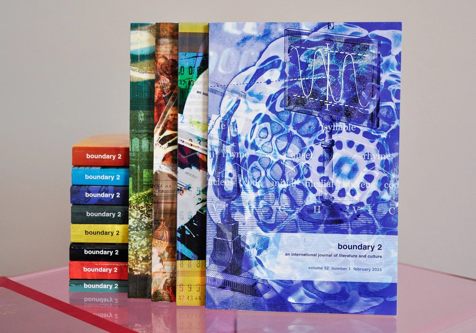
We chose cymatic art for the focal point since it’s such an interesting presentation of how frequency and vibrations can produce something not just visual, but artful. We blended illustrations of the optical study of vibratory movement, a syllable structure chart, and typesetter sorts—and then set it in an all-blue, monochromatic palette as a reference to the cymatic art we selected. The end result is cover art that’s as complex and dynamic as the issue’s content.
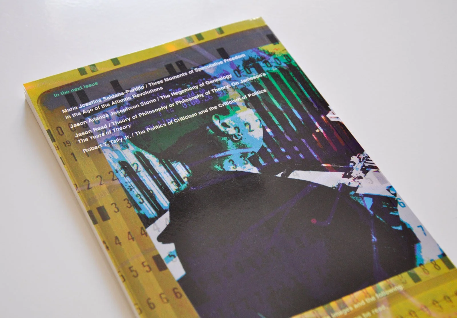
The first issue’s cover art was a strong start for the volume, and we rolled confidently into tackling the concepts of the second issue a few months later. Language was a primary theme for this collection as well, but from a different angle. RA Judy, b2 editor, wanted to hone in on “the politics of language and literature at the ascendance of Large Language Models (LLMs).”
That led us to the fundamental thing that LLMs do: Convert language and literature into zeros and ones. We used imagery from different eras of technology to lay the foundation: An IBM monitor from the 1980s, and a keypunch operator from the 1950s with an overlay of a punchcard. You’ll see images of a person reading braille carved into wood, and a rendering of an atom, layered over the entire piece for additional texture. The atom is a reference to a quote from Fred Jameson’s The Prison House of Language:
"The history of thought is the history of its models. Classical mechanics, the organism, natural selection, the atomic nucleus or electronic field, the computer: such are some of the objects or systems which, first used to organize our understanding of the natural world, have then been called upon to illuminate human reality."
To make the final piece cohesive, we let the throwback to the IBM monitor drive our color choices for all imagery. We mixed a retro yellow with an RGB palette for what shows up in the screen area of the monitor. Overall, it brings tech-themed, artistic playfulness to challenging, thought-provoking topics.
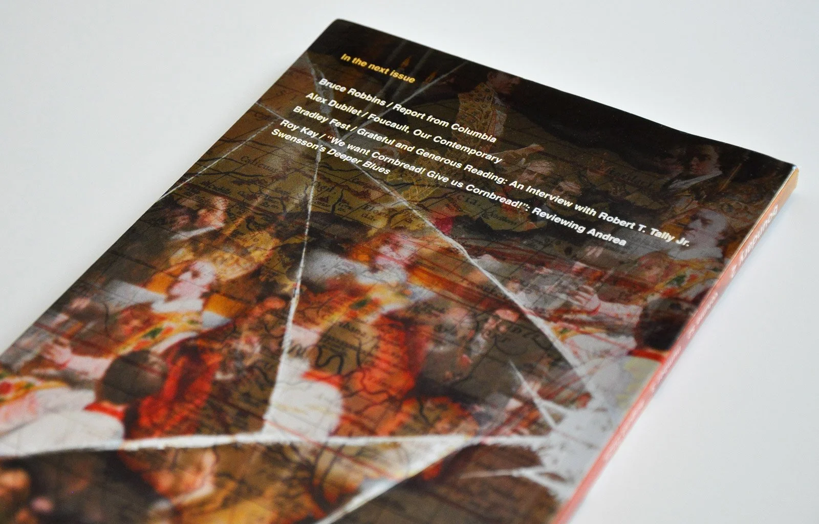
Issue three’s thematic focus was no less complex than its predecessors: “Critical genealogies of resistance and liberation,” according to Judy.
The backbone of the art is a reference to Cortes de Cádiz from the María Josefina Saldaña-Portillo piece called “Three Moments of Speculative Freedom in the Age of the Atlantic Revolutions.” We selected a painting called “El juramento de las Cortes de Cádiz en 1810” to do the heavy lifting. We then overlaid a vintage map with gestural, hand-drawn trade routes from that time period over the painting.
Ultimately, though, this issue’s goal is criticism—so we applied a broken mirror effect to marry reflection with critique and introduce fragmentation. We also featured student protest images from the 1960s as a nod to the Jason Read piece, entitled “Theory of Philosophy or Philosophy of Theory: On Jameson’s The Years of Theory.” The protest images feel especially prescient in today’s political climate, and help tie the past into a modern era.
If you haven’t had enough food for thought yet, buckle up for the last issue of the volume. The theme? Institutions of knowledge, society, and culture. An image featuring the Library of Congress seemed to be a great fit to the theme, but we didn’t stop there. Our instincts told us that Foucault’s version of destituent power and uprising is subversive, widespread, and individual. So, we implied a refused biometric by layering in a subtle image of fingerprints.
Bradley J. Fest’s “An Interview with Robert T. Tally Jr.” dove into the rise of dystopia and how it may imply a need to break the system, even if it seems unfathomable. We used an analog film effect with glitches and burns to imply disruption as a nod to this piece.
We’re huge fans of this thoughtful, vibrant volume, and hope you are, too.
Be sure to check out all our boundary 2 cover art, if you haven’t already. And drop us a line if you’re in need of unique artwork for your next journal or book cover.
Team
David Spratte, Creative Director
Emily Combs, Lead Designer