Capitol Broadcasting Company Website Redesign
Capitol Broadcasting Company (CBC) got its start back in 1937. What began with four partners and one AM radio station has grown into “a bold, future-thinking company, transforming media, entertainment, and communities.”
Considering CBC’s fast-growing family of brands, that description is apt. If you’re local to Raleigh-Durham, you’ll recognize brands such as WRAL-TV and WRAL-FM—and sports teams like the Durham Bulls and Holly Springs Salamanders. That list is a tiny sample of their brands.
While CBC had been tremendously successful in developing thriving brands, CBC’s own website had been around for several years and had fallen behind in both functionality and presentation.
A Little Perspective
When they approached us about building a modern website, we were happy to help. They needed an updated framework that their team could more easily build onto, and the front end needed to be refreshed.
The previous version of the CBC website.
CBC has a tremendously talented team across a vast array of disciplines. Still, when you’ve worked so closely within an environment, it can be challenging to see what changes could be beneficial and implement them. The website had been in the works for quite some time but had struggled to find traction. The pandemic didn’t help, but as pandemic pressure subsided and the job market dynamics changed, the time came to make it happen.
Our job was to show the CBC team the best path to building a new website and then build the site side-by-side with them. This new website would show visitors that CBC is far more than the sum of their brands. To move quickly, we’d aim for a smaller, more dynamic website supporting their long-term content development.
Getting Organized: Audience and Content
The website redesign targeted two primary audiences: job hunters seeking employment and those looking to learn more about the company. We needed to show those groups (and others) exactly how much CBC brings to the table and make it easy for visitors to find what they’re looking for on the site.
We began our work with a content audit and developing an information architecture (IA), tailoring pathways to guide their audiences to the information specific to their needs.
This project also kicked off a new round of photos, ensuring we’d have fresh images for the new website.
Custom Posts Types
Central to accomplishing the above required working through how to bring their diverse subsidiaries together cohesively. We quickly saw the benefit of developing a custom post type (CPT) for their brands. Creating a CPT allowed us to learn precisely what information we needed to convey for every brand and ensure that future brands would have the same information included.
The result is a filterable menu of brands, ranging from creative to television, with landing pages for each.
The CBC Brand CPT is one of two CPTs we developed for the website.
A sample brand landing page, accessible through the brand grid above.
Plot Twist: Brand Refresh
Concurrently with the audience, content, and IA efforts, our team worked through a brand audit.
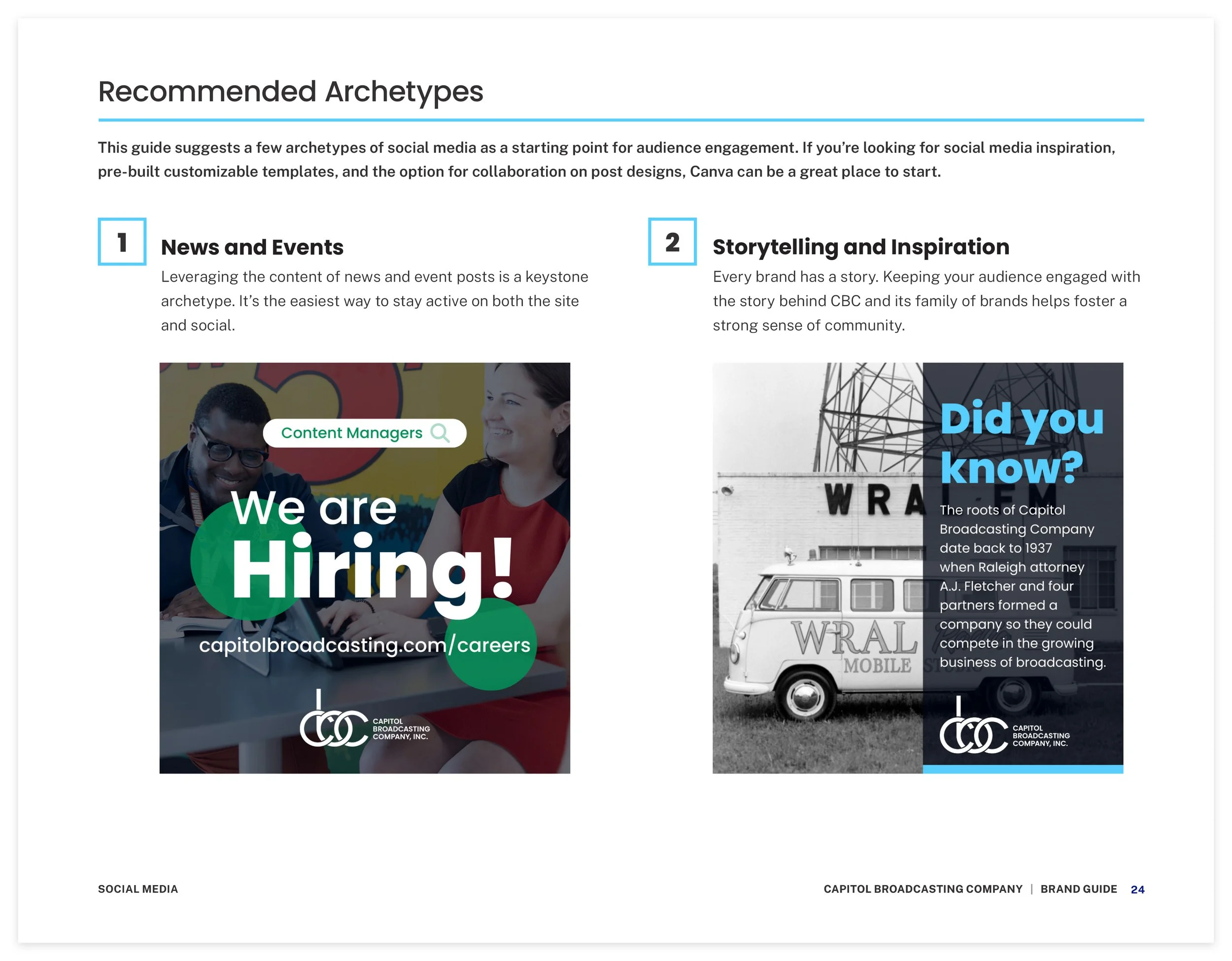
That led us to updates that modernize CBC’s brand presence online, including a logotype refresh, an expanded color palette, and new collateral typography to complement the logo.
Layout and Branding
With our audits done and recommendations in place, we forged ahead into the layout and branding for the site. As you’ll see throughout, CBC has no shortage of great photography and media.
A considerable part of this update included an improved blog presence, giving audiences a reason to return regularly. All our design work is fully-responsive as well—something their old site wasn’t equipped to handle. Responsive designs meant they could finally reach mobile and tablet users, a necessary part of having a modern online presence and communicating with site visitors. Now, no matter the screen size, exploring the CBC site and its many offerings is easy.
We had a lot of fun working with CBC’s talented team, and we look forward to seeing where they take it from here.
Team
David Spratte, Creative Director
Emily Combs, Lead Designer


