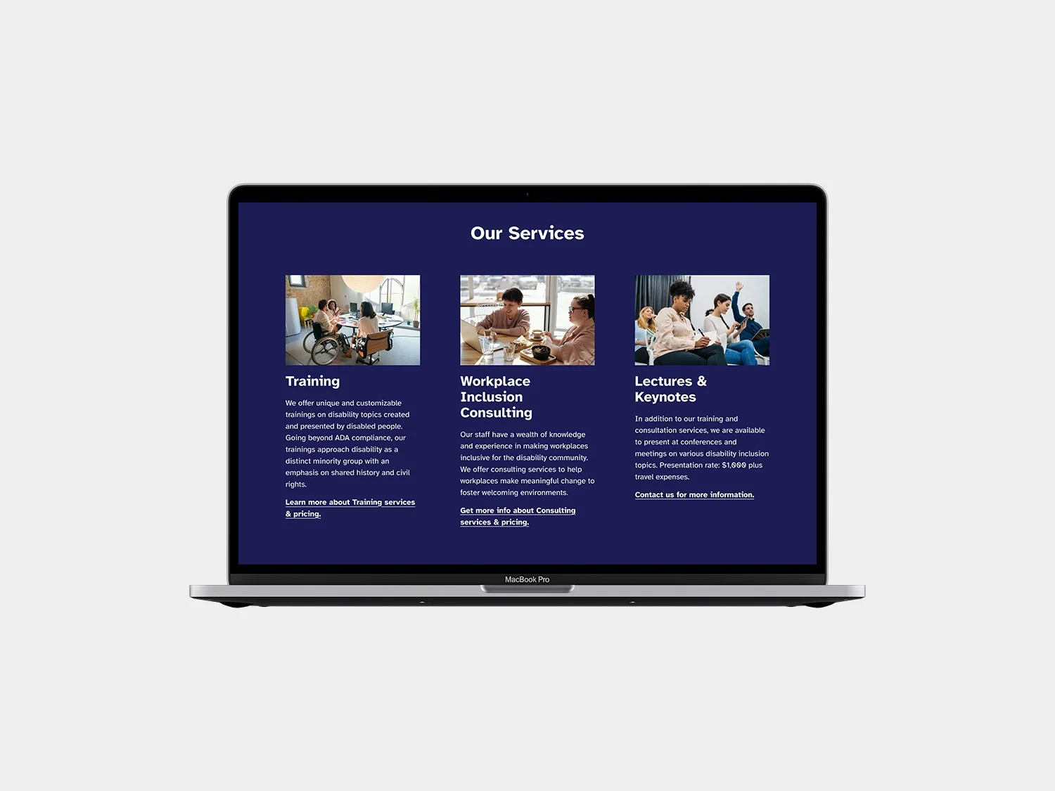
Disability Policy Consortium Website
At HALO 22, we’re always game for projects by organizations making positive contributions to our world. So, we were excited when the Disability Policy Consortium (DPC) reached out to kick off a website redesign project with us.
DPC does incredible work, including advocacy that’s led to vial legislative policy victories for disabled residents of Massachusetts. But DPC’s website was light on content when we first met—in fact, it even featured a message to let users know it was an interim site. While that may have been helpful for users to see, it wasn’t helping them access the information they needed. By partnering with HALO 22, DPC’s busy team could stay active at work while we created a solid foundation for a website that’s easier to keep updated.
DPC’s interim site was built in Squarespace, and based on their list of site needs, we determined that staying in Squarespace was the best plan.
Kicking Off with Content
A good content strategy creates space for good design, so we kicked off by performing a content audit of DPC’s current site and other frequently used materials.
Between the audit and in-depth conversations with the DPC team, we were quickly on our way to a new Information Architecture (IA) for the website.
Organizing information at the beginning of each website project takes time. Still, it’s worthwhile: It gives us a better picture of how the navigation should work, how to order pages, and how post taxonomy implementation can support those pages. If you’re unfamiliar with IA and how it works, check out our article. IA is a crucial step that gives our clients time to consider (and reconsider) their site structure and provide informed feedback before the layout and design phase.
The new DPC IA at a glance.
Next up was content porting. Structuring the content into the new IA before the design phase helps clarify what holes may need to be accounted for in the text and what sections need a little extra visual supplement. We grabbed content from the existing site and created blog posts from DPC’s recent newsletters, which set the stage for content organization.
We encourage all our clients to publish newsletter content on their websites for many reasons. First, it makes it easy for site users who aren’t subscribed to the newsletter to access important information. Second, it shows unsubscribed users the kind of information they’re missing out on in the newsletter, giving them good reason to subscribe. Third, leveraging newsletter content on the site will help improve SEO rankings and get more traffic—without much more effort than it takes to publish the newsletter in the first place. Having a publishing platform in place is such an easy way to show proof of life and gain benefits from publishing unique, detailed content.
Brand Evaluation & Refinement
Before the branding phase, we took a quick detour into DPC’s existing brand. They had an established logo but lacked consistent brand styles and documentation. We’d need to agree on styles before proceeding.
However, DPC’s budget for this year didn’t include a brand overhaul. We met in the middle to help move the site forward. As part of our content audit, we noted the most repeated brand styles and devised a quick-ship brand guide. Due to the nature of our client’s work, we kept accessibility in mind. First, we refined their color codes for improved accessibility on screen and then turned to typography. We selected a new collateral typeface, Atkinson Hyperlegible—a free, Google-hosted font, “developed specifically to increase legibility for readers with low vision, and to improve comprehension,” according to the website. These accessibility-focused design choices help reinforce DPC’s commitment to their mission and goals by improving the user experience for folks with disabilities.
Get a closer look by clicking the images above.
In addition to polishing color and type, we made simple refinements to the logo that would help with deployment on the new site and future materials.
Left: The original logo. Right: The edited logo.
With the new styles in place, we were ready to tackle design.
Supporting Content in Layout with Branding and Other Visuals
We know from experience that stock images and attention to detail don’t always go hand in hand. So, we paid close attention to photos portraying people with disabilities. These supplemental stock photos needed to be inclusive and—in the case of any accessibility tools included in the photo—accurate. We were pleased to find stock photo sites that shared these goals. Here are a few we found most helpful:
Eventually, DPC will swap out these stock photos in favor of their own photography. Unique content is something we strongly recommend for any website. In the meantime, by mixing some stock with DPC’s existing photos, we created designs representative of the people they serve—an imperative part of finalizing the design phase.
Wrapping Up
DPC’s new site is more robust in visuals and content than ever before—but more importantly, it’s a convenient publishing platform featuring accessibility improvements that will help their audience stay engaged. We’re excited to see where the DPC team takes it from here!
Above, a before and after look at the homepage. Left: The original website. Right: The new website.
Below, you can explore more screenshots of the new site.


