Proper Document Structure and You
We’ll cut right to the point: Using the correct headings in your work matters.
Headings collect like-minded content—that’s their functional role in writing. From here, we’ll omit discussing the craft of writing headings—we’ll save that for another time. Instead, we’ll focus on how logically applying headings to your writing can make your content more engaging.
In other words, Heading 1 is always the first heading on a page, chapter, or section. A writer may need to introduce subheads if it’s a long piece. The first, under a Heading 1, would be a Heading 2.
Logical headings mean that a Heading 1 always proceeds a Heading 2. And you can’t have a Heading 3 without a Heading 2.
Why does this matter? Here’s a hint: It’s all about scanning, but not the kind of scanning you think of when you get Aunt Peggy’s photo album. If you’re interested in improving the readability, discoverability, and accessibility of your content, let’s get to it.
Logical Headings Improve Readability
If you always use logical headings in your documents, your work will be immediately easier to read. And, let’s face it, reading is an unnatural act, so our job as writers (and designers!) is to make our work as easy as possible to read.
First, clear levels provide a visual hierarchy that conveys the relationships between your ideas. This gives your readers an outline that helps them scan the content to find what interests them—to see if this is something they want to read. Once they get into the material, good heading hygiene also increases comprehension by reinforcing sections and subsections of the information.
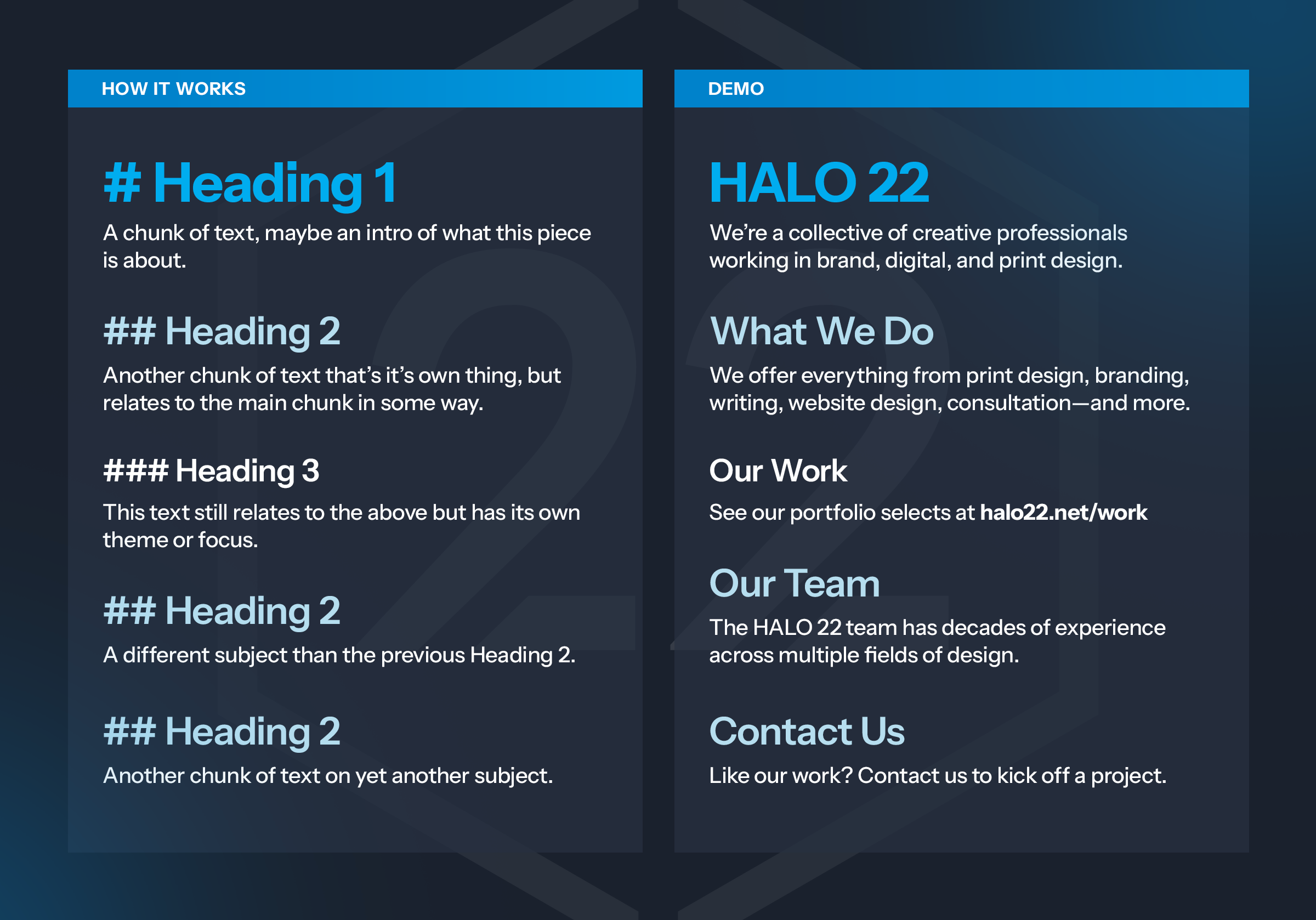
Here’s an example of how heading levels can improve readability through proper structure and style differences.
Logical Headings Improve Discoverability
If you’re writing for the web, your visitors aren’t the only scanners visiting your site—Google scans, too. Many of their patents reveal that good heading etiquette does impact search ranking. Since headings are essential in conveying your text’s structure, it makes sense that Google would rely on them to index your content.
Technically, what’s good for your visitors is good for search. Well-formatted pages—including logical heading levels—don’t scare off visitors, which should decrease instances of visitors landing on a page and immediately fleeing your website. The percentage of how often that happens compared to all your visits is called the “bounce rate.” There’s some back and forth on how “officially” Google measures bounce rate for page rankings, but a poorly formatted and visual mess of a page would make a visitor back right away from your website. If you’ve gone to the trouble of creating a website, you want visitors to stick around, right?
Using your heading levels correctly requires so little effort, and it does so much to make your content appealing to readers and search engines that it’s hard to justify not doing it.
Logical Headings Improve Accessibility
If you’ve read this far, you can guess what’s coming up: Screen readers scan, too. First, let’s be clear. When you write or design for accessibility, everyone wins.
Screen readers are assistive technology for low-vision or blind individuals that help them interact with digital content. They can use a text-to-speech process or a refreshable Braille display.
Proper headings help these users by creating an accurate outline of the page. Screen readers often deliver all page headings to a user. At that point, visitors use the headings to jump to the relevant section. Without good heading hygiene, the screen reader web experience is broken.
In Design
At HALO 22, we rely on proper headings to understand the hierarchy of any document—whether that’s a report, book, webpage, or blog post. Styles in a source document inform our work by assuring us we’re all on the same page with how things relate to one another.
At the manuscript stage of a project, the “look” of styles doesn’t matter. They’re purely semantic. Embrace your love of Comic Sans or Papyrus. Or stick to your guns and use your brand fonts. Whatever, you be you.
Don’t Take Shortcuts
Once you’re in production for a website or going to print your book, you can’t take shortcuts. Assigning H3 to a piece of text because you think it looks better than your H2 style undermines your credibility at a fundamental level.
If your H2s are horsey, a technical term for large and awkward typography, get your design team to update the style. Don’t short-circuit your document’s structure.
Additional Reading
Want to learn more about text structure and search? Take a deep dive on that over at Yoast.com.
Here’s an example of how designing for accessibility is an across-the-board win: Audiobooks got their start on tape(!?) as a service for low-vision readers. Today, they’re a $1.3 billion industry and on the rise.