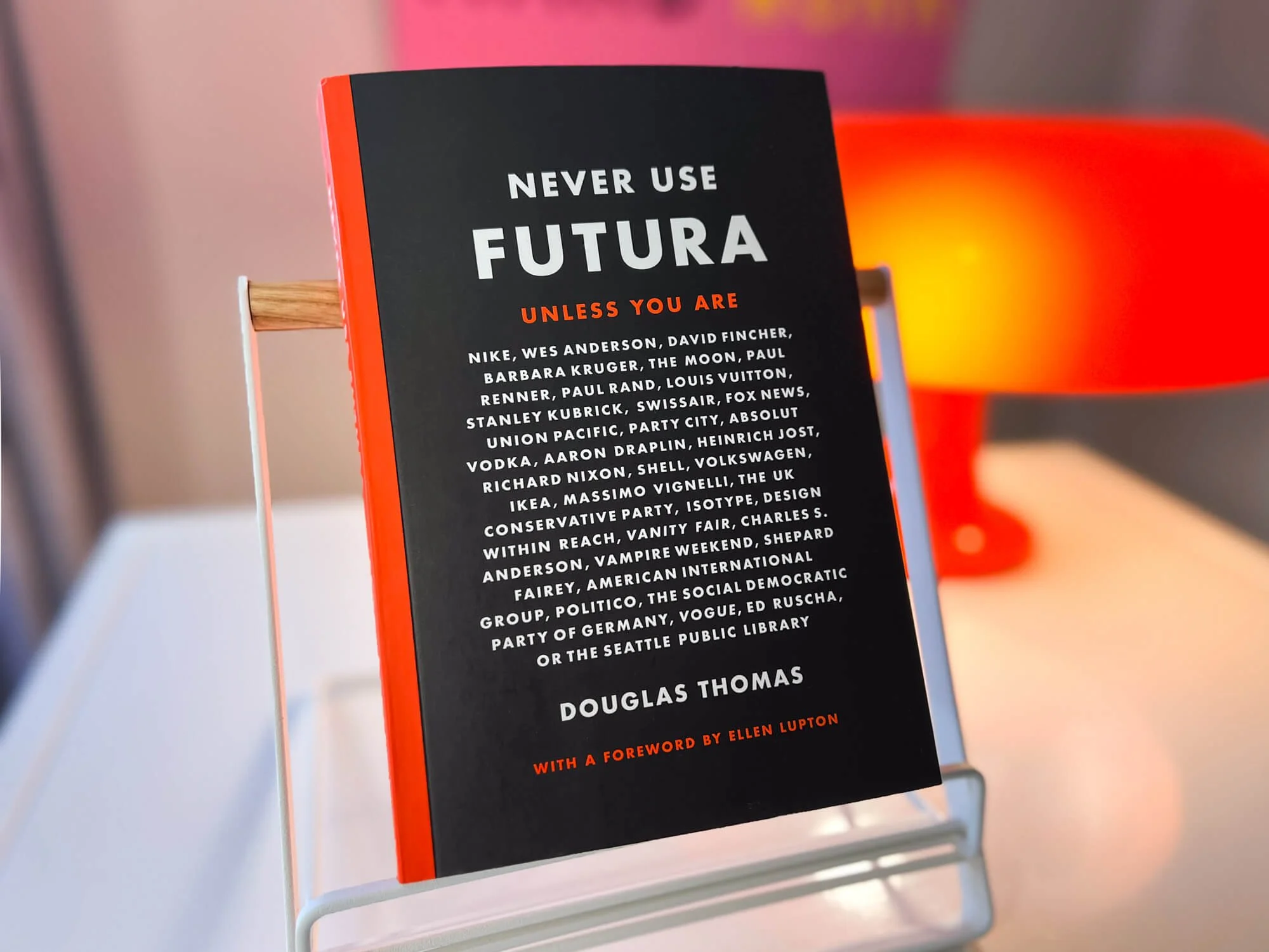
We Can’t Say We “Never Use Futura”
Written & Designed by Douglas Thomas
Oh, we’ve used Futura. We’ve even loved it, and still do. In fact, HALO 22’s original brand headline font selection was Futura PT. That choice was part subjective style preference, part obsession with NASA’s historic design styles.* If you pick up a copy of Never Use Futura by Douglas Thomas, you’ll get a glimpse into how and why NASA chose Futura for the Apollo 11 Plaque in 1969—and how it then became a staple of their look for the long haul. It was a fun discovery for us as a team when we realized we all held NASA’s brand styles near and dear to our hearts.
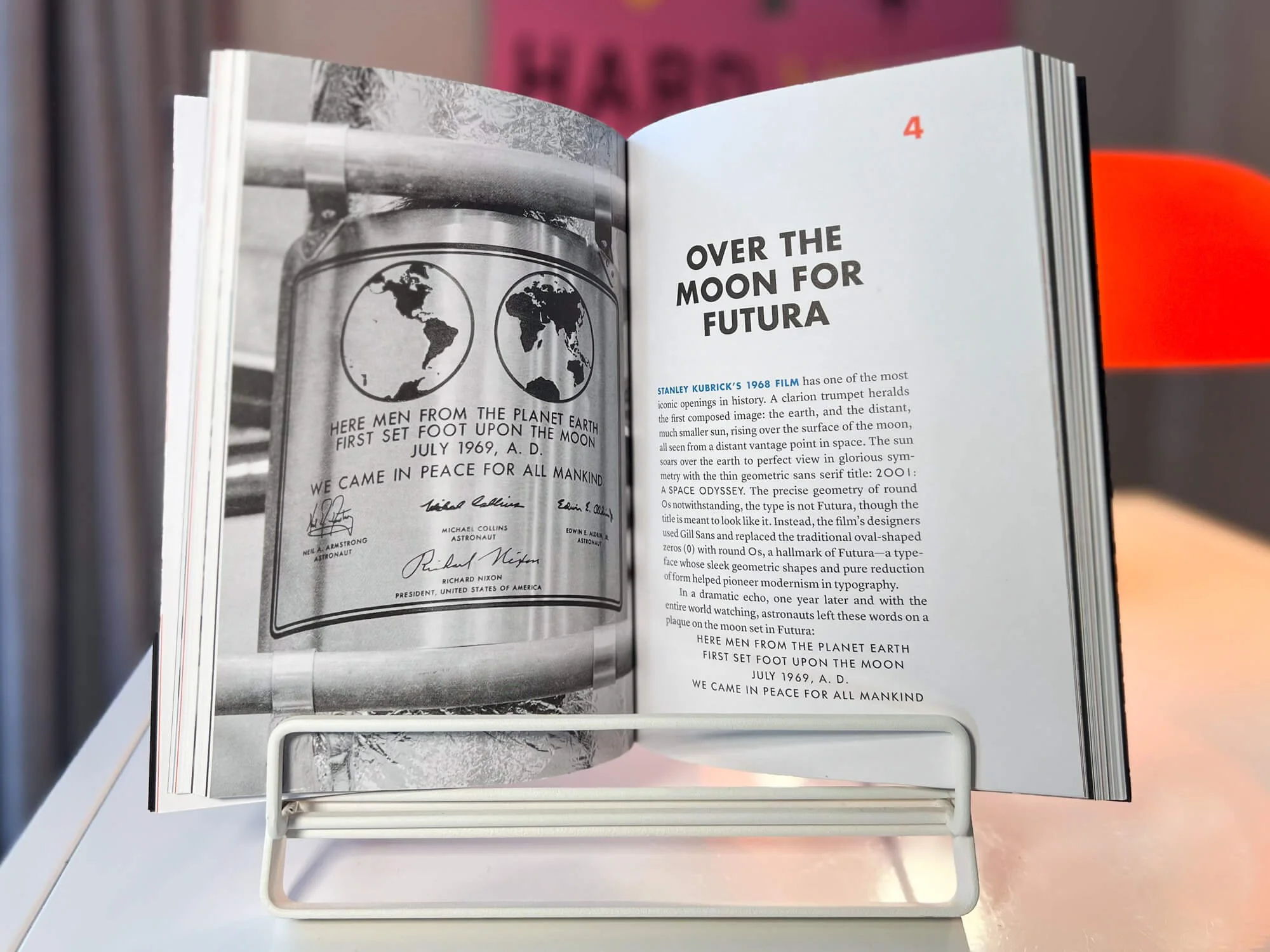
NASA’s Apollo 11 plaque, featuring Futura.
*To no one’s surprise, we’re also dorks for science and space. From our About page, the origins of the HALO 22 name:
Sun dogs, sun pillars, moon dogs, and parhelia are part of a family of optical phenomena called 22° halos. In short, the right group of hexagonal ice crystals comes together to produce any of these halo effects. The results can be stunning.
As time marched on, we kept running into stylistic inconsistencies between the Futura PT files we had for desktop, and versions of Futura PT optimized for web. Eventually, we migrated to Instrument Sans all around. But that inconsistency in Futuras led us to Thomas’ Never Use Futura, which is a treasure trove of design and type history. (You had us at “Foreword by Ellen Lupton.” She’s a typography legend!)
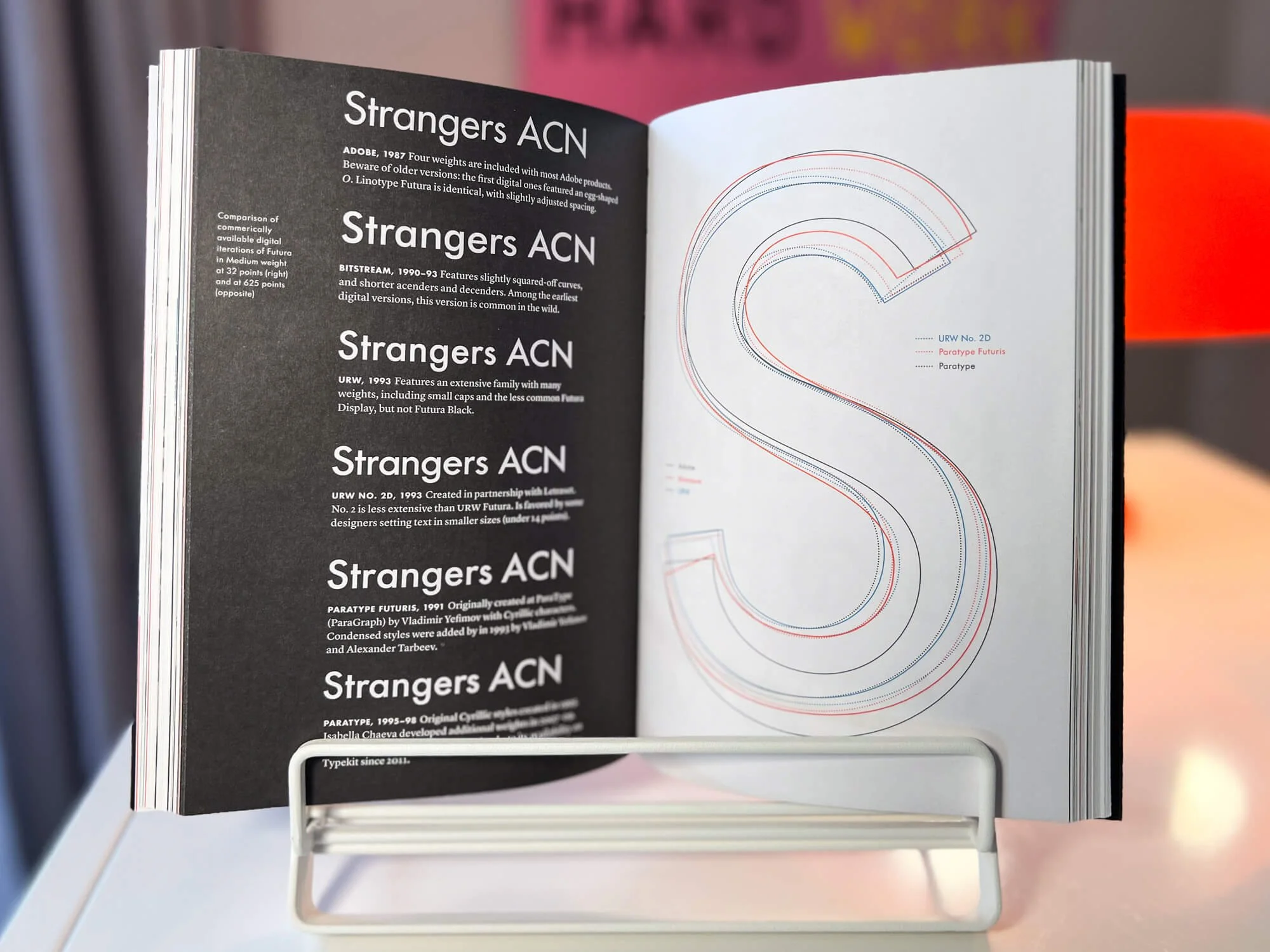
From this sample, you can see stylistic differences between a handful of Futura iterations.
Despite the title, this book is not anti-Futura propaganda. Rather, it’s Thomas’ exploration of its history and societal contexts. For example, did you know that Futura’s popularity dates back to modernist art movements of 1936? Or, that its original development and transformations are hugely political? You’ll find that there’s a lot more to Futura than its lovely geometry: Thomas expertly covers how Futura has impacted global culture and design, from the utterly mundane usages to deeply fascinating facts. Keep reading to learn what stood out most to us.
Making a Full Meal Out of a Few Ingredients
We have to give credit where credit is due: The author is a graphic designer, and he did an excellent job styling the book in a way that felt like a natural fit for Futura and its history. Skipping all the way to the end, the book acknowledgements open with “Design and writing are team sports.” That’s always been our philosophy, as well. You can’t have a strong design without strong content, and strong content can’t perform as effectively without good design. (Imagine how hard it would be to read an entire book set in Papyrus, for example. No, wait—don’t imagine that. We apologize for providing content fodder for your future nightmares.)
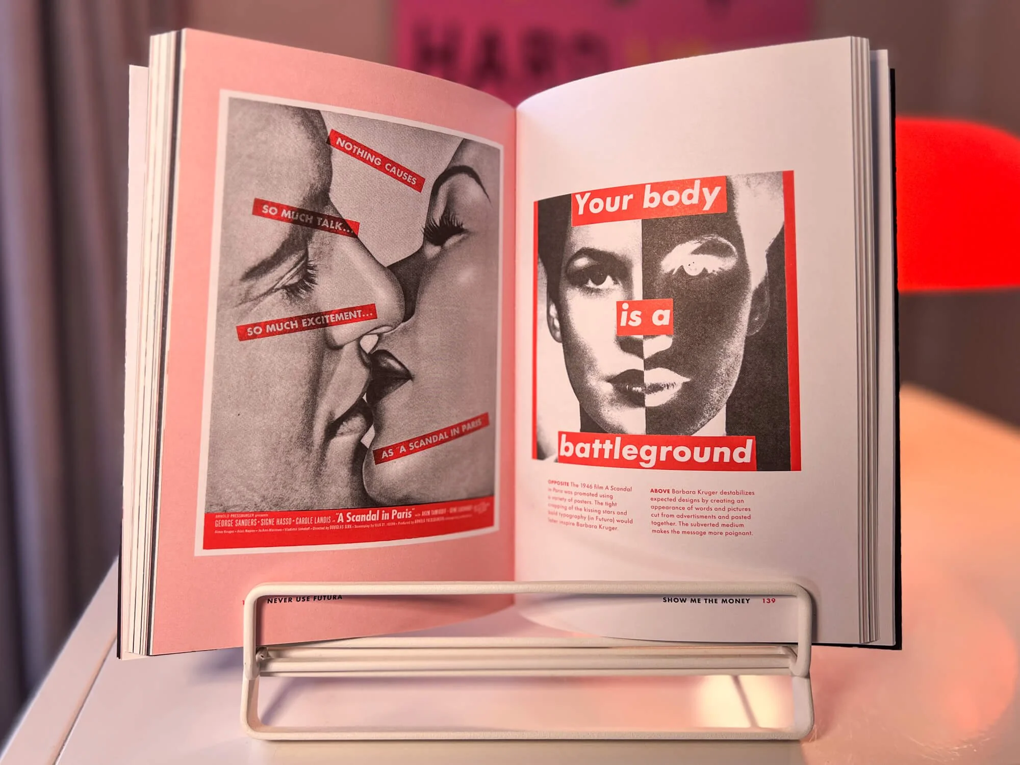
Barbara Kruger artwork featuring Futura.
As mentioned, Futura has varied over the years from foundry to foundry. It also has many connections to politics and, later, political resistance. The book hosts a large collection of images and illustrations to convey Futura’s long history of change. But Thomas succeeded in preventing visual chaos through key design decisions, which we’ll get into next.
Limited Color Palette
You’ll only find three colors throughout: Black, red, and blue. Though it may seem like too few at first glance, an ultra tight palette can still offer a rich visual experience. It just takes creativity to figure out how to wield those colors in consistent yet creative ways, and Thomas does exactly that.
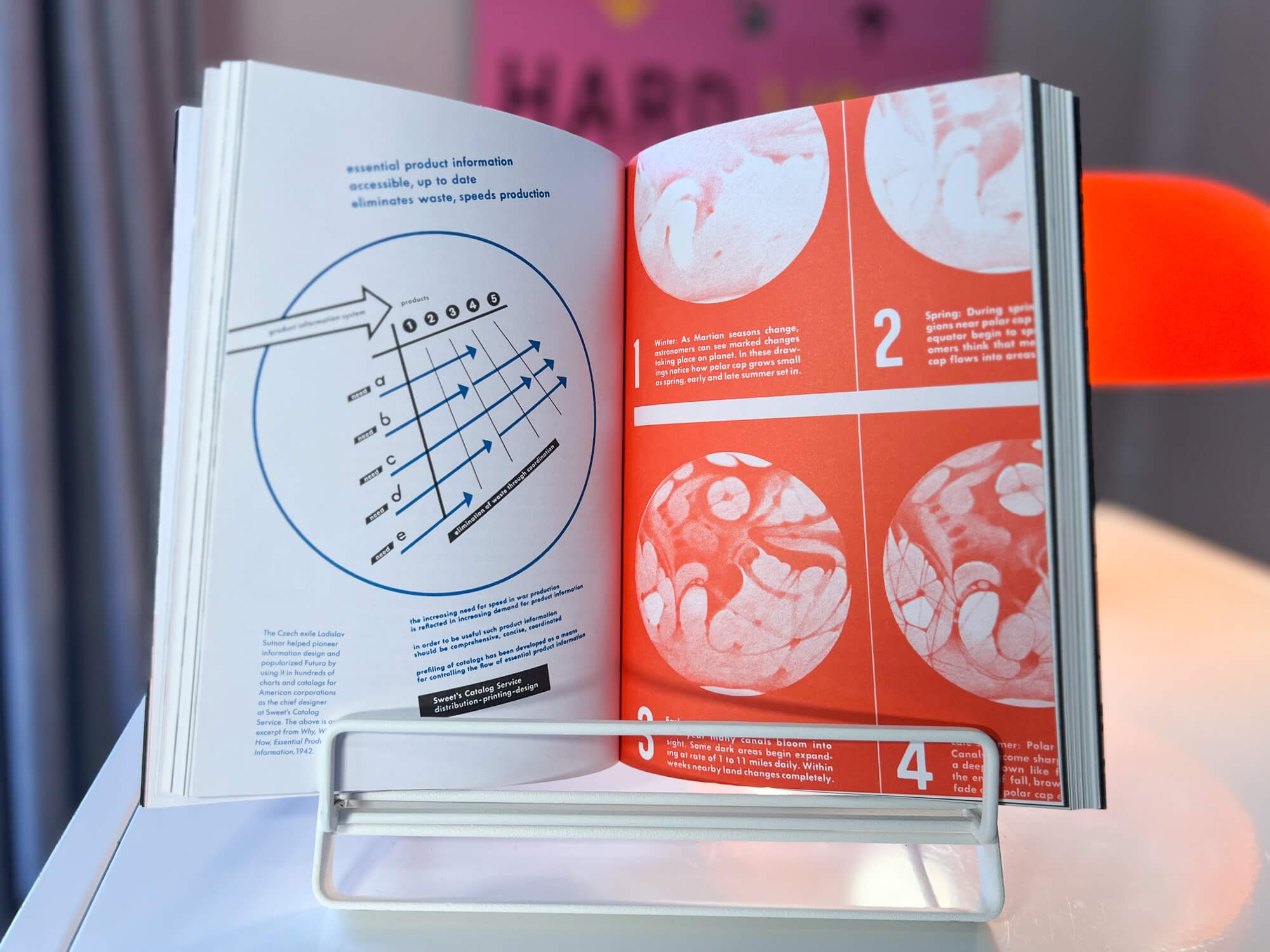
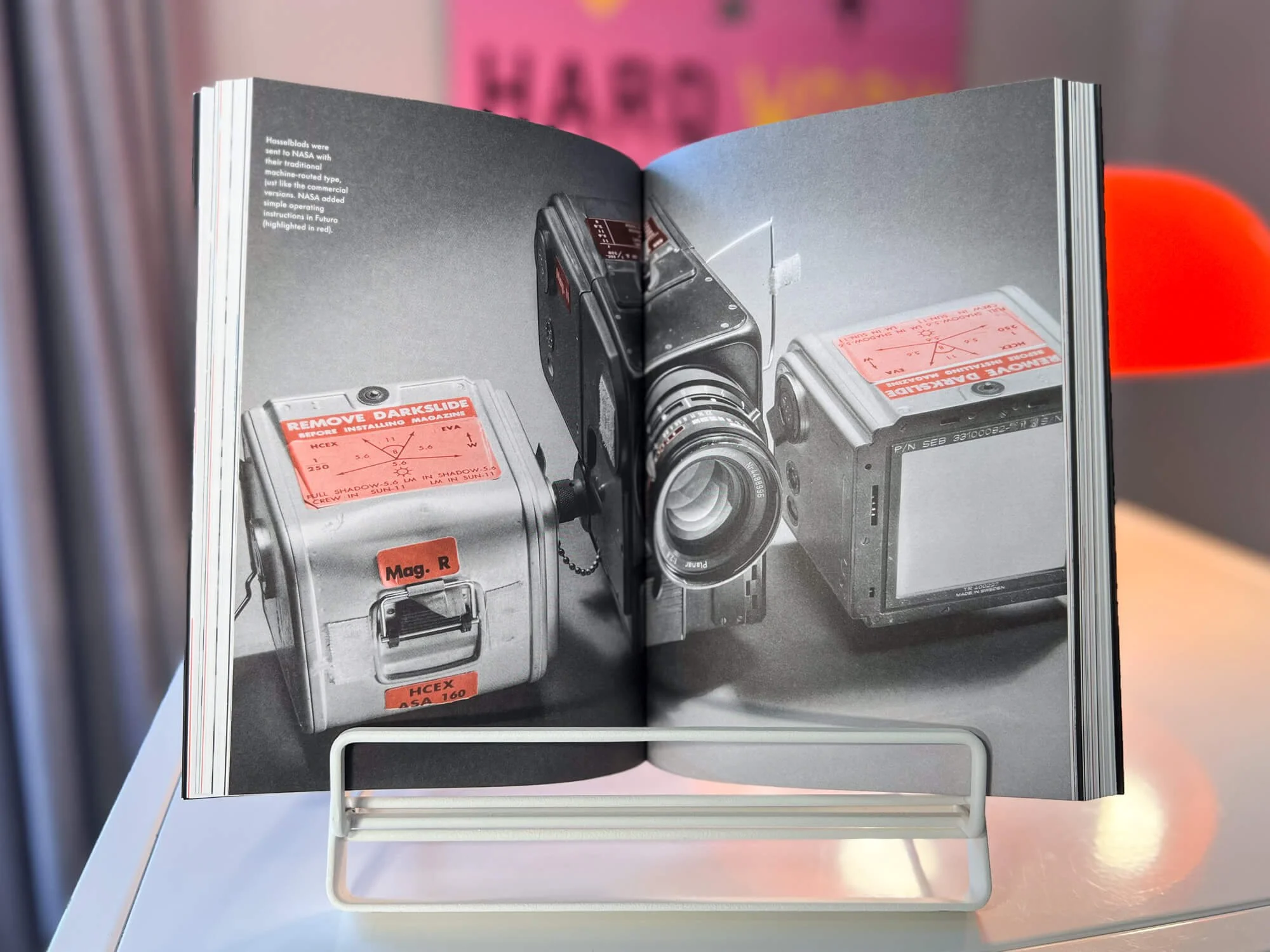
Most images and illustrations are set in a single color, brightly standing out from the black and white text, but also limiting visual distractions on the page. Other times, the color palette is combined just right to appear as though it’s a four color, CMYK print. Those instances are better for the full page sizes, and add more range than you might expect! Dropping these kinds of visual surprises every now and then helps keep readers eager to turn the page.
Flexible, Grid-Based Page Layouts
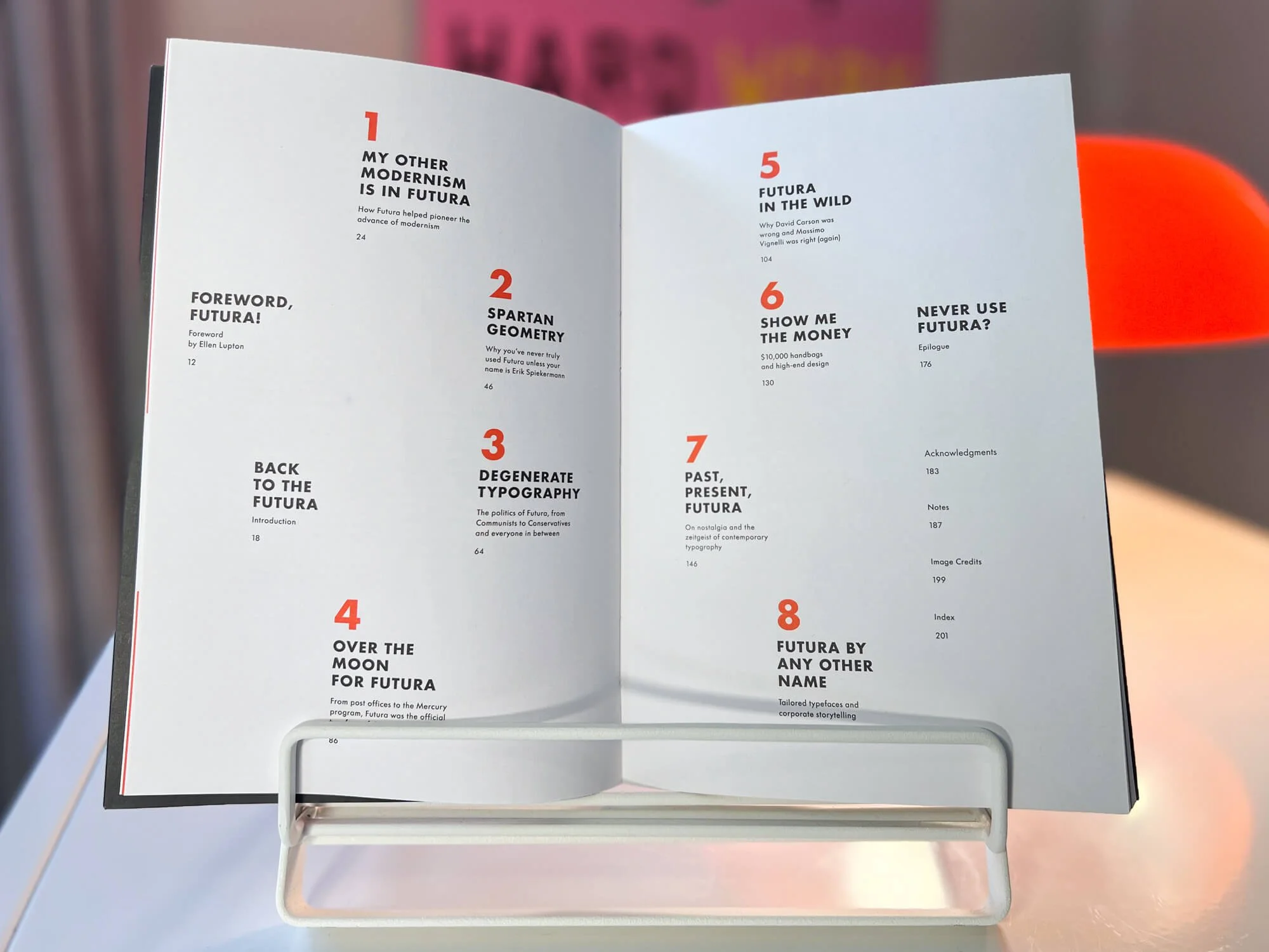
Faster reading requires predictable patterns. So, grids are key to book layout. But breaking the grid in strategic, creative ways shows the mark of good design, and here’s why: If you break the grid too much, you lose visual hierarchy. The outcome is an increase in overall time spent per page, and, likely a lot of frustration on the reader’s side. But, if you break the grid with a repeatable plan in place, you end up with a fast and fun read. We especially loved the way Thomas used margins for sidebar content throughout—and that swoon-worthy table of contents layout. (Excuse us while we fan ourselves. Whew!)
Selective Dedication to Use of Futura
Knowing the limits of a typeface is an important skill for designers. Futura is a fantastic display typeface—it’s bold, and works well whether you’re going for stylistically modern, retro, or somewhere in between. It works great in short form text such as headlines or captions. Yet, it’s not the easiest reading typeface. Entire paragraphs of Futura can feel overstylized, either performing as hard to read or even a little distracting. So, it made perfect sense that Thomas ran with a contrasting serif typeface, Lyon, for the paragraph copy. (Tip of the hat to Lyon’s designer, Kai Bernau, for having the apt slogan “Design for readers,” presented at the top of his site.) It’s one of the reasons we went with Instrument Sans instead—our materials read a lot smoother now! You’re welcome.
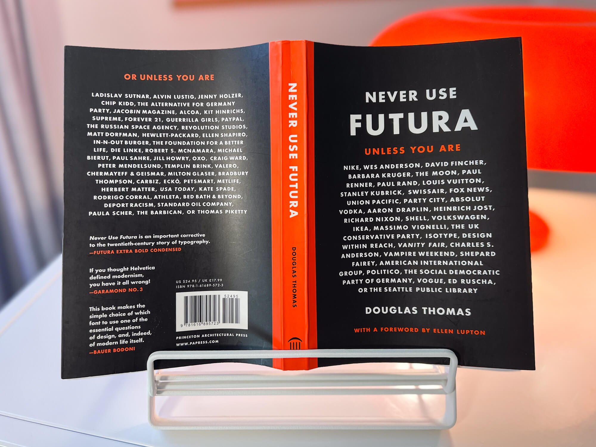
We’ve thoroughly enjoyed reading (and re-reading) Never Use Futura for the reasons above, and for the humor that adds levity to moments of technical design speak or dry historical facts. The lists of who can use Futura on the front and back covers, and the “quotes” on the back cover, are a quick way to sample that fun, cheeky sensibility if you’re feeling curious.
Douglas Thomas has this team’s full respect: To cover design history so well, and in such a skilled design setting, is truly a feat. You’ll find us picking up this book again and again.
Need font guidance? Whether you’re exploring type for a new brand, book, website, presentation, or other projects, we can help narrow down the options to find the right selection. Start the conversation today.