Bland Landscaping’s 40th Anniversary
The HALO 22 team has worked with Bland Landscaping Co. (BLC) for years. We’re sharing some older work because, first, it was a fun project. And it was a great example of mutual trust.
Kurt Bland reached out and shared his idea for a fantastic 40th anniversary celebration.
We were all in.
Projects where we get to leverage multiple disciplines are some of our favorites. For this, we’d leverage brand identity and print. Not only would we produce some fantastic work, but we’d be delighted to see how the client ran with the assets.
Identity
Our first task was to develop a 40th Anniversary logo they could use for the entire year. This would be deployed to the website, a limited stationary run, and other items.
The 40th identity would be everywhere. So, it was critical that we built something that conveyed what BLC has stood for the past 40 years—and that complemented their existing brand identity.
We got to work. From the jump, a seal was in contention. The rectangular aspect of their logo contrasted well with the circular shape of the seal, meaning each would have a unique look that would be unified by brand styles.
The challenge was working out what the content would be—seals are fantastically constrained. If you’re summarizing what the last 40 years have been about—and what you’ll keep doing for the next 40—every element needs to pitch in.
Initial sketches, showing language tests. The version on the right was the better fit, in the end.
After a few iterations, we landed on a three-word summary of BLC’s values, references to the trade, and a nod to where BLC got its start—North Carolina.
Using brand colors and typography allowed the seal to slot in seamlessly to BLC’s existing materials.
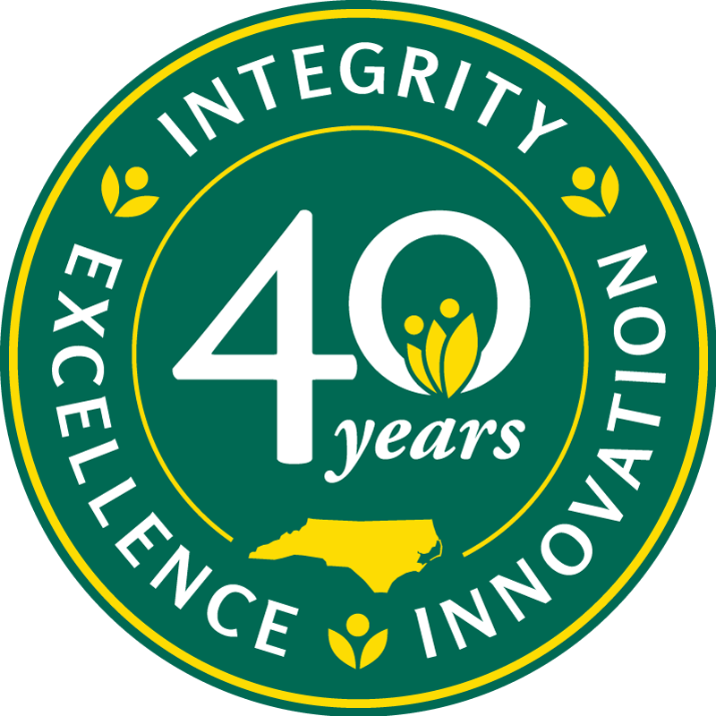
The seal structures allowed us to encompass all the different elements without being too busy.
We developed email signatures and a limited stationery run to carry the 40th throughout the year.
The letterhead is a great example of how the seal pairs well with the primary logo in layout.
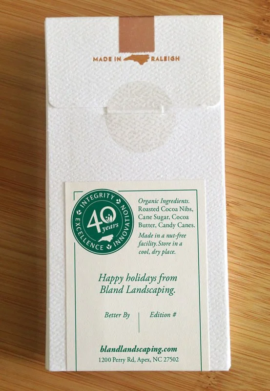
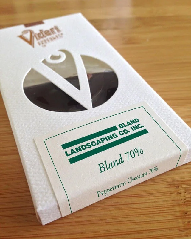
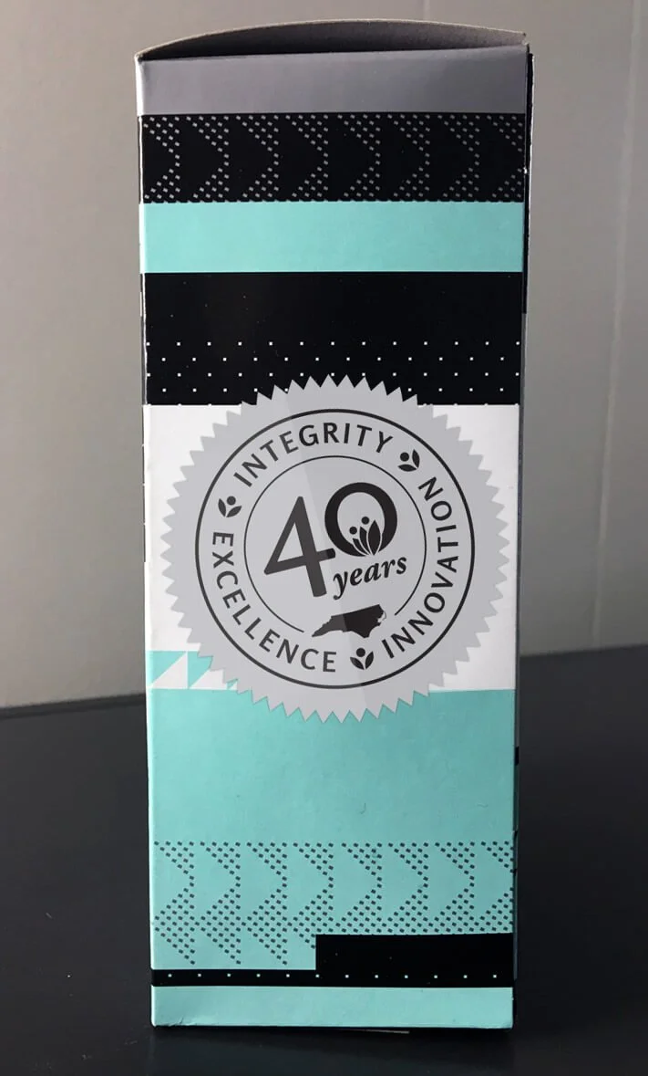
The seal even made it onto branded gifts from local makers Videri Chocolate Factory and Counter Culture Coffee.
The Celebration
To celebrate 40 years, BLC would host a garden party. From the start, Kurt wanted to lean on Alice’s Adventures in Wonderland—with a twist.
John Tenniel’s 42 engraved illustrations for the first edition—firmly in the public domain—gave us the latitude to adapt them for nearly anything. That was important since BLC’s garden party needed a whole suite of support materials, ranging from a save-the-date to numbered, screen-printed posters that would be raffled off to guests.
The event stationery included a Save The Date, Invitation, and RSVP.
The posters turned out pretty stunning, in our humble opinion.
Tee front, featuring the seal. Props to TS Designs for turning our complex artwork into fun apparel.
Tee back, featuring the same artwork as the posters.
A first for us was a logo as an ice sculpture.
The 40th seal in ice sculpture form.
Technical
To bring these print pieces to our usual standards, we had to sweat the details on converting scans of 100+ year-old wood engravings.
We tested several Adobe Illustrator Image Trace presets to get a style conversion we were happy with. With our final settings, we were able to keep these illustrations consistent across a vast range of sizes.
The effort gained us so much flexibility in using these assets—and others, across several client projects that followed.
Taking part in this celebration meant a lot to the team. Everything came together. And, coming back to look at it, it sure has held up well.
A demo of how well our Illustrator preset preserves detail when vectorizing pixel-based art.
Have a big event coming up? A milestone? Reach out to us to collaborate.