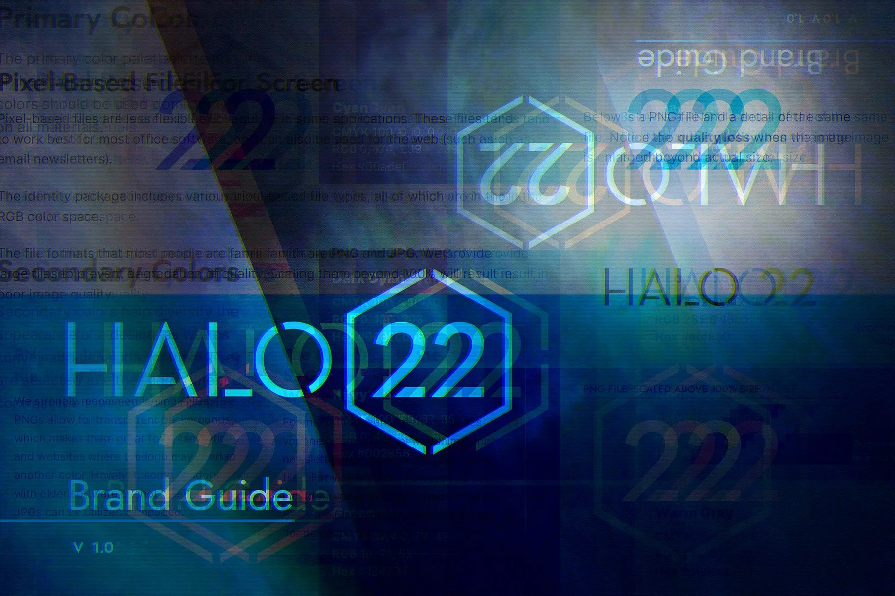
What to Know About Brand Identity Guides
Learn what’s included in our brand guideline documents and why they’re such a valuable investment.

Skate Raleigh ‘Wheel-A-Thon’ Event Branding
Roll through our newest brand work for an upcoming event hosted by Skate Raleigh.

LMG Brand Refresh & Expansion
Lansing Melbourne Group first tasked us with rebranding their existing venture. Their trust, combined with the solid foundation of our design refinements, meant we could swiftly design the identity for their new venture.

454 Grill Identity Refresh
Learn how we transformed a local food truck’s brand into something bolder, more practical, and more iconic.


Third Friday Durham Brand Refresh
We recently refreshed the brand of one of downtown Durham’s most iconic events: Third Friday Durham—hosted by Downtown Durham, Inc.

Downtown Durham, Inc. Brand Refresh
With more than a decade of working together, we were excited to dig into DDI’s brand identity and craft a new kit for them—and downtown Durham.

Fluvial Solutions Brand Refresh
Ever wonder what it’s like to revisit a brand you did 20 years ago? We found out and now you can too.

eCourts Brand Refresh
This year, it was time for eCourts to get a brand refresh. From the logo, the fonts, and the color palette, we redesigned to reflect changes in technology, partners, and attendees.

Bland Landscaping Brand Extension
Honoring a 45-year-old brand while bringing it into the 21st century.

NC-PAL Identity Refresh
After six years of tremendous expansion beyond the original scope, it was time to revisit the NC-PAL identity to ensure it supports all the work they’ll be doing.

Conlon Family Skatepark Identity
Check out our work on this quick ship identity for downtown Raleigh’s first skatepark.

CTC Brand Refresh
We leverage what we've learned over the years, sweating the details to bring about an intentional update to the branding of the world's largest court technology conference.

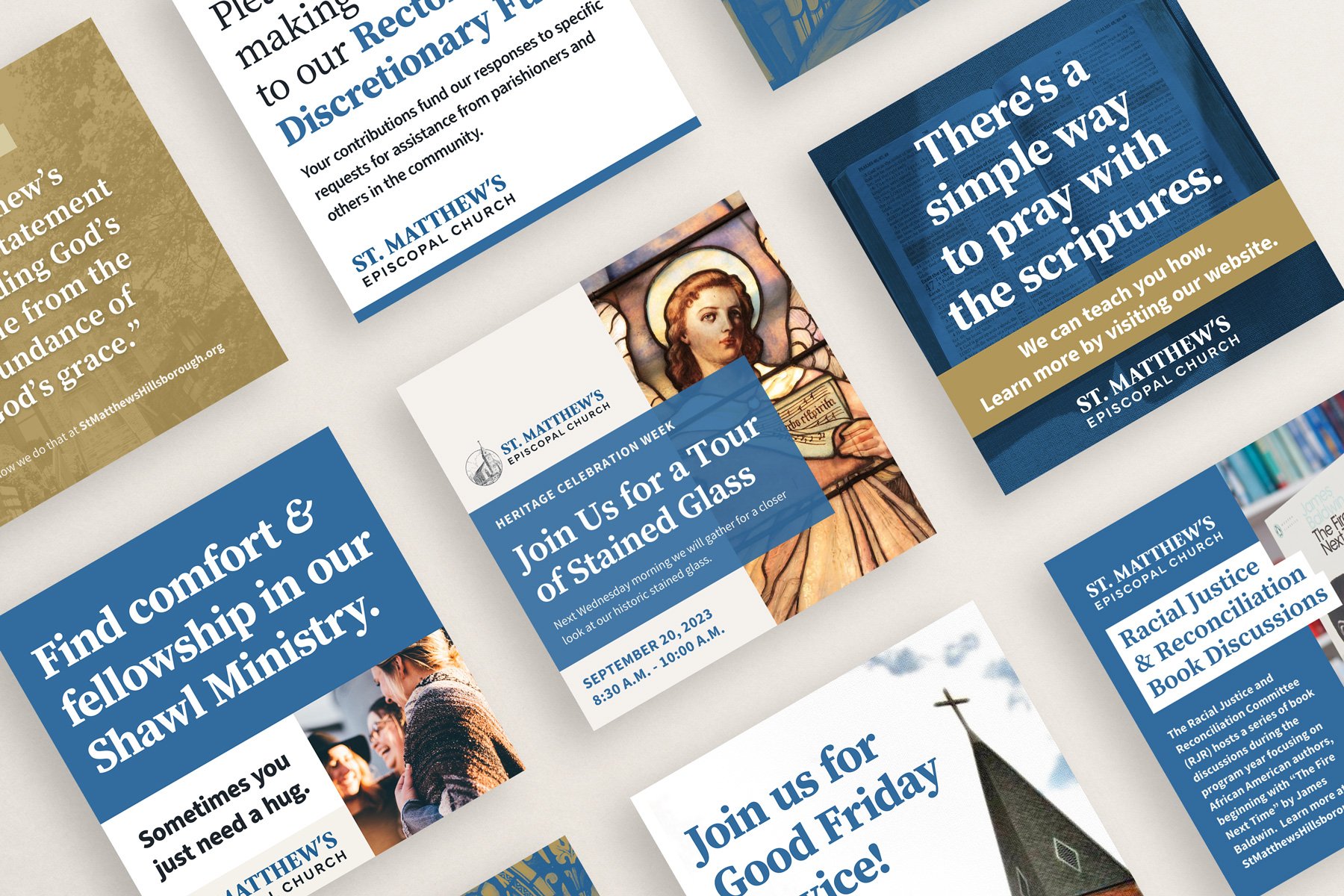
St. Matthew’s Brand Refresh and Website Redesign
When you think “brand,” you probably don’t think of churches. Yet, even a church can benefit from good branding—especially as you embark on building a cohesive online presence.

The Bullpen: Downtown Durham Social District Identity
When the NC House and Senate passed a bill in September 2021 allowing social districts in the state, cities across North Carolina got to work setting theirs up. Downtown Durham’s plans were already in progress when they approached us to name, brand, and create materials for the social district.

Skate Raleigh
Some of our friends in Raleigh are working hard to build a temporary skatepark to activate underused land in a core part of the city. We built a quick ship identity to help them get their feet off the ground.

Downtown Durham Feast
Downtown Durham, Inc. (DDI) approached us with a time-constrained identity, digital, and print project. Their team had just planned a project to help boost sales for downtown restaurants, bars, breweries, coffee shops, etc.—and we only had a week and a half to pull together an eye-catching identity for print and screen.

Atomic Empire Brand Refresh
Atomic Empire’s foundational branding was first developed in late 2013. As digital media became more prominent and responsive designs far more necessary, they realized it was time for a brand refresh.

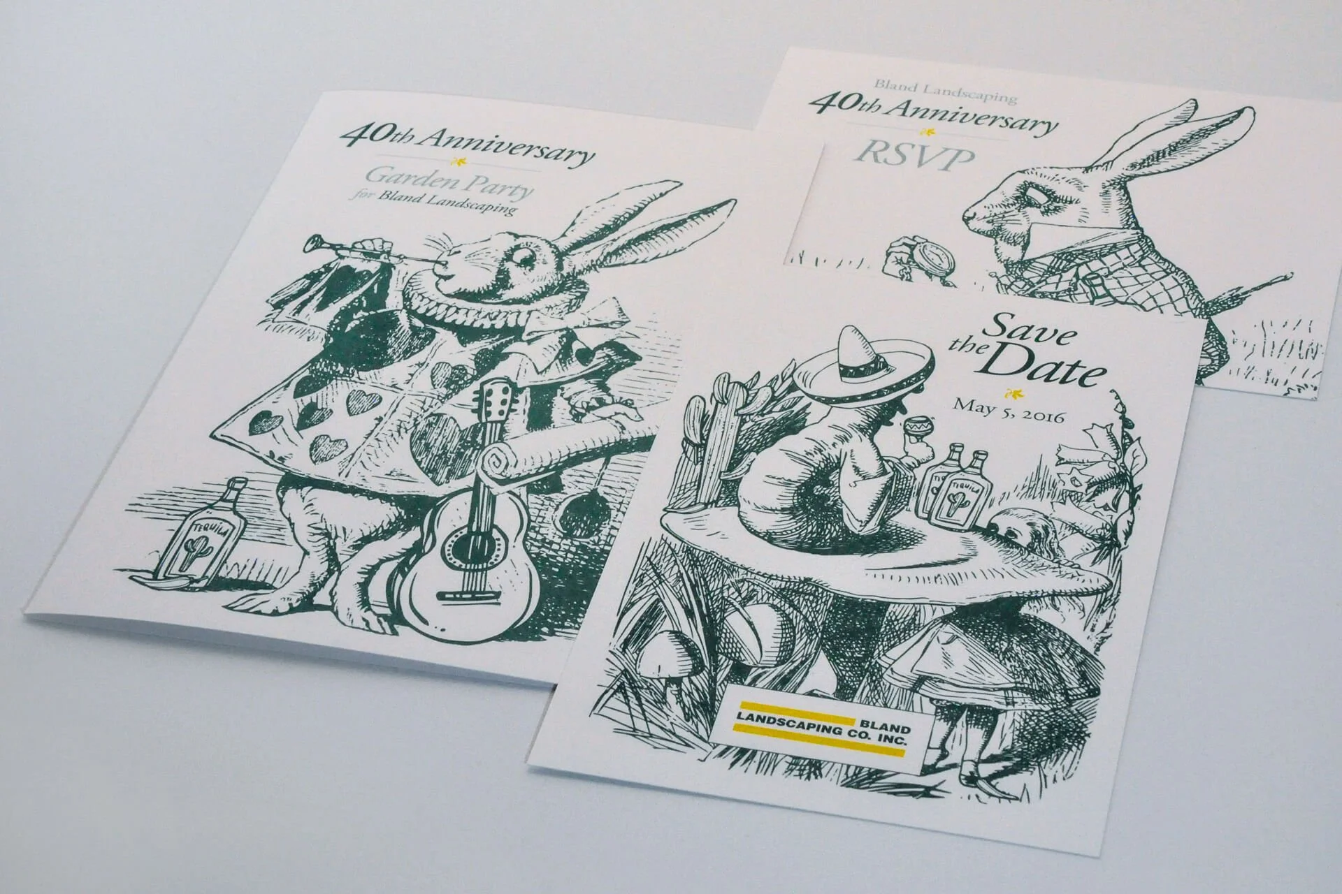
Bland Landscaping’s 40th Anniversary
Looking back at a fun collaborative approach to celebrating 40 years of Bland Landscaping Co.

Reborn U Identity
Pleased with how our team handled their primary brand refresh, Reborn came right back for Reborn U—the new home for their quickly growing collegiate lines. We set to work with a game plan that allowed us to do our homework first and roll right into brand assets.
