The Map Print Materials
Our work with Downtown Durham Inc. goes way back. (We’ve worked on more projects with DDI than we even have posts for!) When they approached us for help developing a quick identity and print pieces for The Map, we were ready to roll.
The Map is a collaborative effort between DDI and Discover Durham that provides a quick reference for visitors and residents trying to navigate the city's heart. It’s a helpful guide that lists merchants ranging from food and beverage to shopping and more. Recently, The Map expanded from print to include an interactive online version, and the new identity would help support the future of both.
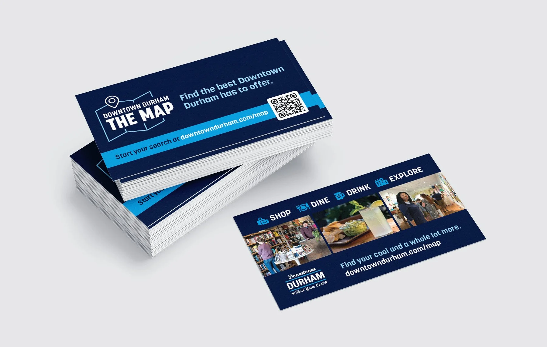
Our crucibles for testing the identity work were a marketing card and The Map’s print cover. Starting with the most straightforward task, we nailed down the look of the business card. This allowed us to confirm that our type and color selections were working as intended.
From there, we moved on to The Map cover art. Using the styles established in the business card design, the cover art came together quickly.
The client also asked us to look at the map side and recommend improvements. We had plenty of suggestions, starting with color. But we also had to remember that The Map district colors were already in use on signage posted downtown, and our adjustments needed to keep some parity with what was already deployed.
The biggest challenge was updating the fonts and layout styles on an InDesign file that had been worked on by several different contributors over the years. We’ll post more on that soon, but we can say that we successfully provided DDI with a much more organized file that’s easier to update. And, while it’s not a complete redesign, it does make it much easier for anyone using the print version to scan lists and find what they’re looking for. Win-win!
Next time you’re in Downtown Durham, get The Map and start exploring.