CTC Website Redesign
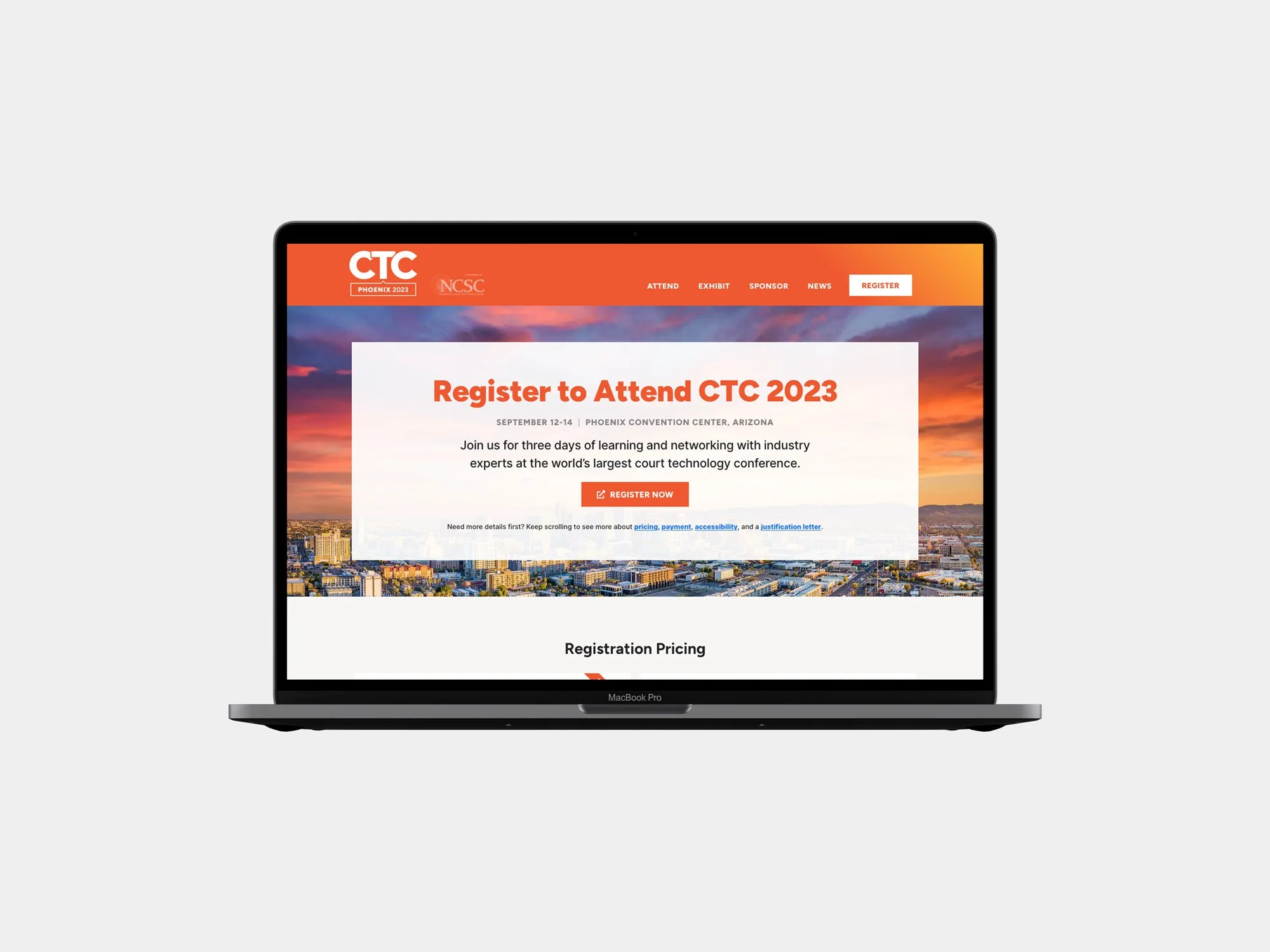
Last year, in addition to a brand refresh for the Court Technology Conference (CTC), we redesigned the website.
Beyond deploying that new branding, we also pressed to improve the functionality and messaging of the site through the entire conference cycle for the National Center for State Courts (NCSC). The site’s fundamental structure was solid, but as the needs of the conference and its audience changed, the website also needed to evolve.
Brand
The bolder colors of the brand refresh allowed us to bring a more energetic look and feel to the website. This included a push to increase the use of gradients where possible. While the plan is to update colors based on the conference’s location, we intend to keep that energy level high.
As part of the refresh, we simplified the home page content for a tighter, more typographical focus on calls to action.
Finally, we introduced just a bit of animation. We were determined to maintain the overall performance, but animation as a bit of polish makes a lot of sense for a tech conference.
Functionality and Messaging
A conference has very distinct audiences that need to do specific things. We re-examined those and looked to make it easier for each audience to find their information and complete a task, whether registering, becoming a sponsor, or finding out about hotels and fun things to do while in town.
A huge attendee draw for CTS is the education program. Featuring speakers and their presentations in a more active way helped bring more attention to the education tracks. Also, to make attending easier, we reworked the “who should attend” information to help potential attendees identify and justify going.
Information for exhibitors and sponsors was given a similar treatment, and explainers for what’s included in the base exhibitor and sponsor packages and current availability were laid out.
Sponsor add-ons are a fast mover for CTC—so clearly showing available and sold-out options makes it easier (and faster) for prospective sponsors to decide.
The resulting website transitioned fluidly throughout the conference cycle, and we can’t wait to see how this site works for CTC 2025.
Team
David Spratte, Creative Director
Emily Combs, Lead Designer
Jennifer Bedell, Project Manager and Back-End Developer


