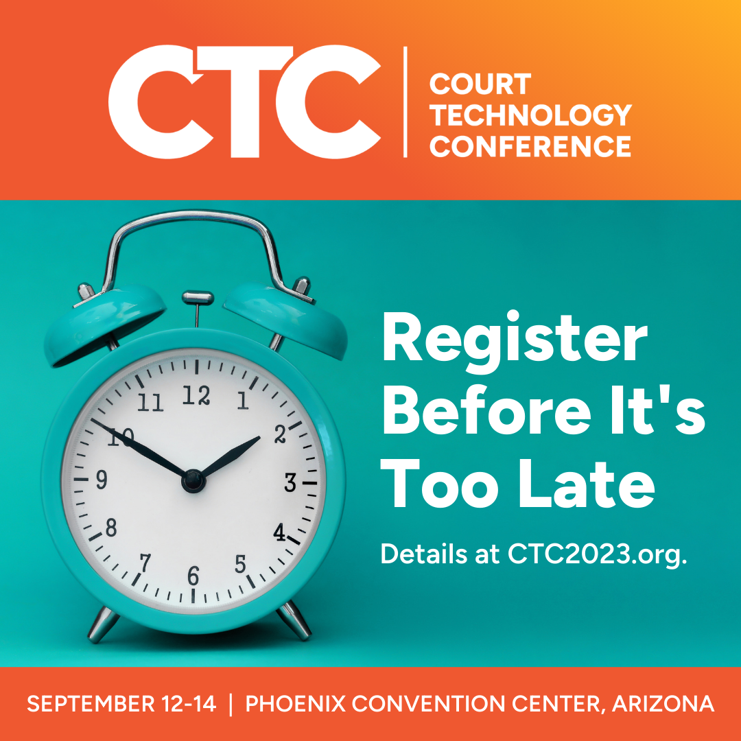
CTC Brand Refresh

TL;DR? Here’s a quick glimpse at how the new branding packs a punch.
One of the great things about having lasting relationships with clients is that you get to be part of their evolution.
A great example of this is our work for NCSC’s conferences, which spans over a decade, beginning with their premier conference: the Court Technology Conference (CTC). Over the years, we’ve moved from helping with simple ads to running several months-long campaigns to drive registrations and sponsorships.
Part of that work entails managing the branding. For this year’s conference, it was time to refresh the look and feel.
Background
First, a bit about CTC: It’s the world’s largest court technology conference. CTC features an enormous exhibit hall, general sessions, and multi-track break-out sessions—plus it’s held in a new location every other year.
The HALO 22 team had first lightly refreshed CTC for the 2013 conference—simply refining the typography and preparing a new, location-based icon. In 2015, we reworked it more thoroughly. We leaned into the tech aspect of that with a clean and crisp logo that called back to messaging to highlight the location and year of the conference. Icons were no longer necessary—which would help standardize across years. Each year following, we could update the color palette based on location. This change made brand deployment easier.
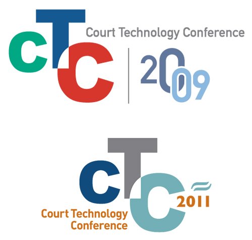
Prior to our CTC branding in 2013, CTC relied on lockups that were challenging to update and deploy.

We were tasked with adjusting the typographic layout and updating the icon and colors in 2013.
In 2015, we shifted the look of the brand dramatically.
It was a durable logo, but it was ready to be refreshed after eight years. Technology moves fast, and this refresh might have been overdue. We’d made some minor updates along the way, but even after adjusting the collateral fonts in 2019, we were due for a more thorough look at the identity kit.
The brand needs to walk the line between state court systems and cutting-edge technology.
2023 Refresh
What did this refresh need to accomplish? Here’s what we wanted to address.
We relied on outdated web fonts, which is a big deal if your focus is technology. The CTC audience has grown bigger than ever, and we needed to ensure they appealed to younger audiences new to working in the courts.
With more team members coming on board to help with conference promotion, we needed a more robust brand guide to highlight photography goals and brand usage as their digital advertising plan expanded.
2023 was also their first entirely in-person conference since the COVID-19 pandemic, which meant the conference needed to be the big comeback.
Collateral Fonts
Let’s be clear: If you’re dealing with stuff online or in print, the fonts you choose to work in are a huge factor in determining the look and feel of your brand.
We presented three collateral font families to kick things off. We quickly winnowed those down to a select with the Center team.

Above, samples from the collateral type in 2015 and 2019 give context for how far we’ve come with collateral font styles in 2023.
Below, samples from our CTC brand update presentation that led to the final select.
Figtree + Inter
Paralucent + Archivo
Articulat CF + Indivisible

A page from the updated CTC brand guide showing the new collateral fonts: Figtree for headings, Inter for paragraphs.
Color Palette
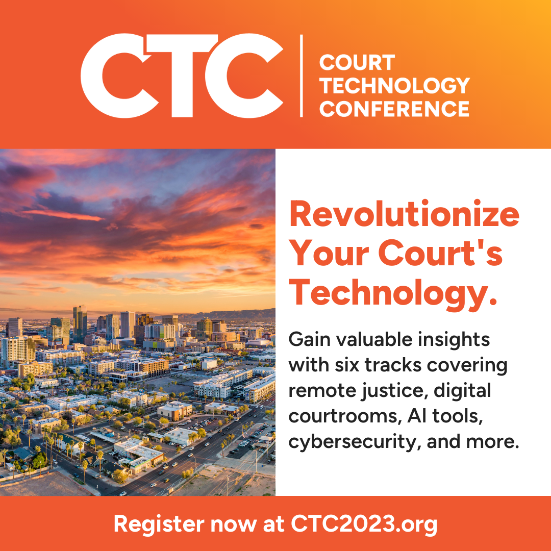
While keeping with the standardization of the location and year in the logo, we knew we’d want to lean on color to refresh the look for each conference and tie it back to the city we’d be in. We steered toward the vibrant end of the spectrum to bring energy to the entire look and feel and planned to lean into gradients from the start. Primary and secondary colors are built out every year, and in previous years the palette had been quite small. As CTC grew, we found that we were also in need of a more robust palette with options we could deploy for specific purposes.

A sample color palette from a past CTC.
In 2023, we’ve added guidance on how and where colors should be deployed. These notes help us—and NCSC’s team—make sure we deploy brand colors with intent and consistency, whether we’re working online or in print.


The Logo (Kit)
Along with leaning into more vibrant colors, we wanted to push the logo to be a bit bolder. Making the acronym letter thicker achieved that and made it more readable at smaller sizes. Also, in the name of readability at small sizes, we switched up the font and increased the size of the location and year in the lockup.
The original rounded corners looked soft and dated to trends of the mid-2010s when we first developed the look, so we squared off the corners on all outlines.
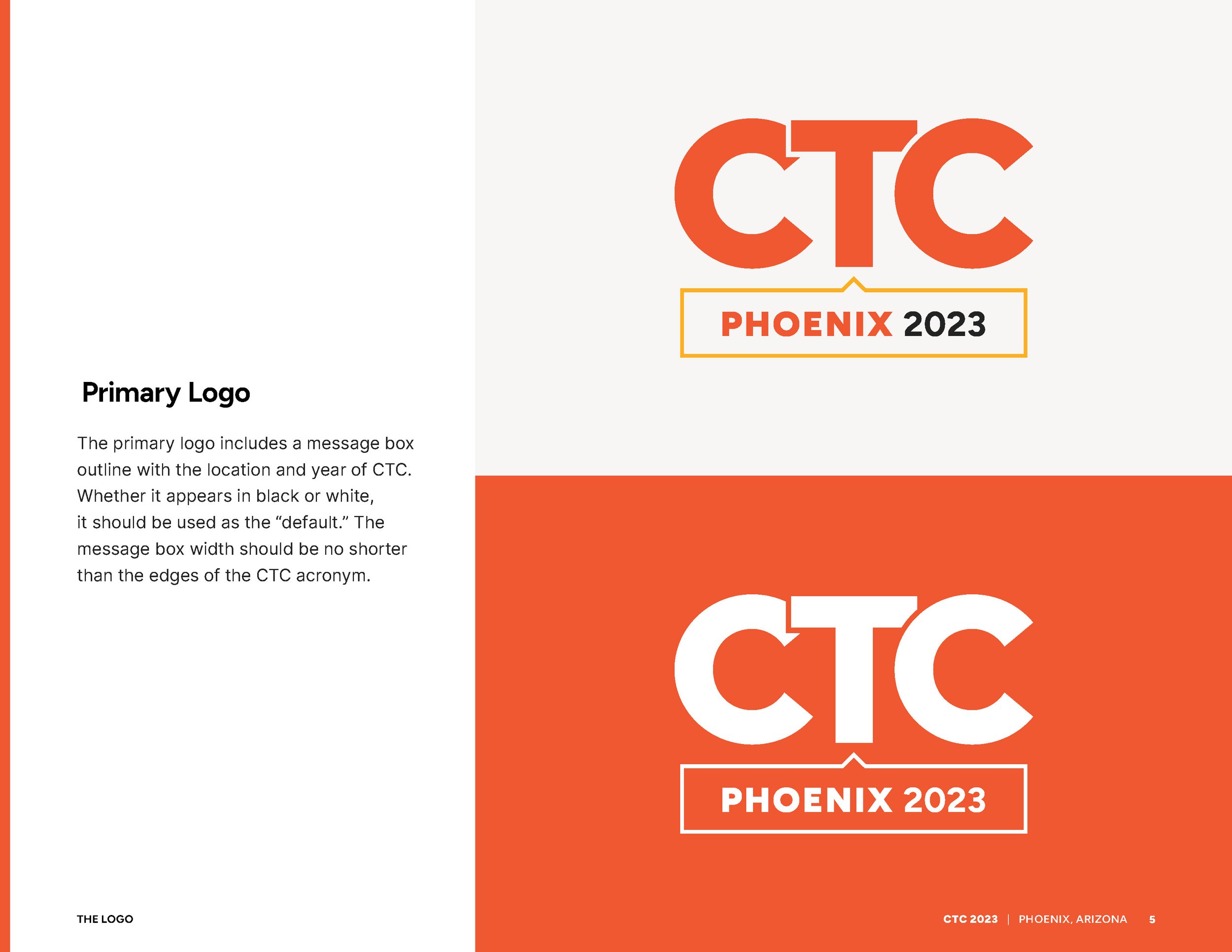
Being more sophisticated about identity deployment extended to the logo itself. Instead of shoehorning the one logo into every need, we developed a roster of alternates that we could rely on in outlier situations.

That’s a Wrap
After thoroughly testing the new brand kit, we got to work deploying it for both the marketing campaign and on-site materials. It worked out phenomenally well across all kinds of media, from the website to the range of display materials at the conference proper. It made for a bolder, sharper look for CTC—one that received rave reviews from speakers using our branded social graphics advertising their presentations, as well as our new deck templates. Audiences benefited from the improved presentation styles and more readable signage—and got to enjoy a vibrant, photo-worthy environment.
We’ve come a long way and look forward to developing the palette strategy unique to the next CTC in 2025.
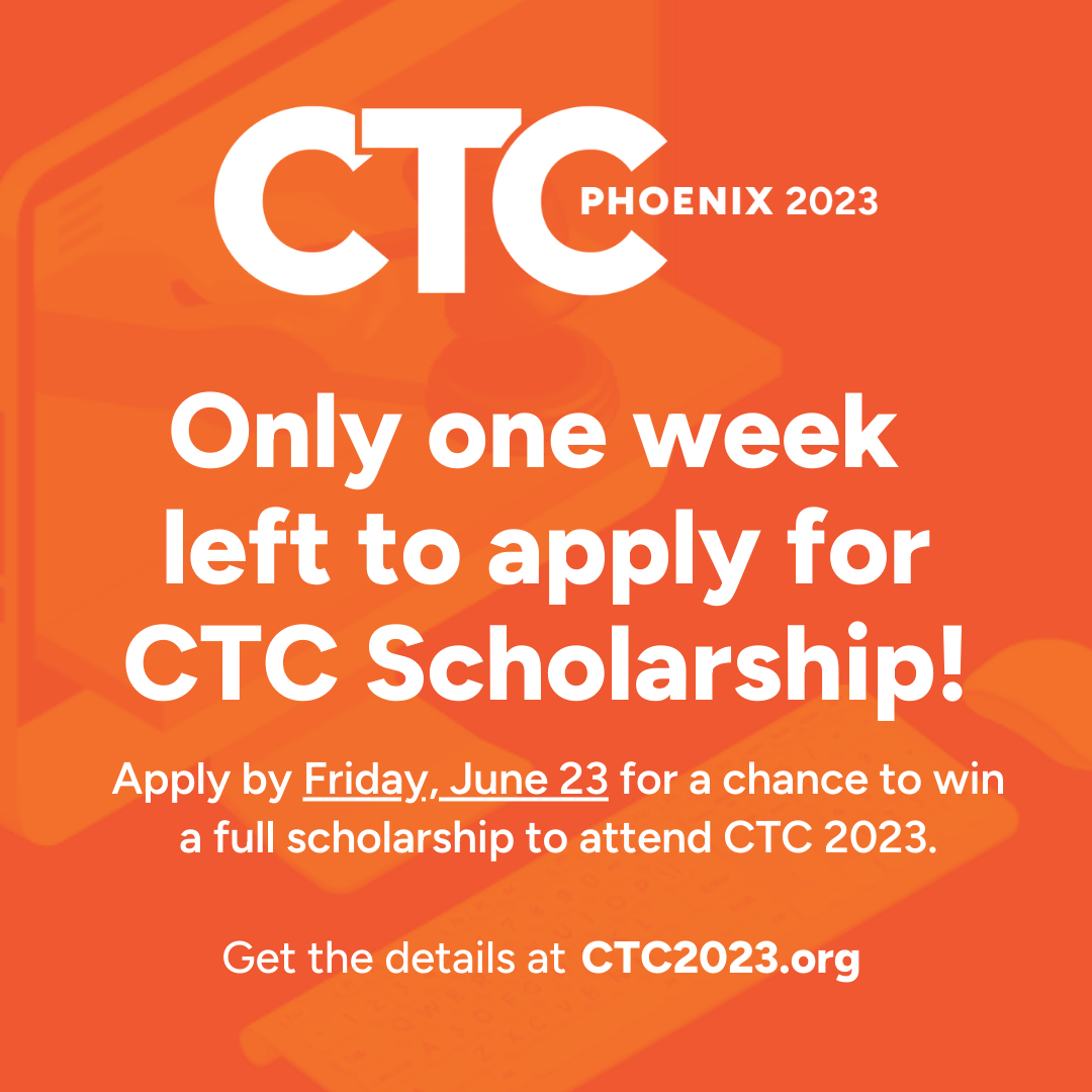
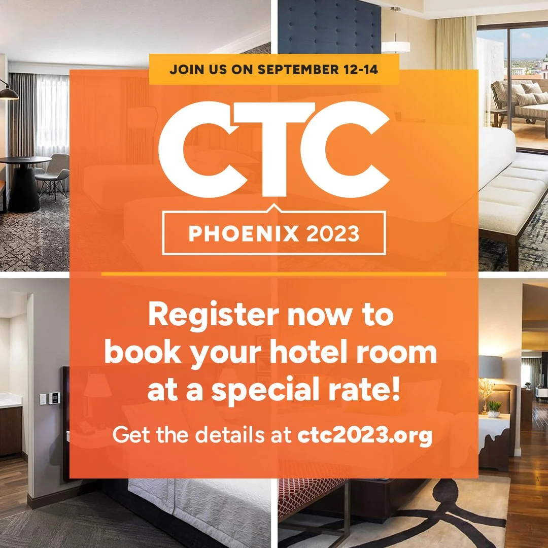
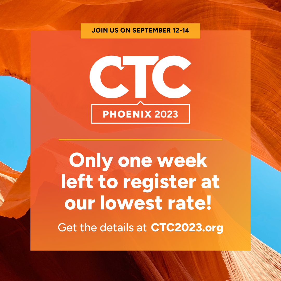
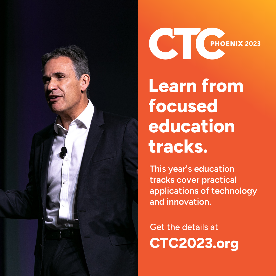
Above, samples of social media posts with the new branding applied.


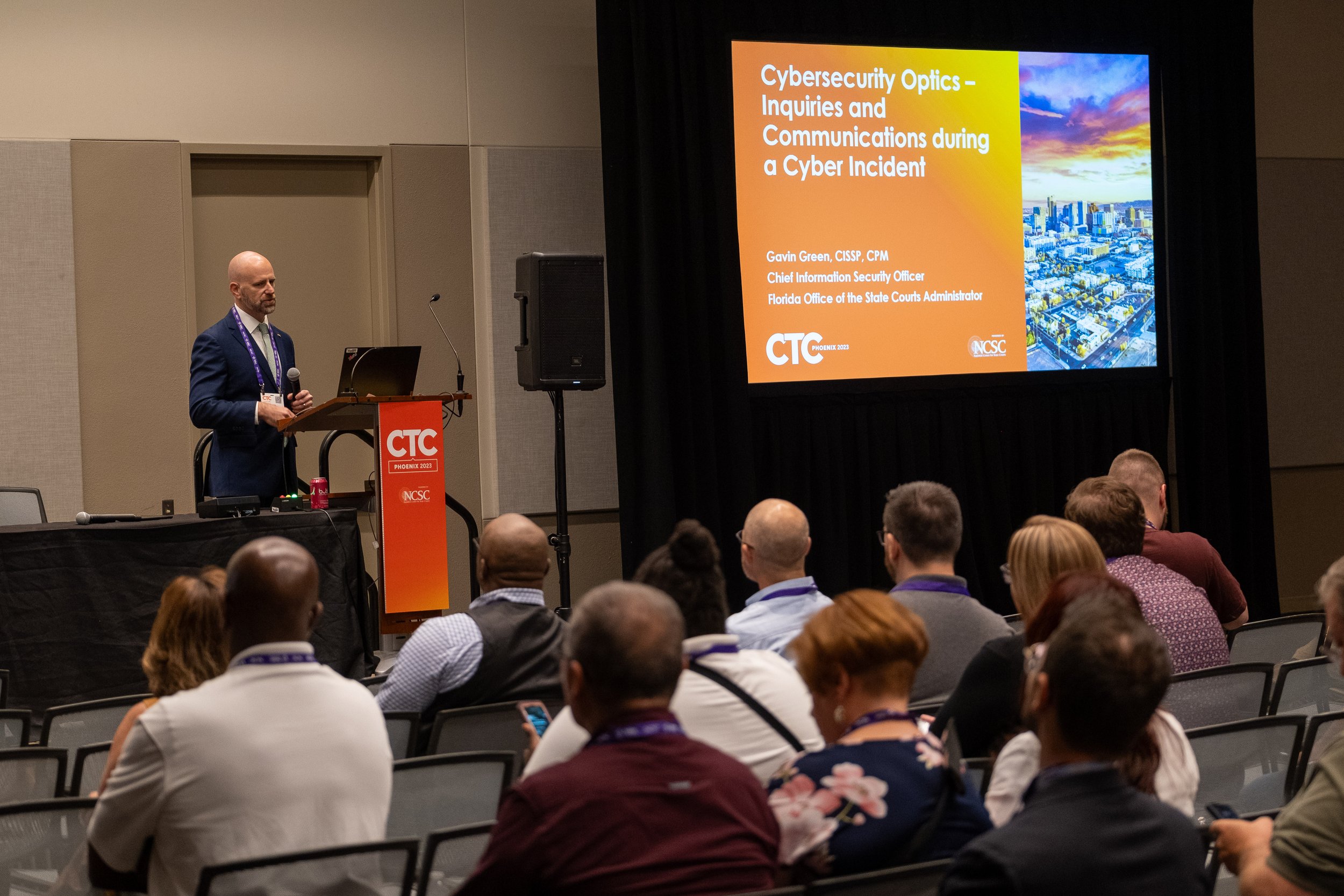


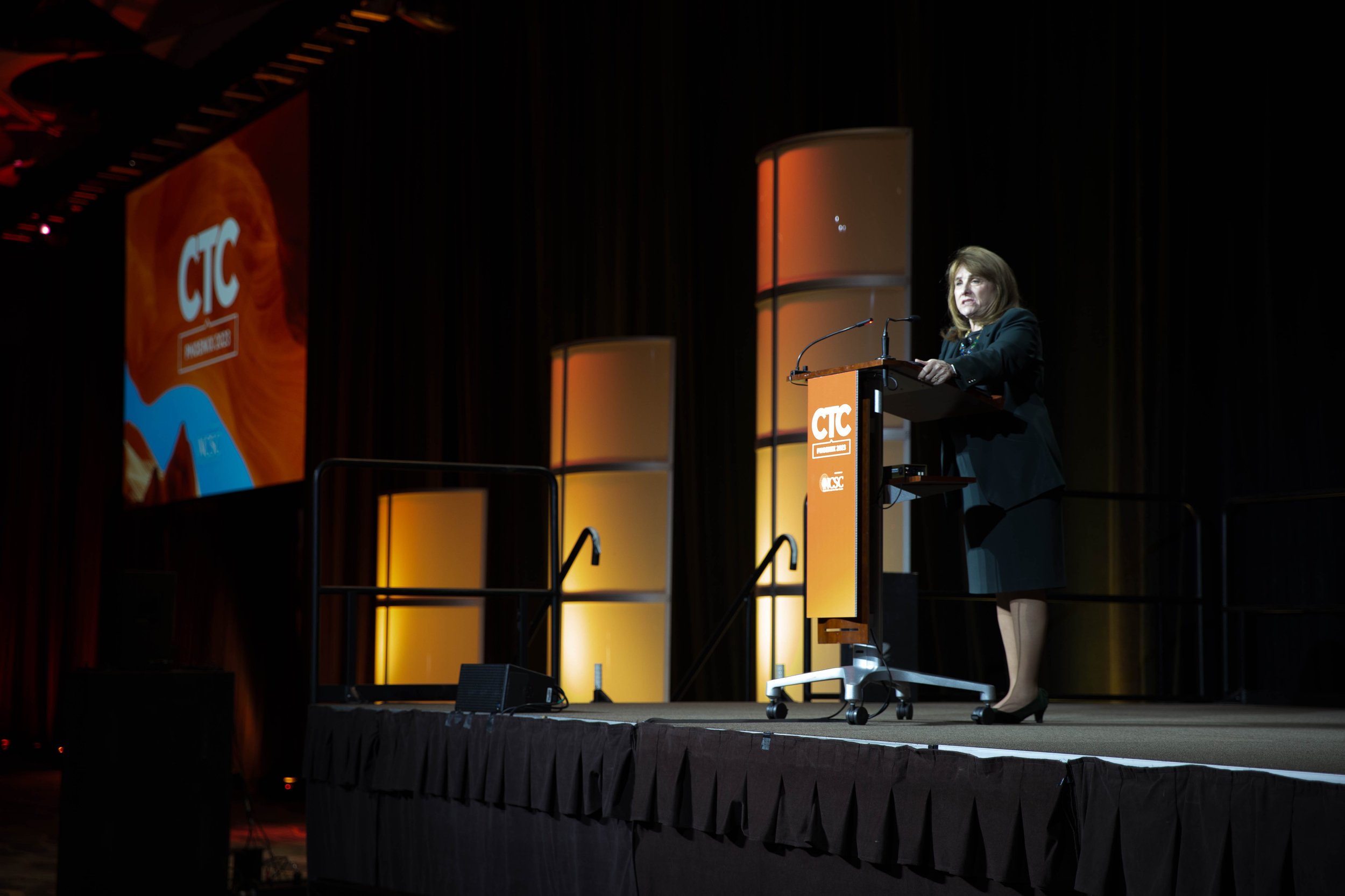
Photography selects from CTC 2023 show how the new branding stood out in presentations and in print by adding legibility and a pop of color that’s impossible to miss in such a large space.
A Strong Body of Work
Our work with NCSC goes beyond CTC, including their other conference, eCourts. We also design their annual State of State Courts presentations, strategic plan booklets—and more. Check out the Center work we’ve shared on our site.
Team
David Spratte, Creative Director
Emily Combs, Lead Designer