Downtown Durham, Inc. Brand Refresh
Our team has a nearly 13-year working history with Downtown Durham, Inc. (DDI), and we’ve developed a great deal of trust with their marketing department over those years. From branding their initiatives to producing annual meeting pieces, we’ve created successful work together—more than we’ve even had time to add to our site. With all this history, we were delighted when DDI approached us for one of their biggest projects to date: A brand refresh.
They were ready for an entirely new visual identity to represent their work for an ever-changing downtown Durham, NC. The new brand identity needed to reflect their efforts to welcome visitors, provide resources for residents and workers, and support businesses, organizations, and the arts and culture of downtown. Finally, the new identity would need to be modular and responsive to work in various layouts, both print and online. It was no small undertaking, so we needed to learn more before we could get started on design.
Kicking Off with Research
At HALO 22, we research before we even start sketching ideas. No matter the budget, research is a crucial step in any rebranding process. Our work during this step informs decisions we make throughout the project.
We begin the research phase by looking at the existing branding and getting client input. We sent surveys to the team, asking them to define what aspects have been the most successful about the brand and what’s clearly not working anymore. We also created a quick style tile of DDI’s existing branding—from logos to color palette and marketing materials—and compared it to style tiles of other brands they viewed as successful. We then discussed how the brand needed to exist within its landscape, where it needed to stand out, and ranked their audiences by priority level. These conversations gave us the information we needed to form a path for our designs.
A decade can make a marked difference on any city. DDI’s existing brand had served them well since 2014, but it no longer accurately represented today’s downtown.
Digging into Design
The key takeaway from our research was that the new identity needed to show off Downtown’s vibrancy while maintaining its look of professionalism for business and municipal audiences. Our design phase begins with lots of testing in preparation for the new logo.
Logotype
We tested a variety of typography options that ranged in styles from serif to sans serif, and narrowed it down to three selects. Ultimately, the option DDI chose was the one that best matched their goals—a bold yet friendly sans-serif set in a mix of cases. We came up with three layouts: a version including “Inc.” to use when referring to the organization and the business side of their work; a version without “Inc.” to use for general downtown marketing; and an abbreviated version to use on social media avatars—and to add a memorably iconic form of visual diversity to the general downtown marketing items.
Collateral Typography
Based on the type styles set by our logo options, we developed collateral typography to coordinate with the new look. The final logo pick led us to Schibsted Grotesk, a modern, fun, sans-serif typeface. Another benefit to this choice is that it’s available via Google Fonts, making it easy to find and budget-friendly.
A page from the new DDI brand guide illustrating the preferred collateral typography.
We also defined backup fonts for when the preferred font is unavailable, such as email marketing. With that done, we were ready to get into color.
Color Palette
Color palette development was no different: We started by testing out the options internally, narrowed it down to three, and met with the DDI team to talk through the ways each palette might help them better meet their marketing goals. We bring mockups into this part of the discussion so it’s easier for the client to envision how these styles might exist outside of the vacuum of a brand guide.
Pages from the new DDI brand guide illustrating the breadth of the final color palette. This many secondaries means DDI has a wealth of design options for future materials—and they’re covered for practical needs on the website, such as links, error messages, alert banners, and more.
Mockups help illustrate how the brand plays out on marketing materials.
DDI ultimately agreed on a palette leading with a punchy purple, toned down with a deep navy blue. Like their goals, it’s a mix of fun and professional. From there, we were able to export their vibrant new logo kit.
DDI’s initiatives will use the logo combined with a divider line and the initiative name. It’s a great way to quickly brand something new without losing the DDI tie-in.
Initiative Logo Lockups
Part of the challenge in creating the new brand was keeping in mind how they’d be using the logos alongside initiative names for a consistent brand look. We created a template that would allow them to make these new initiative logo lockups quickly and in-house. One of our first real crucibles for this was in developing materials for their holiday tree lighting, an event they hold close to the end of every year. The abbreviated logo form worked well in social media and print designs.
The Results
The new branding has certainly been a hit internally amongst DDI’s team—they’ve already started rolling out the new styles on their website and marketing materials. We’re excited to see where they take it from here and to learn how it’s received more broadly downtown.
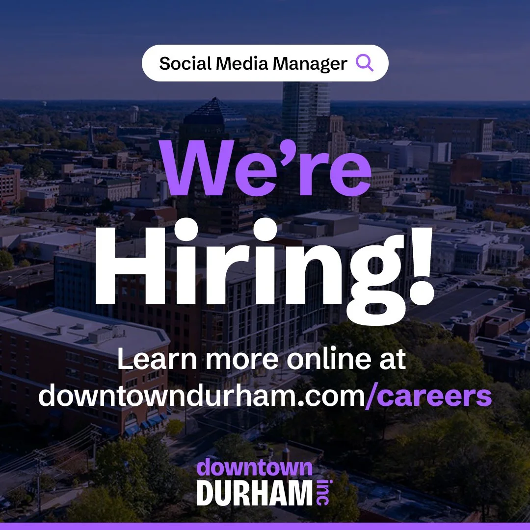
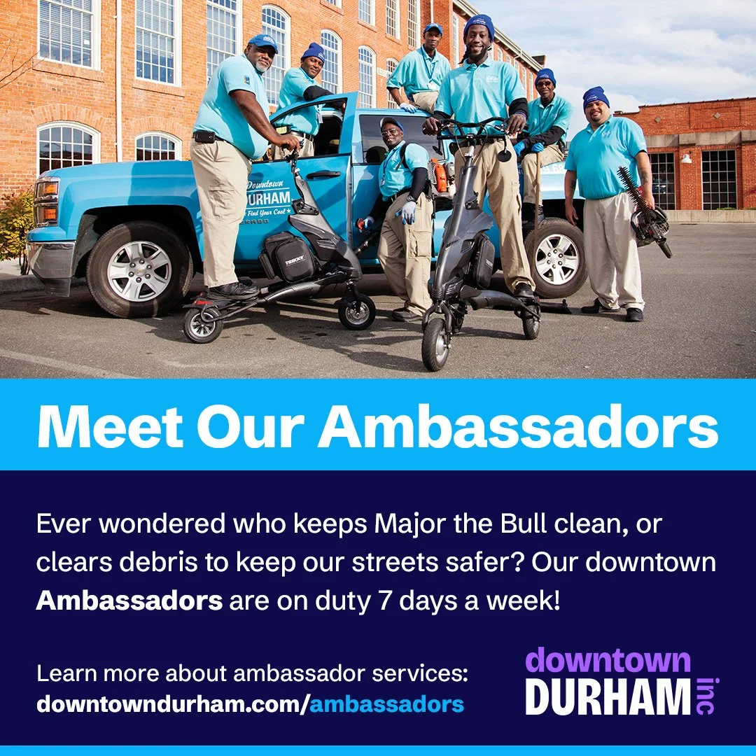
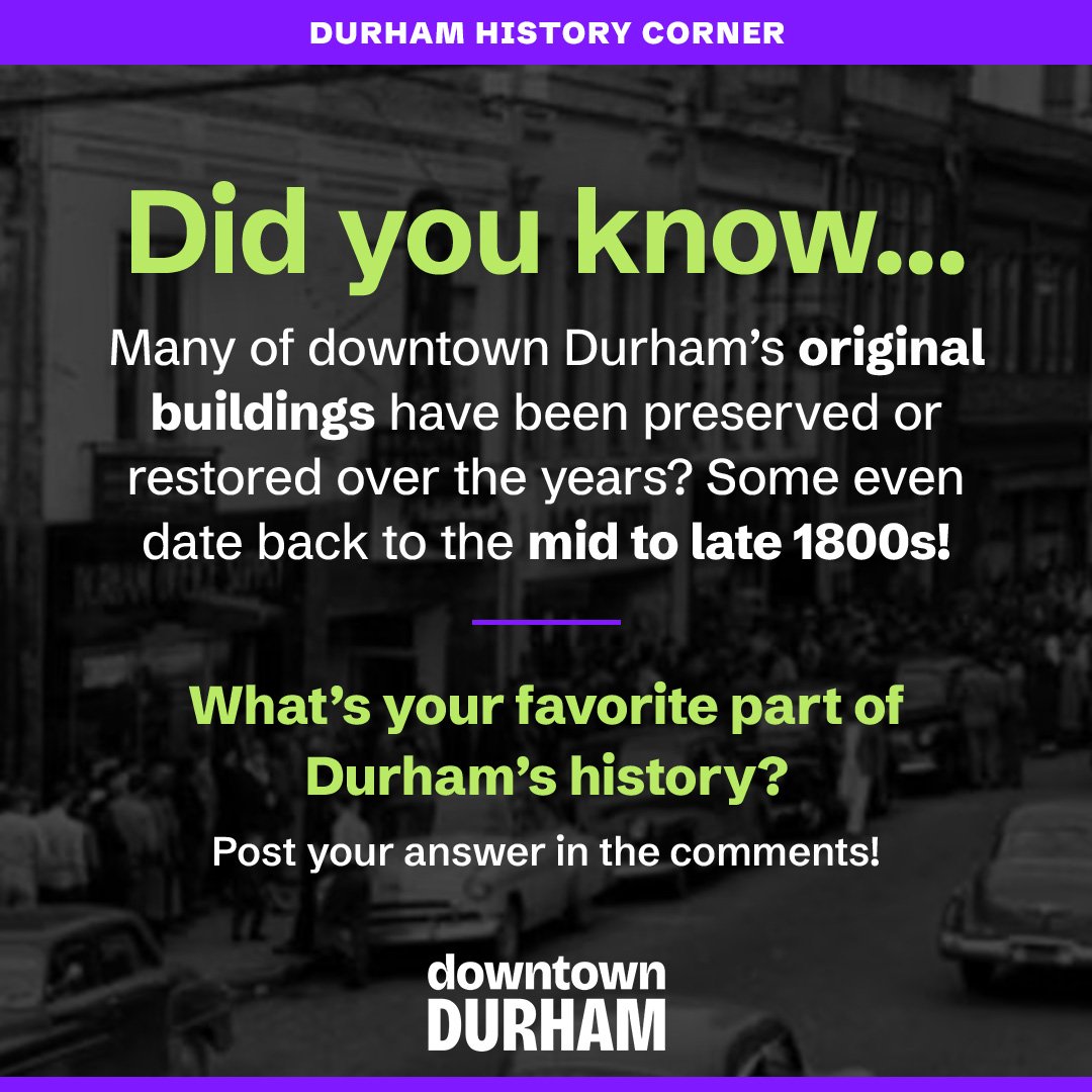
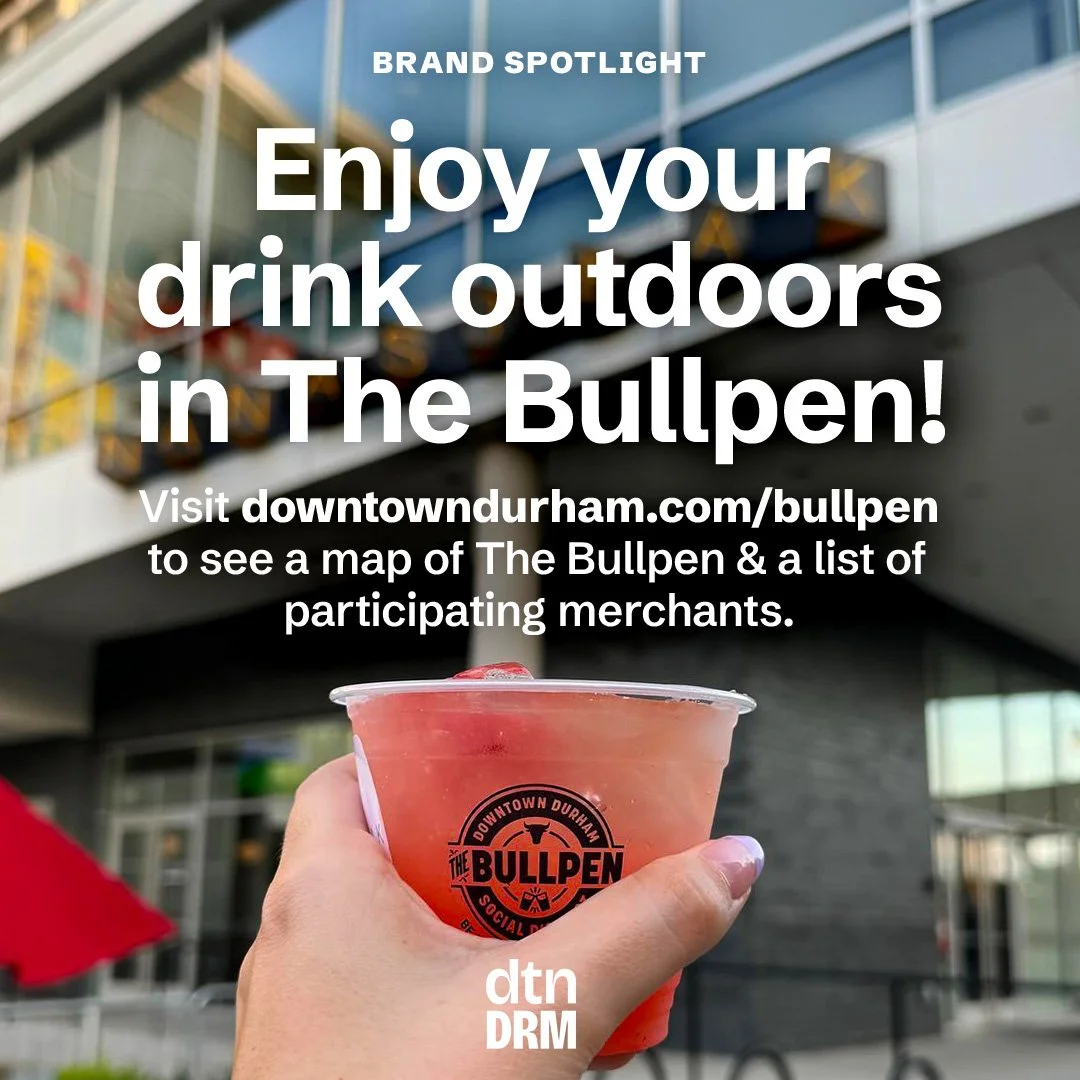
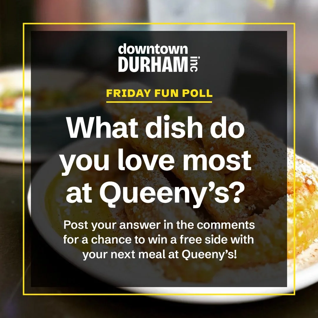
Above, mockups of how the brand could work across print items. Below, social media post layouts to show how flexible the new brand can be online.


![Option 1 - [US-Size] Business Card Mockup Purple.jpg](https://images.squarespace-cdn.com/content/v1/6092f854221c6843eb07e798/1731013502666-5U6C5846ZD9REVQDBW84/Option+1+-+%5BUS-Size%5D+Business+Card+Mockup+Purple.jpg)


