An Introduction to Site Frames
A site frame is the persistent structure that appears on every page of a website—the parts that stay put while the content changes beneath them. On most sites, the frame has two components: a header at the top and a footer at the bottom.
Both components can house navigation: The links and other elements that guide users through the site. Navigation is a content linking system, and it can take many visual forms—text links, buttons, icons, or yes, tabs. Whatever it looks like on the surface, the underlying purpose is the same.
Header and footer navigation often differ from each other in scope and emphasis, but both should remain consistent across every page.
The Header
There are two required elements for a website header: Branding and navigation—bonus points if you include a call-to-action. We’ll use the HALO 22 website to demonstrate how site frames are typically constructed.
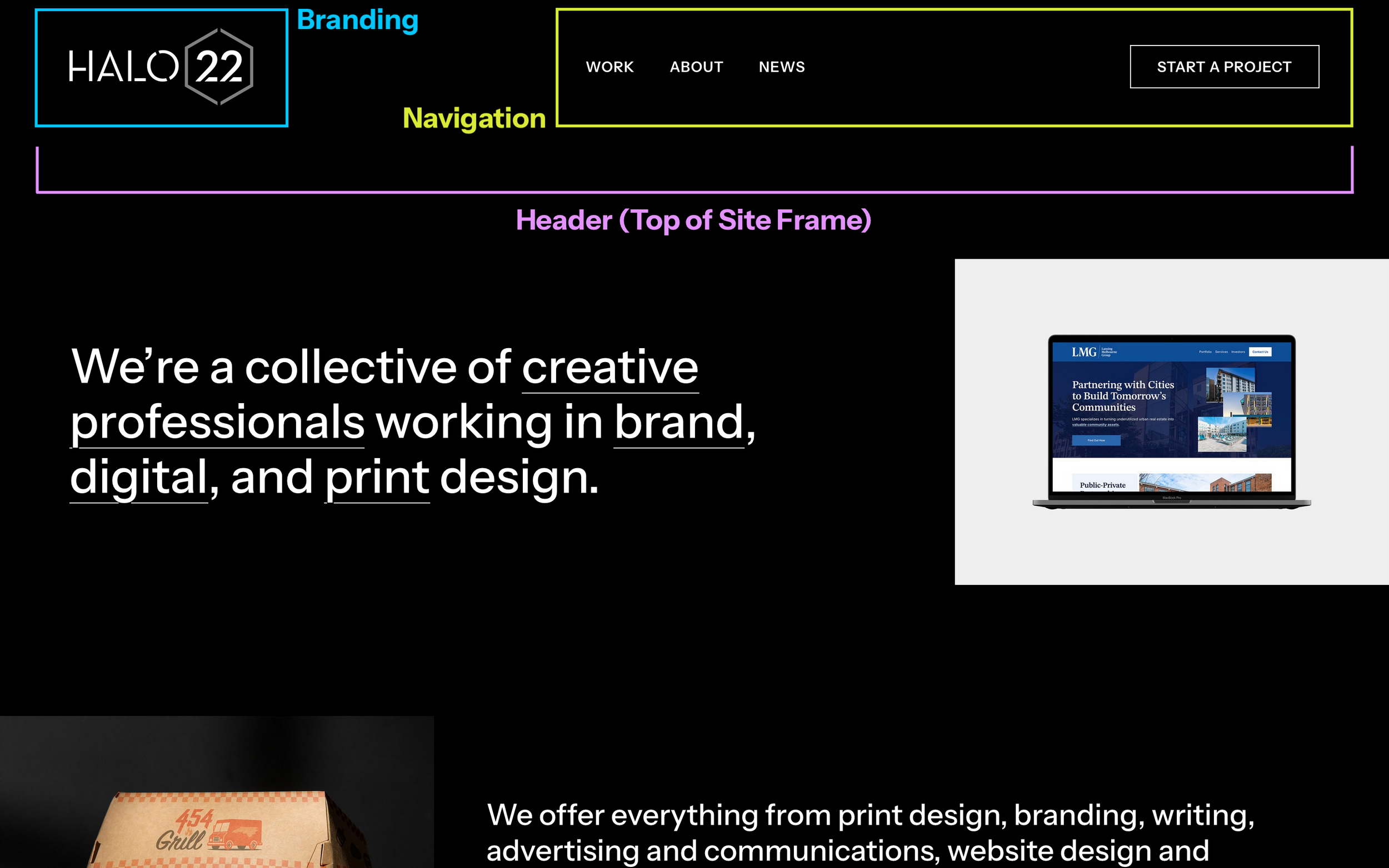
The HALO 22 header.
In the HALO 22 header, we establish our branding on the left with the logo. The logo becomes an implied part of the navigation by linking users to the homepage, which is a conventional method of streamlining navigation overall.
On the right is our main navigation menu followed by a call to action. If you’re curious about strategy for which links to include in your navigation, we cover that briefly in this article—and in an article about Information Architecture, as well.
A Word of Caution on Dropdowns and Mega Menus
Broadly, our recommendation is to focus the header content and navigation on just a few key items. Dropdowns and mega menus are potential options if your site runs deep—but not every site needs them. As Stanford University IT notes, they can even be a detriment if they’re overloading users with too many choices. You don’t have much time to gain traction with users before their attention span breaks. It’s all about creating intentional pathways that make site navigation as easy as possible, and making sure the user interface design styles support that functionality. Deciding whether or not to expand your navigation is a complex decision, so reach out if you’d like to schedule a consultation.
Alternatives to Deep Navigation Menus
Don’t forget that you can (and should) link to other areas of the site within your page content! For example, the H22 site header links to all our Work, and the Work page uses targeted content to direct users to the type of work they’re most interested in seeing. In doing this, we’re not only simplifying the header navigation, but also making sure users have the opportunity to see the breadth of our capabilities before honing in on one area.
The Footer
Unlike the header, the footer doesn't compete with the page content for immediate attention—users arrive there after they've had a chance to engage. That makes it a natural home for expanded navigation: Additional links that didn't make the cut in the header, organized by topic when the site warrants it.
The HALO 22 footer.
In the HALO 22 footer, we’ve expanded the navigation to include extra links not displayed in the header, like Resources and Contact. Our website design for Bland Landscaping Company is a good example of a more robust footer menu, with more links structured by topic:
Bland Landscaping Co.’s robust footer menu.
Outside of branding and navigation, the footer is the right place for social media links. We understand wanting to put those in the header, but our philosophy is to avoid showing users the door before they’ve had a chance to explore the website and utilize calls to action. Ultimately, social media is supplementary and secondary. The website should provide a more valuable experience for you and the user.
How to Make Use of Empty Space
If you have a footer that’s light on content, consider adding a quick email signup form to make use of the empty space with a practical approach. Our design for the Roger Canaff website for example:
Roger Canaff’s concise footer menu with email signup.
Roger’s link menus are brief. An email signup block seemed like a great way to make it easy for users to find a way to subscribe no matter what page of the site they’re viewing.
The footer must also house a copyright notice and links to Terms and Conditions, Privacy Policies, or other legal statements if necessary. We have another piece that explains how best to structure your copyright notice, if you need it.
In Summary
Developing an effective site frame is a huge part of reaching your target audience effectively. When in doubt, keep it brief and make sure links to content are clear and intuitive.
Need guidance for your site navigation or information architecture? Reach out to kick off a project with our expert team.