LMG Brand Refresh & Expansion
When your company is successful enough to branch out into a whole new range of services, it’s a good time to evaluate how well the parent brand serves existing business and future goals. Lansing Melbourne Group (LMG) approached us in late 2024 to kick off a brand refresh that would become the launching point for their new, adjacent venture, LMG Capital Advisors (LMG CA).
LMG has decades of experience developing in public-private partnerships, hospitality, and industrial spaces. All of which require them to be both trustworthy and unconventional as they seek to build and support communities throughout the eastern United States.
Research
We started with a brand audit that would help us nail down LMG’s target audiences and discuss what the brand needed to convey to those groups.
In this phase, we like to get into the nitty gritty and discuss pain points faced with the current branding. Details like these help us know what to look for stylistically when we’re further along in the project and keep us on the right track with our design choices.
From there, we reviewed other brands in LMG’s market and talked about what made them successful (or not), and used that conversation as a framework for discussing design strategies that would be a good fit for LMG.
Design
Before: The original logo. Notice how the bottom line of type becomes a scalability issue.
During the audit, we agreed that the existing logo had scalability issues due to the typesetting and ultimately was too busy to be as sophisticated as they wanted. The color palette needed adjustments for modernization—plus a few extra colors for more flexibility in design. The typography also needed refinement and consistency.
Logotype
Figuring out the logotype first sets the brand’s tone in the most straightforward way possible. The number of fonts available to designers has exponentially increased over the years, and selecting the right one is a bigger deal than you might think. It requires lots of trial and error before you even get into layout.
After: The new logo. No more type scalability issues. The kit includes files with just the acronym or just the full name for even smaller layouts.
We landed on IvyPresto from IvyFoundry because it conveys a number of qualities LMG sought to project. Above all, it’s modern with sophistication. First impressions are important, and IvyPresto’s simple elegance shines through in a glance. Logo versions with an acronym and full name are connected with a line that tilts slightly forward, a subtle architectural element that swings in the opposite stylistic direction of the original building clipart—and implies forward-thinking.
Collateral Typography
Everything about the logo is a delicate balance, and so it goes for the collateral fonts. As much as we love IvyPresto in the logo, we found another serif that performed better for long-form content: Stix Two. The added benefit is that it’s free for download via Google Fonts—as is Inter, the paragraph font we chose. While it’s a sans-serif, Inter is its own kind of refined and tasteful. It brings a touch more modernization via its contrast to the more traditional serif heading font. We included alternate recommendations for cases where the preferred fonts may not be available, such as email marketing platforms or office software such as PowerPoint. Having these alternates specified from the beginning of brand development means you’re less likely to find off-brand variations when multiple team members are producing branded materials.
A sample page from the LMG quick brand guide.
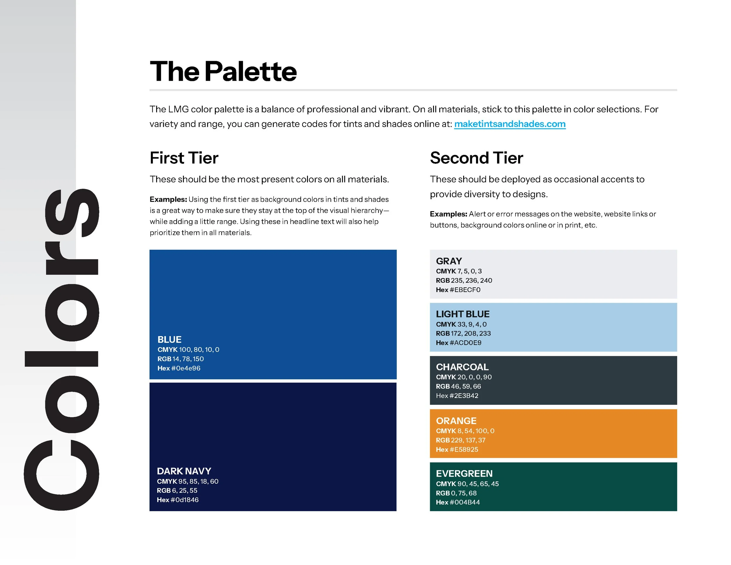
Color Palette
The original color palette only needed a few slight tweaks to make it more visually appealing. We removed the yellow and added saturation to allow the medium blue to feel more modern. The edit contrasts beautifully with an ultra-dark navy, and together, they convey the professional, approachable qualities of LMG.
They also had silvery and dark grays in the original palette, which stayed onboard, but modern applications call for more colors. Websites are where you need more than brand defaults, for example. Websites feature error messages, alert banners, and other elements that must stand out from the primaries to fulfill their function. That, and designs always benefit from a little range. We gave them a bright orange for the ultimate contrast against the primary blues, as well as a lighter blue for more subtle details, and an evergreen that would create parity as we simultaneously developed styles for their newly launched endeavor LMG CA.
Another sample page from the LMG quick brand guide.
Extending the Brand
The new LMG CA logo.
With LMG’s brand kit developed, we built on it to form LMG CA’s visual identity. LMG CA required rebalancing the logo with different wording and pivoting the color palette to shift focus from the blue to evergreen. (Green was a natural color choice for a company focusing on capital management.) As with the logos, the type choices for the collateral remained the same. In just a few simple, targeted shifts, we created a strong visual relationship between brands.
The Results
The LMG team feels confident and excited about their new branding, and they’ve already started using it on new materials. Spoiler alert: We’ve been working on digital LMG projects since the brand work and will post more on those soon.


Have a brand that’s not living up to its potential? Reach out to the team at HALO 22. We offer a range of brand services for almost every budget.