Skate Raleigh ‘Wheel-A-Thon’ Event Branding
Our first non-profit volunteer project of 2025 was helping Skate Raleigh brand their upcoming fundraiser event, Wheel-A-Thon. From skateboarders to rollerskaters and more, Wheel-A-Thon invites teams of skaters to put their wheels on for four hours straight to raise money for better skating opportunities in Raleigh, NC. First, we needed to create approachable and fun event branding that would appeal to their multifaceted audience—and that’s where HALO 22 came in!
Logo
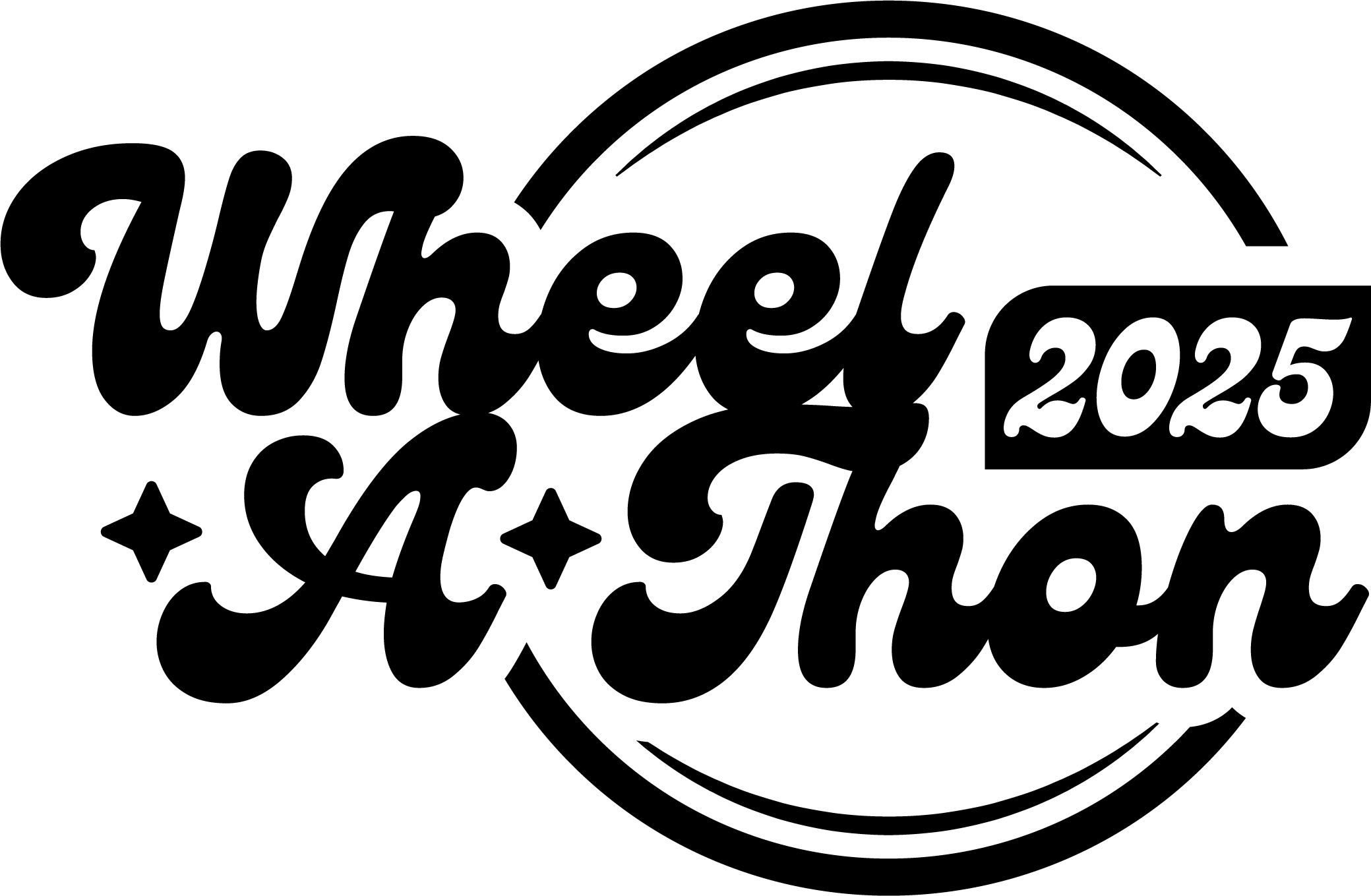
We started with type tests that conveyed different moods and styles, ultimately landing on a chunky, retro script. This typeface worked well in multiple layouts and had just the right combination of friendliness and a sense of motion to fit the event. We created horizontal and stacked versions of the logo for maximum flexibility in layout—and the stacked version includes the bonus of a wheel shape around the type.
Color & Type
While the event gets its own branding, it also needed to connect with the Skate Raleigh identity since they plan to host it annually. So, we selected two greens from the Skate Raleigh color palette to become the event’s primary colors. Together, they create a fun, funky gradient.
When it came down to collateral typeface selection, we figured, why reinvent the wheel? (See what we did there?) Skate Raleigh’s typeface is Poppins, which is flexible and readable. It’s an excellent choice for brand parity and the event.
How It’s Working
We’ve already started to see how the event brand has played out in real spaces, and we’ll be working through more designs soon.
Need help with event branding? Reach out to the team at HALO 22.


