NC-PAL Identity Refresh
When the HALO 22 team built out NC-PAL’s first identity in 2017, things were much simpler. NC-PAL was a psychiatry access line run out of Duke.
The identity served them well, with a minor update in 2019 to accommodate a new perinatal aspect.

Since then, the program has seen tremendous growth, and they recently celebrated five years as a statewide endeavor. Along with the new website we launched last year, we revisited the identity to ensure it was serving all the work they were doing.
A Transitional Opportunity
From the start, the new brand and website launch were tied together. However, the NC-PAL team had a fifth-anniversary celebration planned prior to launch.
Since we always test an identity, using the new work to support an event was too good an opportunity to pass up.
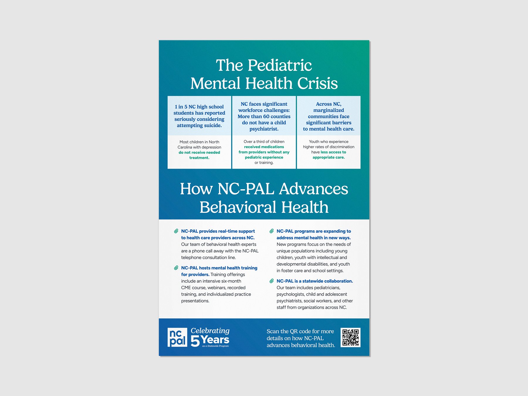
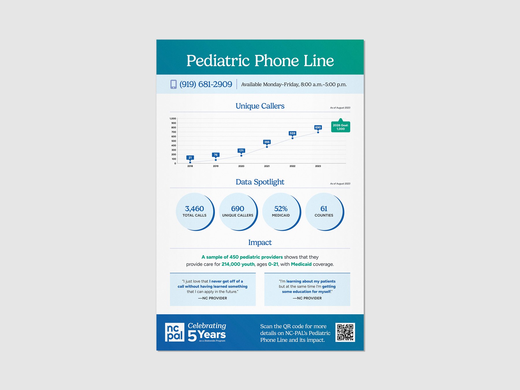
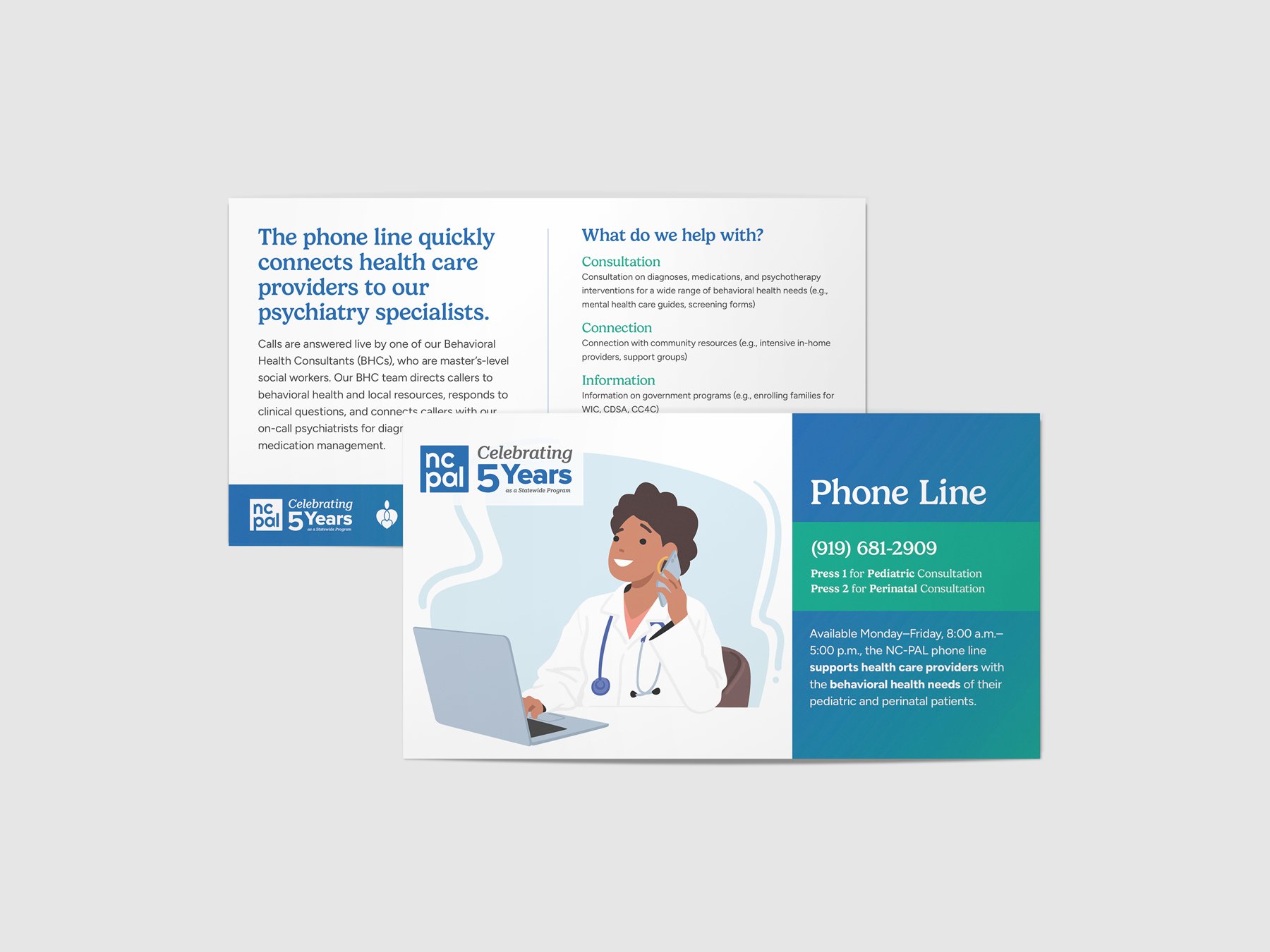
We designed a thorough suite of print and display pieces to support the event. We fully explored the new typography and colors but reserved the new logo package for the site launch.

The collateral worked great, and we took some cues from our work here for the website.
The New Identity
In 2023, NC-PAL was working with many more partners across the entire state. Based on our discovery work, we knew we wanted to shift the tone to be more friendly. As a service speaking to only health care providers, the original identity could be direct and to the point.
As NC-PAL’s scope has expanded, so has its audience. The refreshed identity should be more approachable.
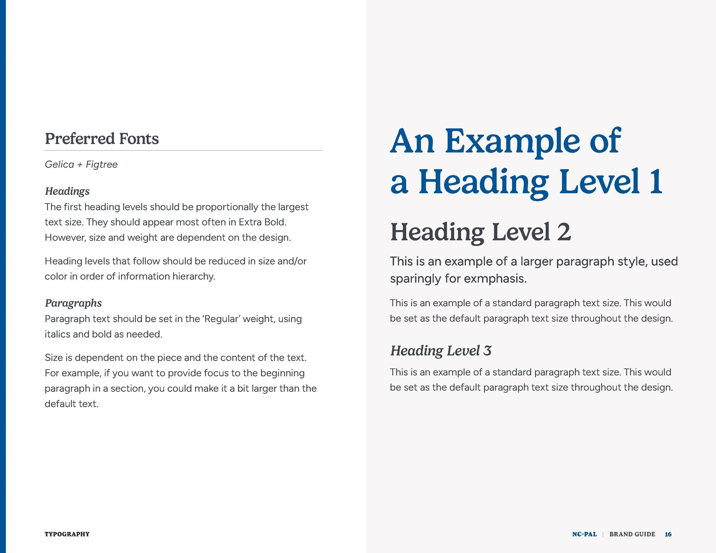
Font Sourcing
When sorting out collateral typography, we were mindful of how easy it would be for the NC-PAL team to access fonts to produce their own print materials like flyers and invitations. We started with Google Fonts—there’s hardly any more extensive and accessible font repository available, but we also made some recommendations from Adobe.
Our new heading select, Gelica, was so much the right choice that NC-PAL simply did a one-time license fee to access the font. Figtree, the select for reading copy, is sourced from Google. They were able to upload the new fonts to their Canva account, making it easy for their team to work on print materials as a group—and stay on brand.
One significant change was switching to a serif display face and a sans-serif reading face. This change played a big part in making the organization approachable.
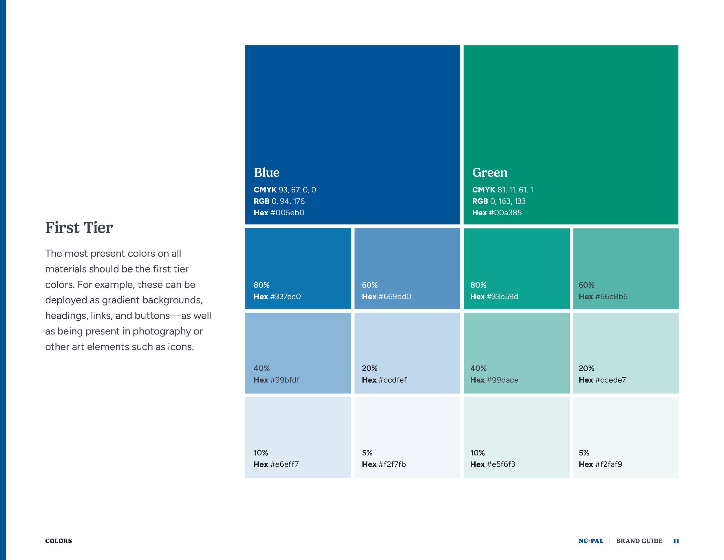
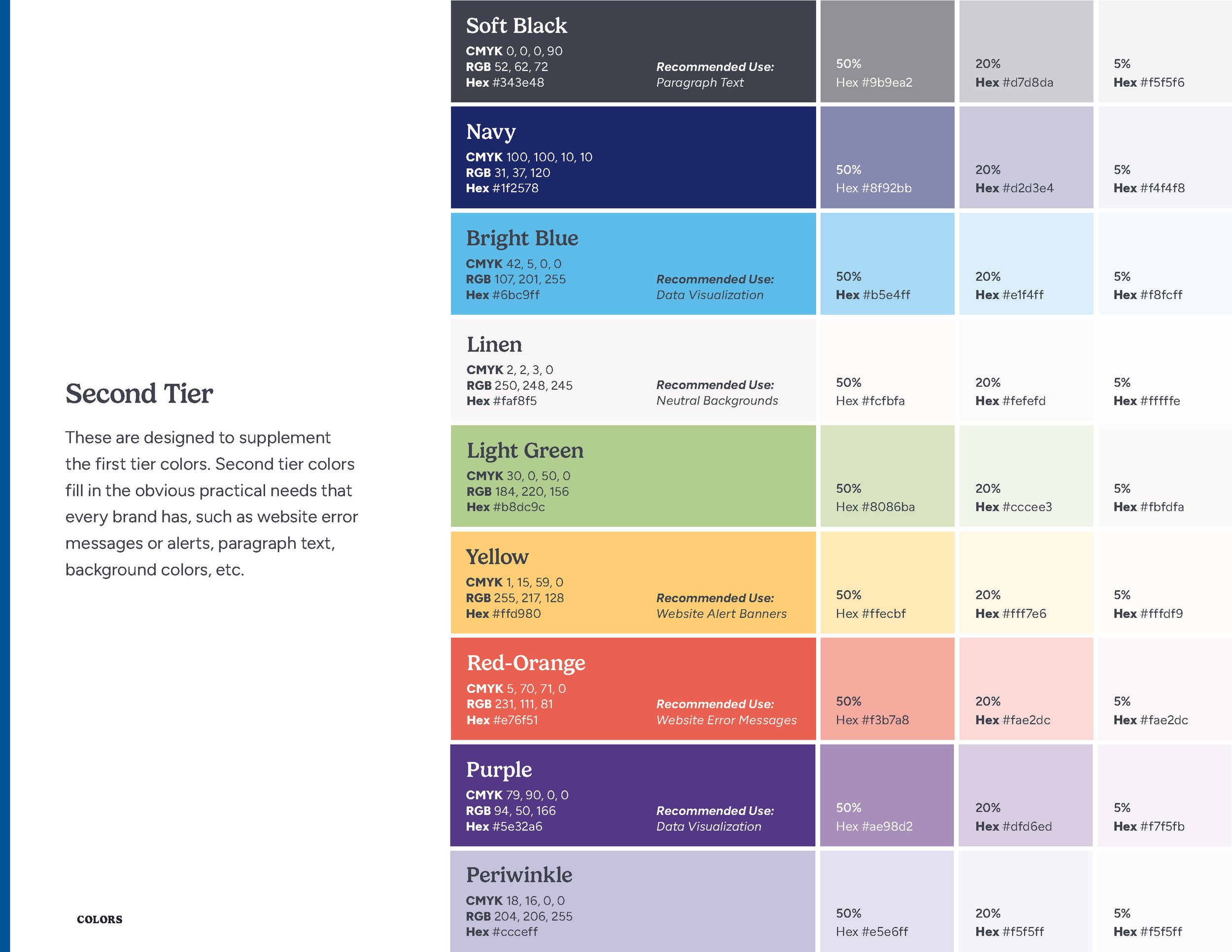
Coloring Outside the Lines
When they started, NC-PAL was entirely a Duke Health endeavor. As a result, the brand leaned heavily on Duke’s color palette. With a roster of partners in 2023, we could expand our options.
As a refresh, we looked to bring depth to the blue by pulling yellow out of the original. It’s subtle as a swatch, but it opened up design options—especially with gradients. We pushed the purple to a secondary palette color, using a vibrant gem-tone green to pair with the blue as a primary.
As for the secondaries, we expanded the count and introduced neutral colors to soften the overall presentation. Instead of using literal Duke palette colors, we pushed for something cohesive and unique to NC-PAL.
The New Logo
Borrowing from our approach to book design (the cover is the last thing to be designed), we tackled the logo at the end of our process. This allowed all the prior decisions to inform this final, critical piece of the kit.
After a few rounds, we leaned on the strong and friendly display face and left the box behind. It reflects how much growth NC-PAL has—and continues to—experience.
The result is a highly functional brand keystone. The simplicity affords an elegant deployment in any medium.
Here’s to NC-PAL’s next five years and beyond. We can’t wait to see where you take this program.
Team
David Spratte, Creative Director
Emily Combs, Lead Designer