Reborn U Identity
Reborn Clothing Co. found success so quickly they immediately encountered growing pains. With an initial product line focused on individual, bespoke products using customer-supplied materials, they quickly discovered the vast, untapped stream of college goods destined for landfills.
Reborn needed to differentiate their growing product lines. The main product line would remain dedicated to its partnerships with non-academic brands and in-house upcycled products. A new sub-brand, Reborn U, would be the new home for their quickly growing collegiate lines.
Pleased with how our team handled their primary brand refresh, Reborn came right back for Reborn U. We faced an aggressive launch schedule to launch in time to get investors on board, and they wanted to move swiftly into updating the website and social media platforms. We set to work with a game plan that allowed us to do our homework first and roll right into brand assets.
Conversations Lead to Clear-Cut Goals
Our initial conversations with the Reborn team were crucial. We needed a thorough understanding of their brand and product differentiators and goals, audience demographics, and more.
After an initial brand survey and kickoff calls with their team, we worked together to figure out the building blocks for Reborn U. We knew the Reborn U line would match the primary line’s focus on storytelling. But there were more qualities to factor in. When we asked what set their business apart from other upcycling and eco-friendly products, they said:
“We’re working directly with school systems and offering customized products. We can take waste directly from campuses or offer them a unique product made from our on-hand surplus.”
Reborn’s approach provided an excellent opportunity for schools and universities. They could expand on their environmental commitments by reducing waste and partner with a small business with a female founder and leadership to sell one-of-a-kind products not available anywhere else. Those are equally appealing factors to alums who keep tabs on their alma mater and want to feel good about their purchases.
“We want our audience to feel excited, hopeful, and trusting. We want them to think and notice that Reborn U makes quality, innovative products—and that Reborn U is leading the way in a new kind of cool, sustainable product.”
Sales data showed their audience was primarily female between 18–24 and 45–54. Those stats confirmed they had room to broaden their demographics with the right brand style and messaging. Reborn also wanted to avoid a color palette that felt too on the nose of “eco-friendly.” Their collegiate audiences are excitable and full of team spirit, and the color palette needed to show that. We agreed that the next step should be defining the path of the brand style via mood board explorations.
Research Gets Visual with Mood Boards
Mood boards are informative for both the client and design team. Initial design concepts are far more likely to hit close to the target if they’re backed by mutual visions. They’re also a great way to ensure everyone stays focused on the audience’s needs rather than relying on personal preferences to drive look and feel.
Nike always comes up as a brand inspiration, which we understand entirely. But Nike is a globally recognized brand with decades of development and can do more with less because it already lives in its audiences’ heads. What is useful is including Nike ads or graphics in mood boards to figure out why they are powerful and influential. Then we can figure out how to effectively use that inspiration to speak to a new brand’s audience.
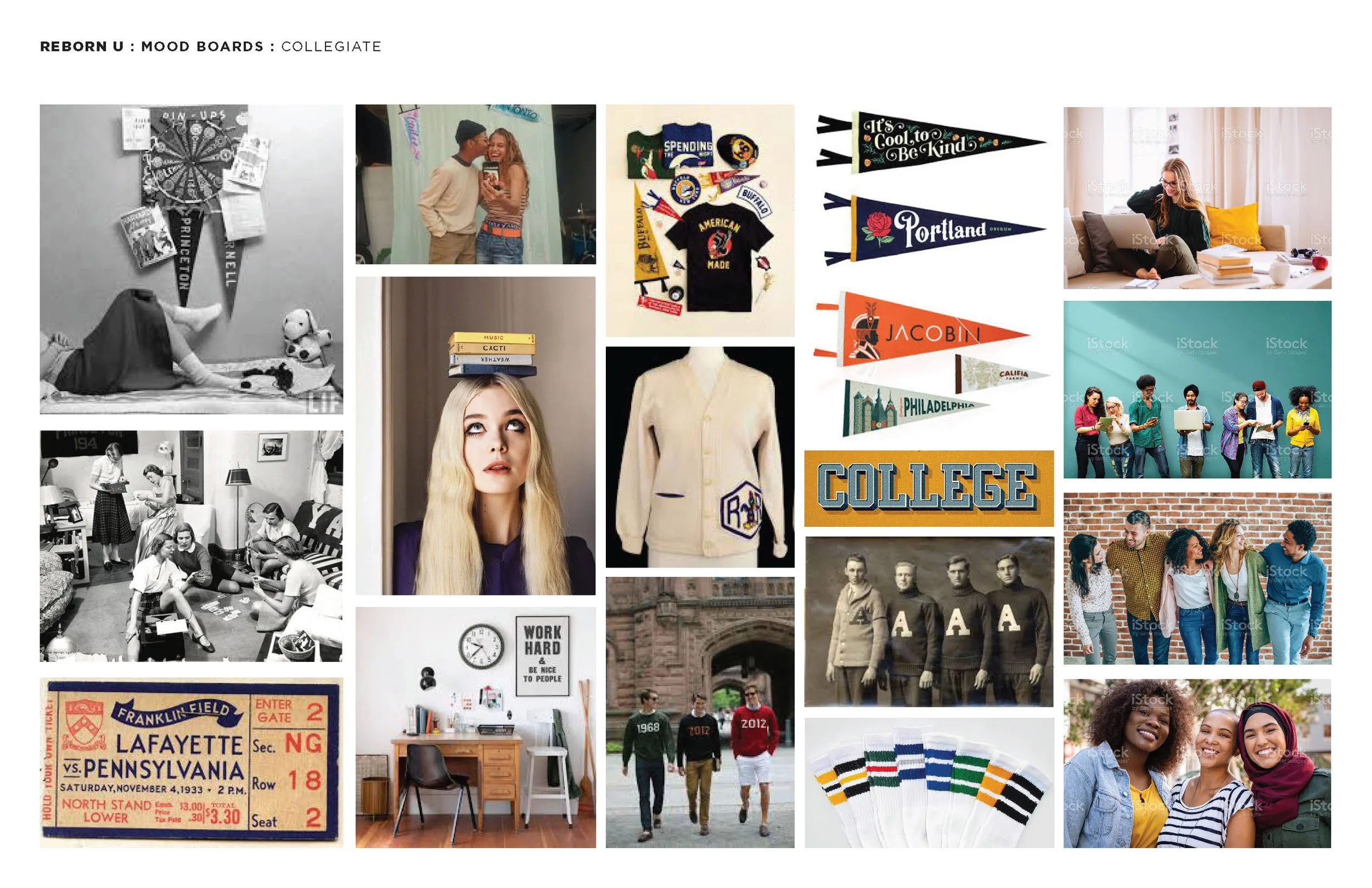
Collegiate Mood Board: Looking to the past for inspiration for and in the present, “Collegiate” embraces the classic and enduring aesthetic of college life and college sports.
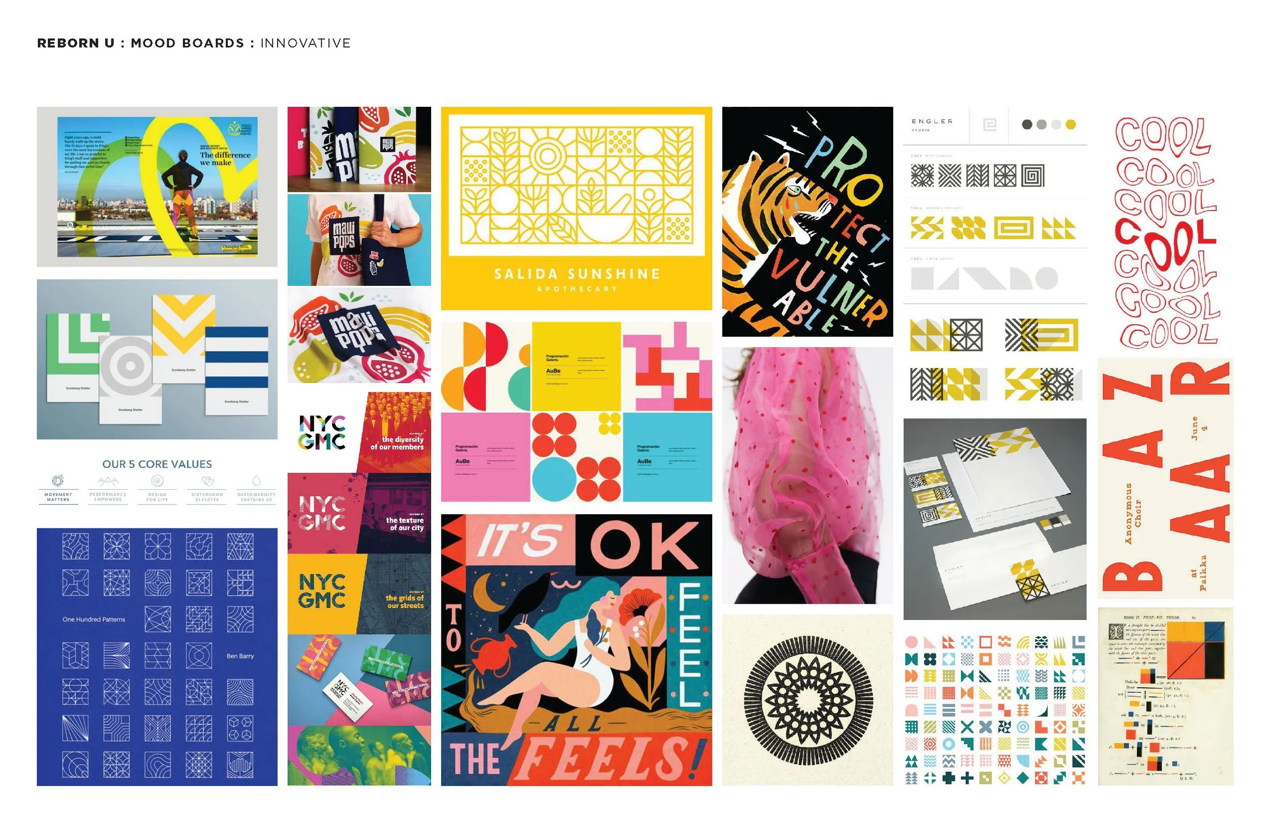
Innovative Mood Board: Modern, bold, exciting. This system would speak to Reborn U’s innovative process/products, an aesthetic that is playful and mature, creative and tasteful.
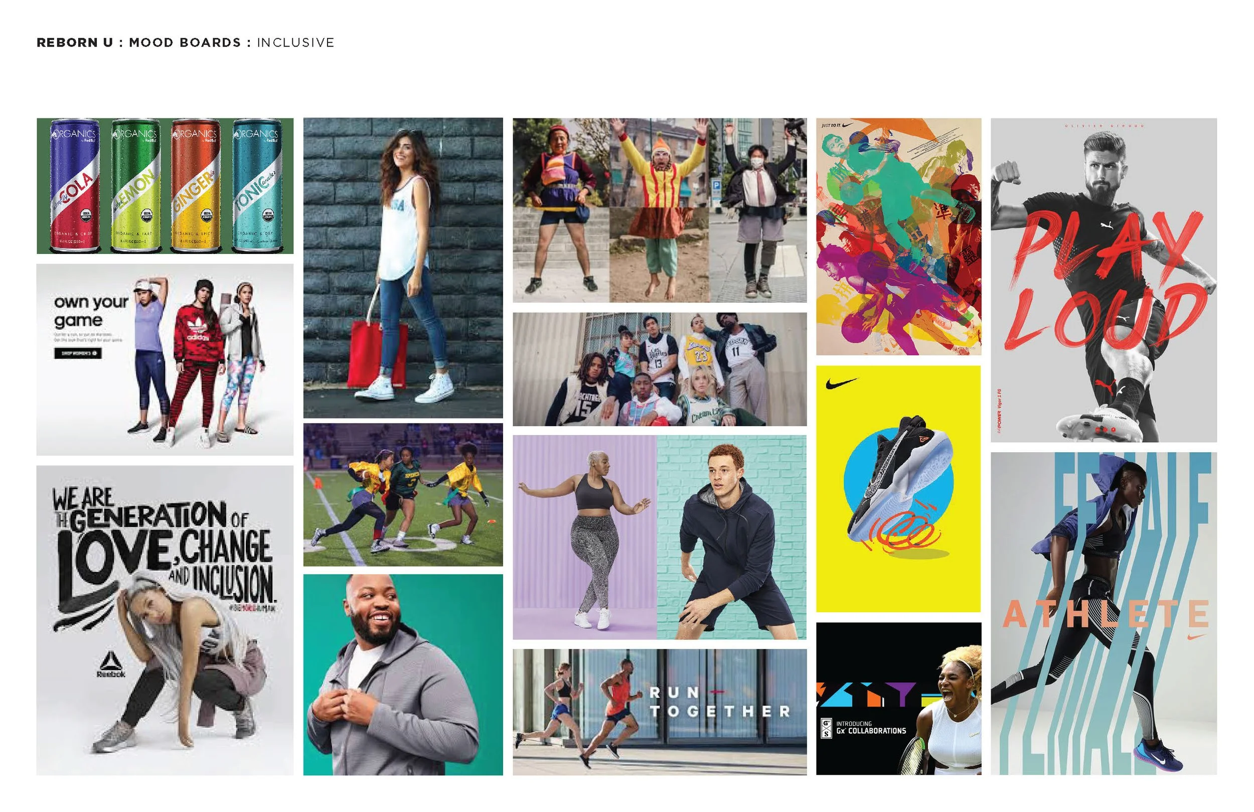
Inclusive Mood Board: By showcasing a variety of ethnicity, ages, and interests within the realm of “fan gear,” Reborn U is able to acknowledge the ever-changing market and focus on the positivity of inclusion.
Sometimes one mood board matches a brand’s goals exactly, and sometimes it’s a matter of mixing and matching. In this case, both teams agreed that our path should be collegiate and inclusive with vibrancy and boldness. That gave us enough to get started to work through the initial branding.
Designing & Testing Go Hand-in-Hand
Color
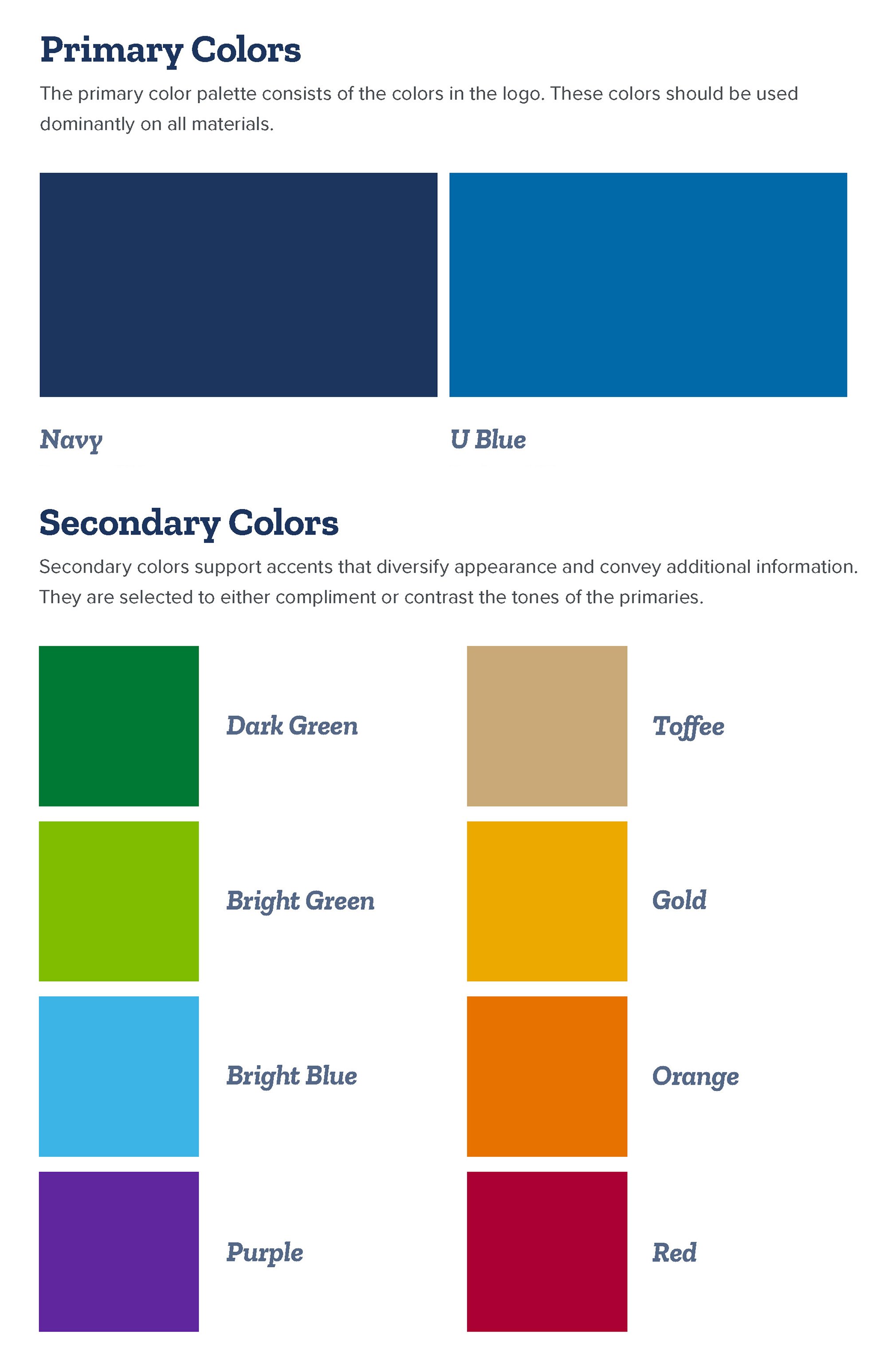
We often discuss the idea of tethers when we’re working on a related brand identity. For Reborn U, we borrow color direction from the parent brand. Reborn U would use the same navy blue as the parent brand as a primary color, paired with a vibrant, brighter blue for its own unique look. The remainder of the palette is a sophisticated rainbow: Some traditional colors are included alongside colors that stand out. Overall, it matches the goals of being collegiate yet bold and spirited.
The Logo & Type
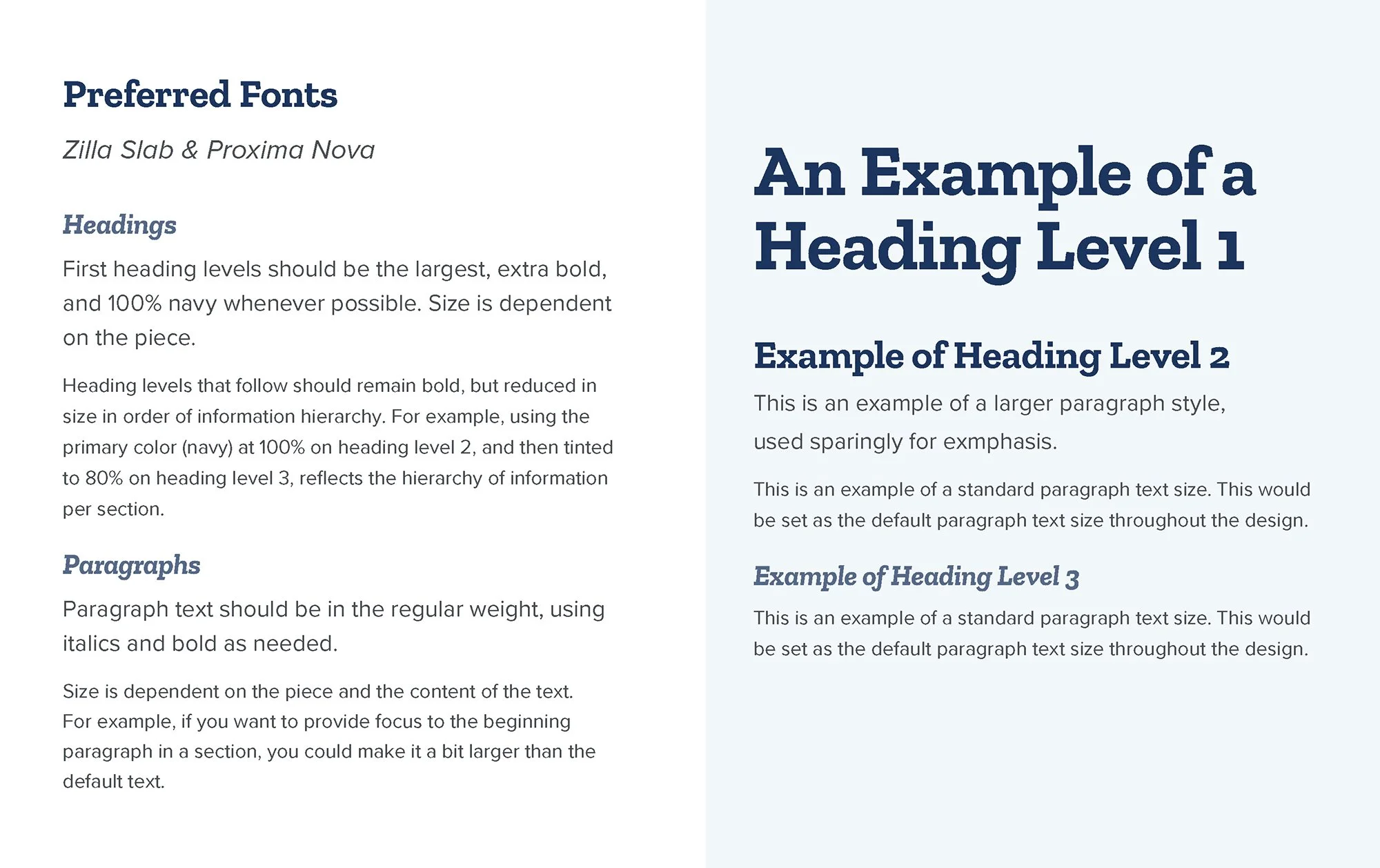
We worked through several iterations of the logo, agreeing that Reborn U should follow the model of the parent brand: A variable identity with maximum flexibility in deployment. Each iteration of the logo is unique, but the common thread is the collegiate yet modern logotype. We selected a slab serif that looks great online and in print. (For those unfamiliar with the terminology, serifs are the little “feet” on the ends of the letterforms. The ‘R’ and ’N’ in Reborn have the most distinguishable serifs in this example. Slab means those serifs are extra thick.)
That type choice is reinforced in Reborn U collateral as the headline font. The body font stitches the parent brand influence back in with Proxima Nova, achieving harmony between the two.
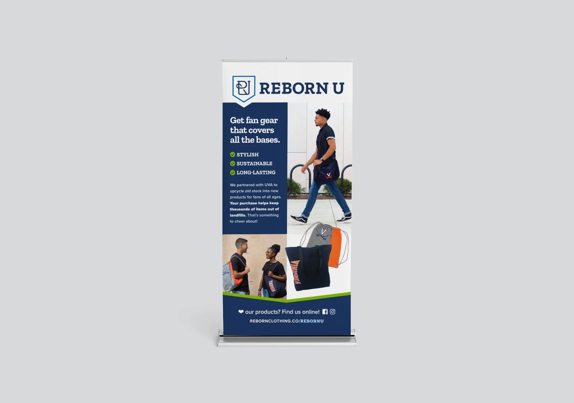
Print Mockups to Visualize the Result
We needed to get into mockups quickly to confirm that everything was working together as expected. We started with the products Reborn U needed immediately in their kit.


Deploying the New Brand Online
The Website
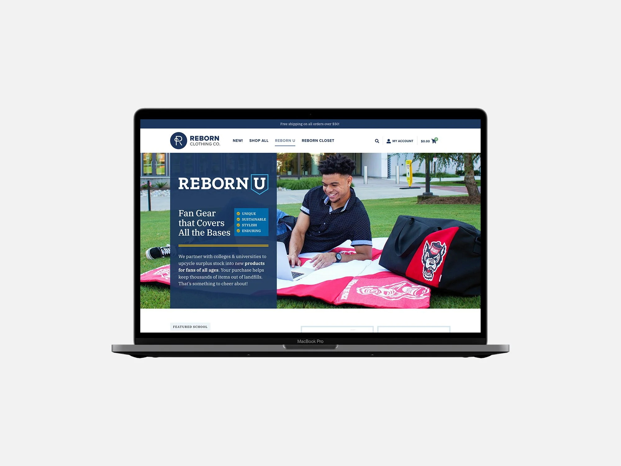
While we worked on print mockups, we were simultaneously creating Reborn U landing pages for Reborn’s website. These landing pages needed to serve multiple purposes.
First, there would be a landing page for Reborn U. It needed to briefly explain what the brand does and who it’s for, and highlight products for sale as well as school partnerships.
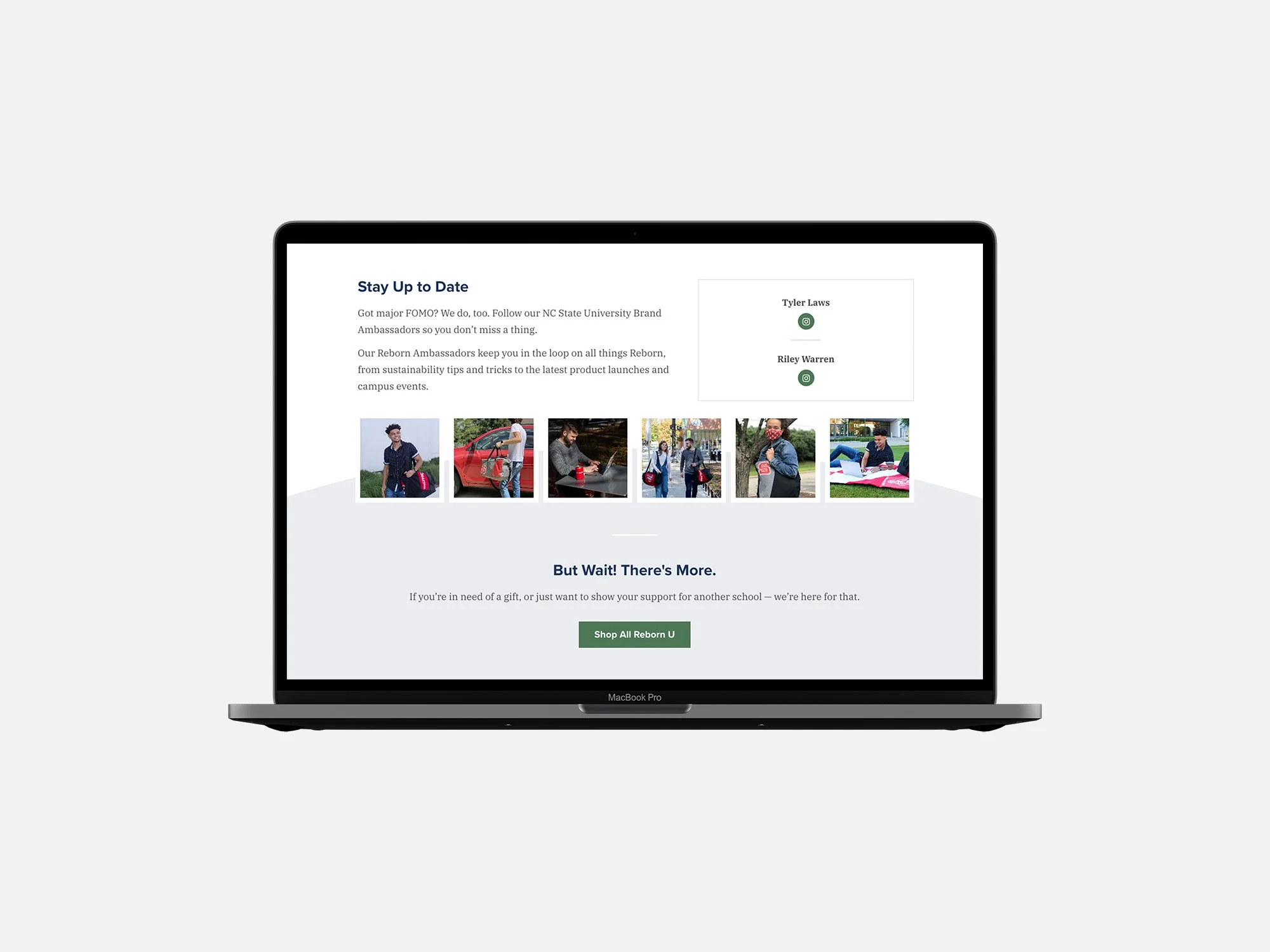
Second, developing a template for landing pages to highlight each school partnership. Templates would help Reborn’s team launch new lines fast, offering some flexibility in layout based on the content available. They show off school-branded products and push traffic to the stores where the products are sold. They also showcase a crucial part of Reborn’s partnership with schools: the brand ambassadors. From Reborn’s site:
“Our Ambassadors will update you on all things Reborn. From sustainability tips and tricks to the latest product launches and campus events, our ambassadors are your go-to gurus.”
Seeing actual students engaging with these products on and off campus is a natural way to promote sales, and each ambassador gets a boost for their social media accounts.
Social Media
Speaking of social media, we also got them started with a few templates their team could begin working with in Canva. While it’s a bit limiting if you’re a designer, Canva is a fantastic tool if you have a marketing team that must collaborate and stay on-brand at the same time—without purchasing expensive software licenses or subscriptions.


Ship It
In the end, we delivered a robust, flexible identity kit that positioned Reborn for success in the academic space and a jump start on materials to get them rapidly promoting a new line of products.