Reborn Clothing Co. Rebrand
When we started working with Reborn Clothing Co., they had an identity. It was perfectly serviceable for launch, but Reborn was picking up pace considerably. There was little doubt the Reborn brand was going to grow—our task was to cultivate that growth.
Reborn would need to show they could punch way above their age bracket at tables with universities, retail institutions, and investors.
Since our team had run with Reborn from nearly the beginning, we were a natural choice to work a rebrand to carry them forward.
Rebrands can be tricky, which is why we ask plenty of questions. “How much brand equity have you built?” is a simple question, but it reveals complexity. It gets into:
What’s working for you with the current kit?
Where is it coming up short?
Where is it not resonating with your audience?
Shoring Up the Weak Spots
The foundation was solid. If it were a house, you’d say it had good bones. But it needed updates to be livable today.
The typography needed refinement. The color palette needed to be extended if we were going to serve the increased website complexity and have flexibility with a growing product line.
Typography
Talking about type in 2021 is a rabbit hole—there are more options than ever before. For Reborn, a known constraint was to plan on something via Adobe or Google Fonts.
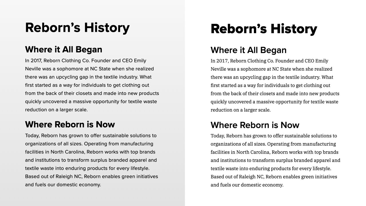
Reborn’s prior brand was all in on Proxima Nova. They used it for the logo, display, and reading copy. We kept Proxima Nova for display given the substantial investment but pitched a serif—IBM Plex Serif—for reading copy. It pairs well with the display face and provides some much-needed texture to Reborn’s materials.
Reborn Clothing Co. collateral type: Before and after.
Color
Expanding the original palette of four colors was a requirement from the start. The blue was, to go back to the house metaphor, a load-bearing part of the brand. We left that alone but tweaked the gray secondary so we’d have contrast in two-color print work and across the board.
We grew the secondary palette four-fold for range in working with increasing products and audience diversity.
Prior palette consisted of four colors.
Primary Colors
Secondary Colors
Logo
The old logo.
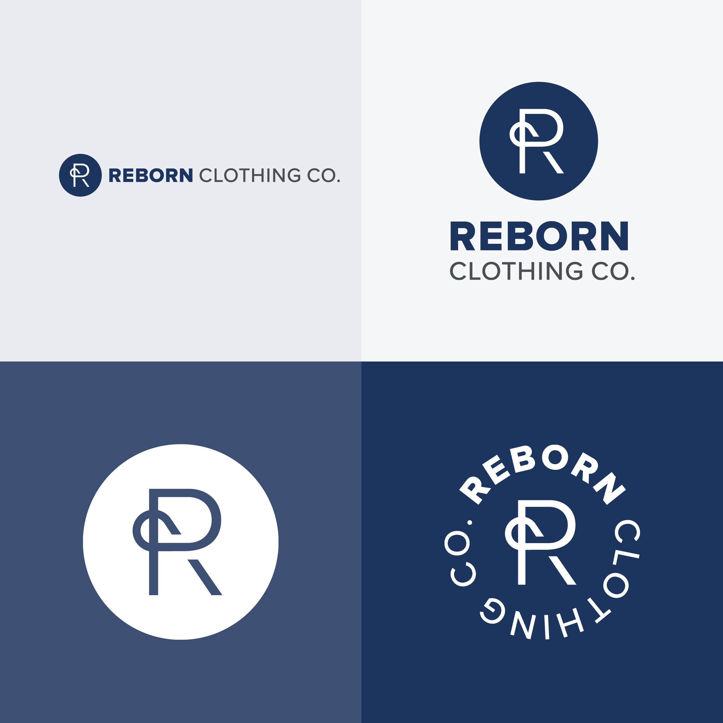
Straight away, we looked at how to make the logo more useful. We realized the answer was logo variants we could deploy across the web and print. Instead of a single, middle ground lockup, we introduced solid horizontal, nearly square format, and new seal style alternatives.
Details Matter
Even though we knew from the start that R Stitch Button was sticking around, there was room to improve it relative to the new type changes.
The Result
Reborn Clothing Co.'s new identity is flexible enough to serve the growing needs of the company and build brand equity.
Team
David Spratte, Creative Director
Emily Combs, Lead Designer
Monarose Ryan, Designer
This project was initially produced at Registered Creative by members of the HALO 22 team.


