St. Matthew’s Brand Refresh and Website Redesign
When you think “brand,” you probably don’t think of churches. Yet, even a church can benefit from good branding—especially as you embark on building a cohesive online presence.
During the COVID-19 pandemic, St. Matthew's Episcopal Church in Hillsborough, NC found that their website was gaining more traction than ever. While the site had once been supplementary to their traditional in-person worship, the website suddenly became the primary way to stay connected with and support their congregation and the surrounding community. They also needed to engage on social media but found publishing anywhere online to be challenging with an outdated website and the piecemeal brand elements of their past.
When they approached us for help organizing their brand and website, we were confident we could set them up with a better toolkit.
The Brand
The existing materials for the St. Matthew’s brand were few and far between. The only logo files they had were flattened, and fonts varied pretty wildly in their graphics and print materials. It was clear they needed a guide to define styles and make it easier to produce coordinated materials, no matter who worked on them.
From Line Drawing to Vector Art
The logo files also featured line art of the church that appeared to be from a scanned drawing. While that pixel-based art was not easy to work with, it had become a linchpin of their branding over the years and needed to be in the future logo as well. Did that scare us? Not one bit.
Several years back, on another project, we developed our own custom preset for Adobe Illustrator’s Image Trace tool—one that would serve us well in turning a complex line drawing into scalable vector art.
After several rounds of editing and testing, we wound up with an asset that could do the job.
The existing versions of the logo featured line art and inconsistent type styles.
Color & Type
Our next task was figuring out collateral typography and color palette. Typography and color goals were in alignment: They needed to appear more modern and approachable, while still remaining reverent. They also needed fonts that would be freely accessible for everyone to use—most of their publications were handled by church volunteers and staff.
The new logo with improved type styles, fresh colors, a better layout, and vector-based church art.
Based on the font choices for the logo, we selected two free fonts from Google for collateral type: Source Serif Pro for headlines; Source Sans Pro for body copy. Using the same family would keep things simple while adding diversity to their type kit.
Type sample from the brand guide.
While they had previously leaned on a burgundy red for their branding, they wanted the new brand identity to have a softer initial impression. We kept the burgundy in their secondary palette to help transition, and chose a mature, medium blue and charcoal for the primary colors.
Brand Guidelines
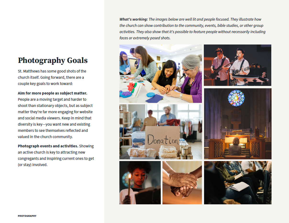
One of the most important parts of a brand is a brand guideline document. We made sure that all typography and color styles were defined, with color codes included, and even added photography guidance so their future assets could better supplement the new branding. We also supplied input on size and layout factors that may prevent them from deploying versions of the logo with the church line art included.
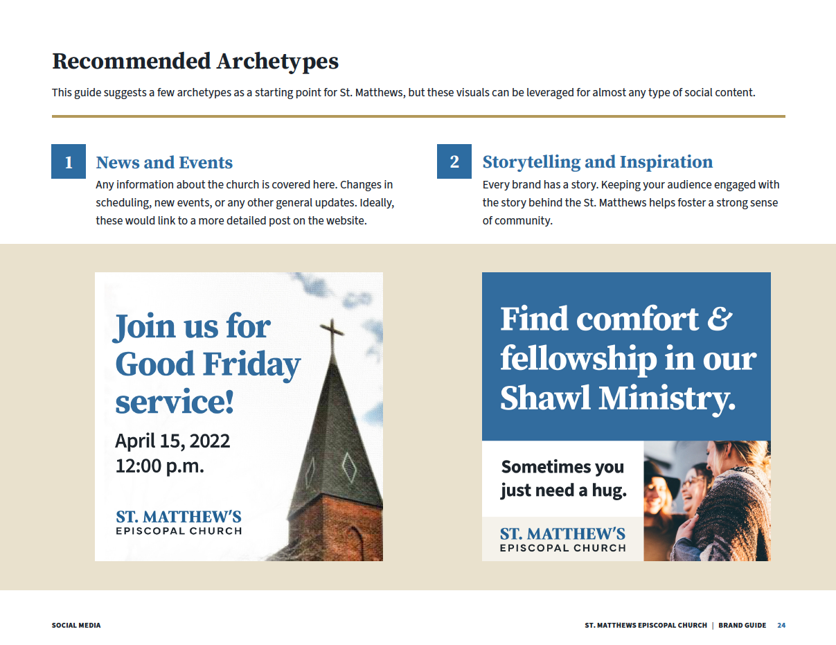
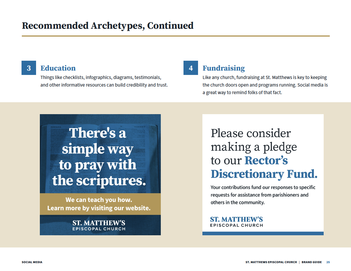
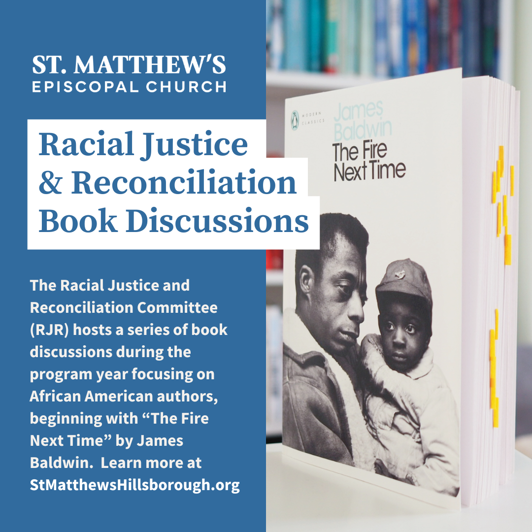
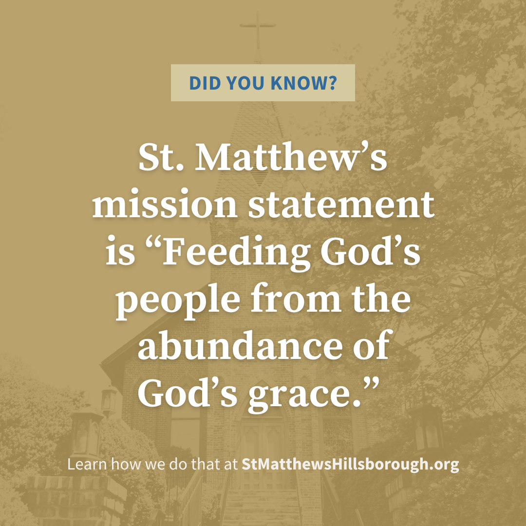
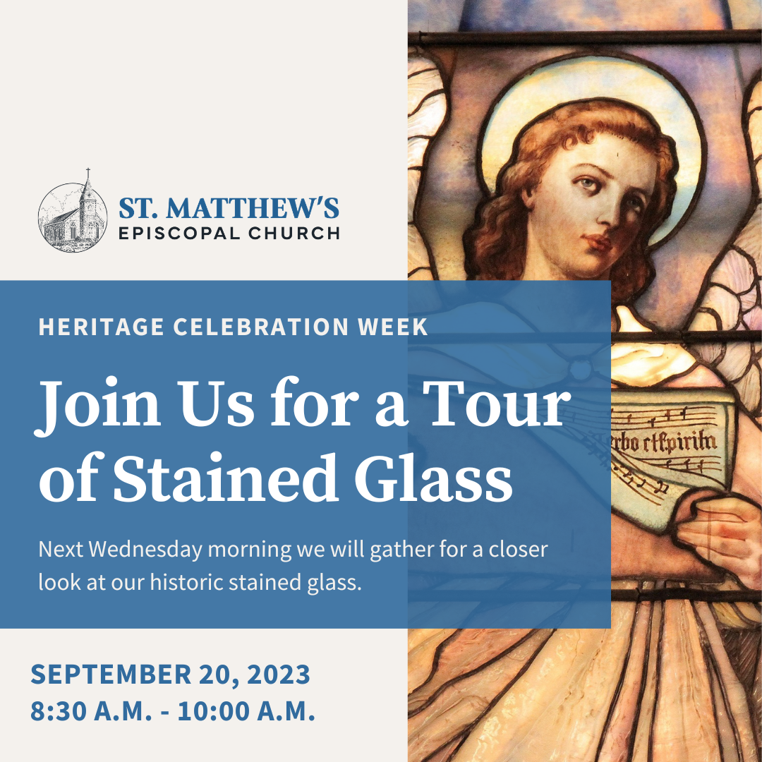
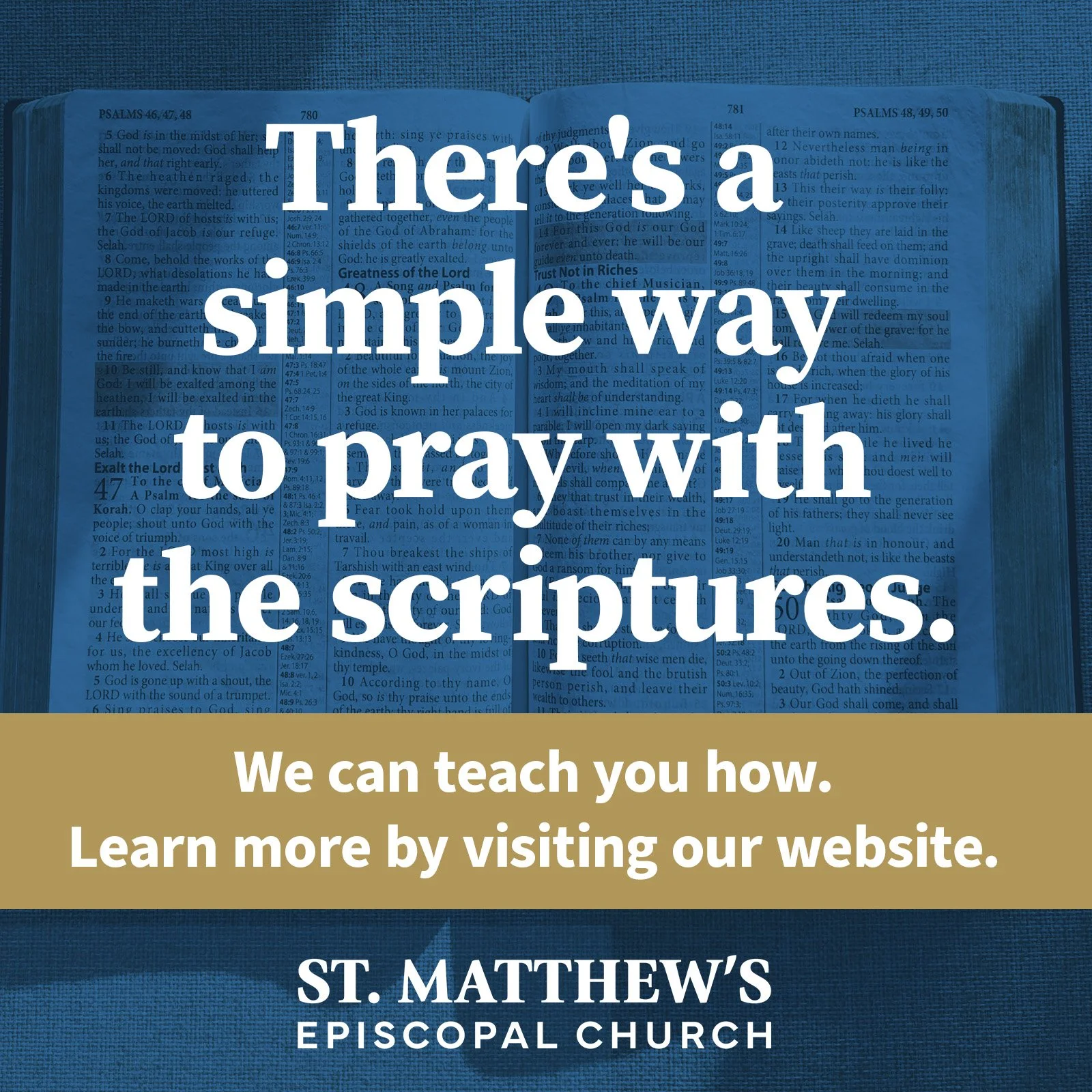
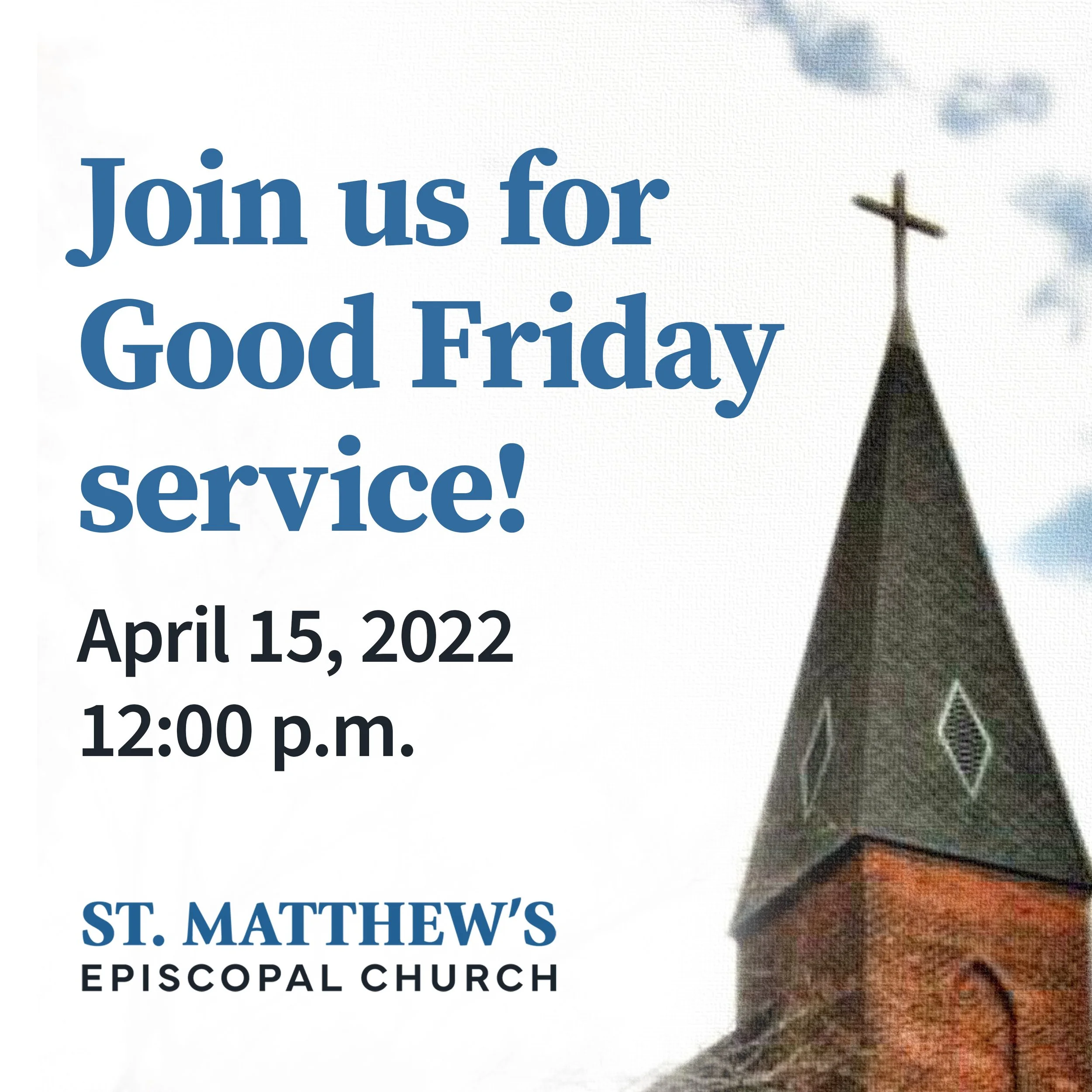
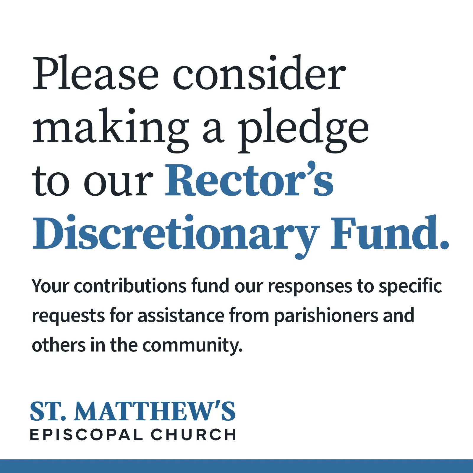
We also included some social media post layouts to get them started on deploying the new branding on their accounts.
The Website
The website we were redesigning was a version of an even older site that had been hastily ported to WordPress.com.
We’re fans of both WordPress and Squarespace and since the St. Matthews team was coming off a less-than-optimal WordPress experience, we were game to explore Squarespace for them.
Both platforms have pros and cons, and we’re always up for discussing them with clients. Either platform would work, but Squarespace was the answer here to give St. Matthew’s the reset they needed.
Information Architecture
The prior website suffered what had turned into an ad hoc approach to adding content. Over years of organically adding content, the old site had become a mix of pages and PDFs. This sort of thing often happens with volunteer organizations.
We knew for the new website to be effective, we’d need to understand their content needs and look to provide structure—to lead them to cultivate their content in a way that was discoverable to visitors. We‘d also need to guide them to using native web views (over PDFs) whenever practical. PDFs don’t typically provide visitors on mobile with the best user experience.
Ultimately, we relied on thinking through a taxonomic structure that would allow the diverse team at St. Matthew’s to leverage the blog to handle the vast majority of their updates. From bulletins to sermons, these regular updates can now simply be posts that populate appropriate pages.
Launch
While the project took longer than expected, the result was worth the effort.
“I am so grateful for how you guided us in setting up the site and its design. It's really great.”
—The Rev. Robert Fruehwirth, Rector, St. Matthew’s Episcopal Church
Have a rebrand coming up? Need a website? Let’s get started.
Team
David Spratte, Creative Director
Emily Combs, Lead Designer


