An “In Progress” Review
Every design we create includes consideration of letterforms and styles. Why? Typography choices directly impact the success of your messaging. For example, setting long-form text in a decorative font means that your audience may skip over it by quickly deeming it too hard to read, and therefore not worth the effort. But if you set the same long-form text in a practical, legible serif or sans serif, your message will be more likely to get through.
An example of how careful typography choices are key for legibility: On the left, Instrument Sans makes for clear headings and paragraphs. On the right, a decorative choice for fun headings is a poor choice for paragraph legibility. Type samples generated by Jargon Ipsum.
Typography also conveys brand personality. A sleek, geometric sans serif font is an entirely different impression than a handwriting-style script or chunky slab serif. You can make or break your brand styles entirely through typography.
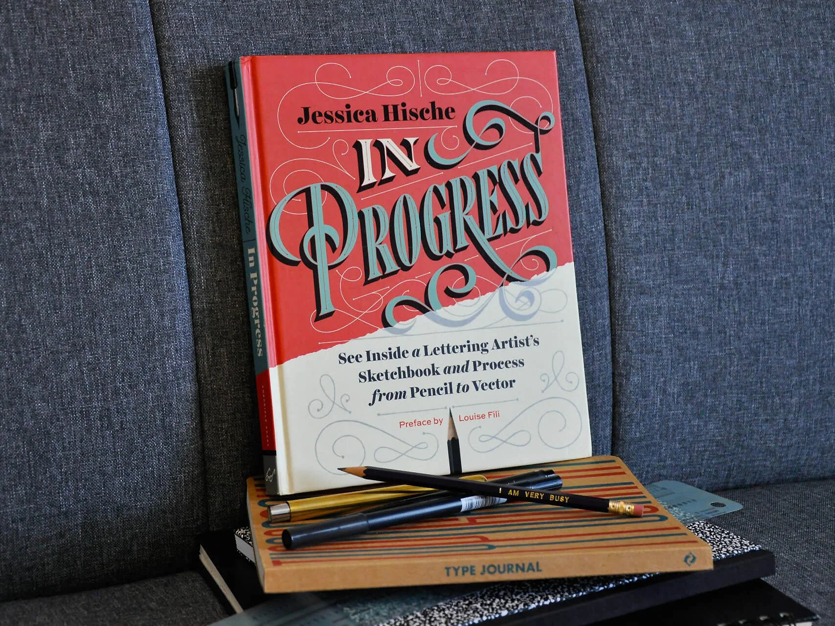
Because the HALO 22 team has such a close relationship to typography as designers, we’re huge fans of type artists, like Jessica Hische, who share the details of their process. (Speaking of process documentation, we have that too in case you’re curious about how we work.) In her book In Progress: See Inside a Lettering Artist’s Sketchbook and Process from Pencil to Vector, Hische demonstrates everything from the tools she uses to how she conducts research to her sketches and final development. It’s a thorough overview of how her typography projects are structured, from beginning to end.
Let’s take a look at some highlights.
An On-Point Preface
The book opens with a Preface from legendary typographer, Louise Fili, whose work inspired Hische—and me, separately, on my own journey—as a student of design and typography. Personally, I’ve found that every Fili piece demonstrates creativity, attention to detail and form, and unique style. (My Fili obsession was eventually what led me to discover Hische’s work, since Hische was hired by Fili freshly out of college.) In Fili’s Preface, you’ll see examples of her collaborative projects with Hische, which illustrate meticulous design decisions that result in beautiful, thoughtful, complex art. Even if their work isn’t within the boundaries of your stylistic preferences, you can still clearly see how they are masters at their craft.
A shot of the Preface by Louise Fili.
Signature Styles
As the narrative rolls on, you’ll find that each section opening page is set in what I’ve come to know as Hische’s signature look: A blend of typography styles (script, serif, sans serif), careful linework and spacing, and a mix of subtle and bold colors. It’s fun and professional—a style that conveys approachability without going overboard in playfulness.
Mixing type styles can bring visual interest when done well, as in this sample.
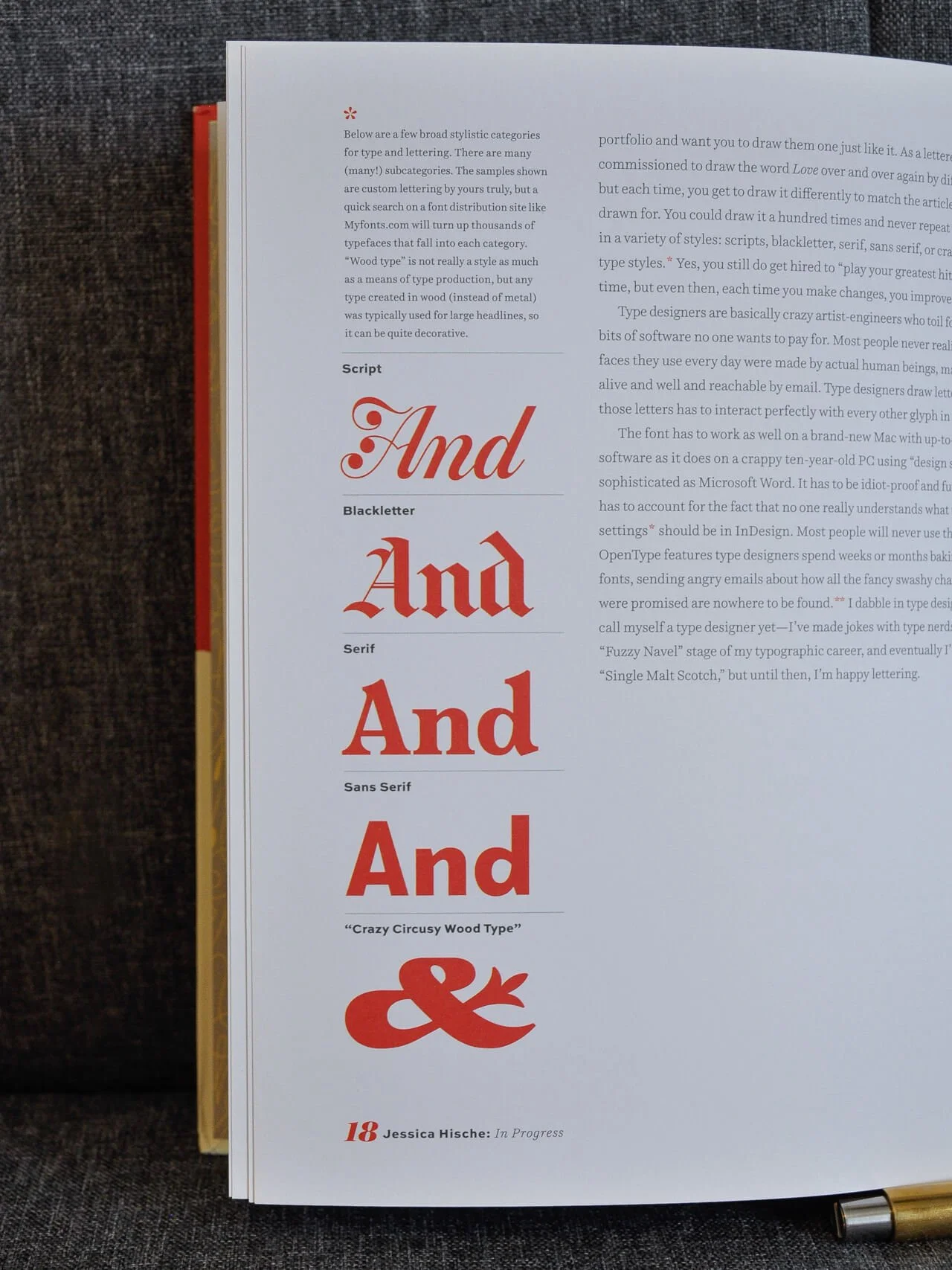
Great Use of Grids
Hische is also skilled at wielding grid-based layouts. You’ll find creatively deployed sidebars mixed in with rigid grids, but you’ll also see how she intentionally breaks the grid in order to allow illustrations more space on the page. We love strong grid work like this at HALO 22. If you break your own structure, that intentionality makes all the difference.
A sample of intentional grid breaking and excellent use of sidebars.
A Note on Contrast
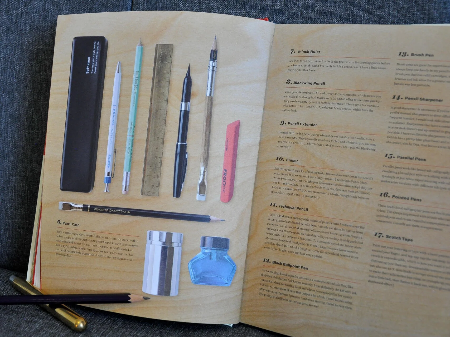
One point of critique, however, is an occasional issue with legibility—particularly in the tools section and featured projects. In those areas, the already thin letterforms are set so small they appear wispy and hardly legible against the background. It’s a combined issue of font choice, scale, and color. Print is always a challenge, for many reasons. Thankfully, it’s not an issue that affects the main body of content.
The red contrasts well against graphics and large, white type—but not so well on small, black type.
Inside the Sketchbook
To add visual variety, the content of some sections is presented as if you’re looking directly into Hische’s sketchbook. It’s an easy, creative way to add interest for the reader without interrupting their reading flow, and fits well with the theme of the book.
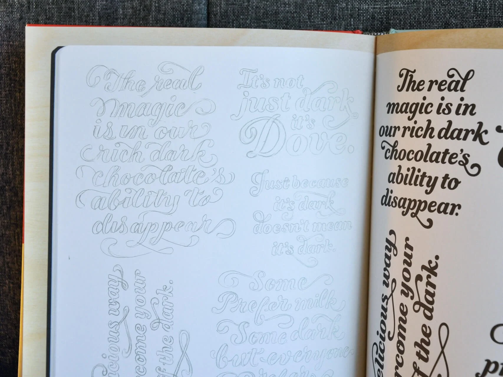
It’s fun to see how Hische’s sketches go from penciled, quick concepts to polished, inked designs.
Hische’s work is always a master class in creativity, and this book is filled to the brim with fun visuals for anyone interested in illustrative typography.
Looking for guidance on the right typography choice for your brand, website, or marketing materials? Talk type with us!