Bland Landscaping 50th Anniversary
If you’ve followed our work, you’ll know that we have a long-standing relationship with Bland Landscaping Co. (BLC). Well, time flies when you have fun! It seems like only yesterday when the team worked with BLC to create their 40th Anniversary kit. When they reached out about a 50th Anniversary kit, we didn’t hesitate.
As with the 40th anniversary, we knew this would be a chance to flex our team’s interdisciplinary skills—starting with strategy.
Strategy
Before we could get into plans for the identity and other materials, we needed to make sure we were all on the same page in terms of approach and vision. This meant taking a beat to consider the whole campaign, not just tasks.
Of course there would be a good deal of acknowledging BLC’s history, but leaning into the future would be core to the campaign. After all, it’s an opportunity to connect with clients and the community in new ways.
Content
We started by thinking through content plans. With an audience of clients, partners, and potential acquisitions, what BLC talked about would be essential.
We advised an adaptive approach to content. First produce it and then modify for different platforms. The messaging would focus on gratitude and reflection, changes and updates, and future goals.
You don’t last 50—or even 10 years—without strong client relationships. Nostalgic communications would center on reaching out to long term partners, talking about activity in the community, and pivotal moments.
With the history piece established, we could think about how to talk about change and growth—not just for the company, but the industry as well. This piece would highlight how BLC remains at the forefront of their industry and local communities.
The topic of change is a natural segue into looking forward. BLC would need to show their audience ideas for the future, and talk expansion and other plans for the next decade.
With an outline in place, we could move forward into building an identity and other assets that would support BLC’s campaign goals.
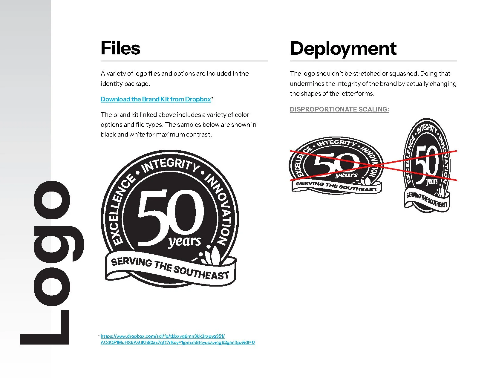
Identity
Our seal design from BLC’s 40th anniversary.
For the 40th anniversary, we decided on a seal structure. We love seals because they can neatly contain many elements, like BLC’s anniversary info, brand elements, and most prioritized values. Seals are also a great way to supplement the brand’s primary logo with a modular element: They can work together, or solo.
We saw no reason to abandon the seal for the 50th—it’s a structure that clearly works. We also kept their representative values, since excellence, integrity, and innovation remain core to BLC’s culture. But, we needed to differentiate this seal from the 40th identity so it could be uniquely its own.
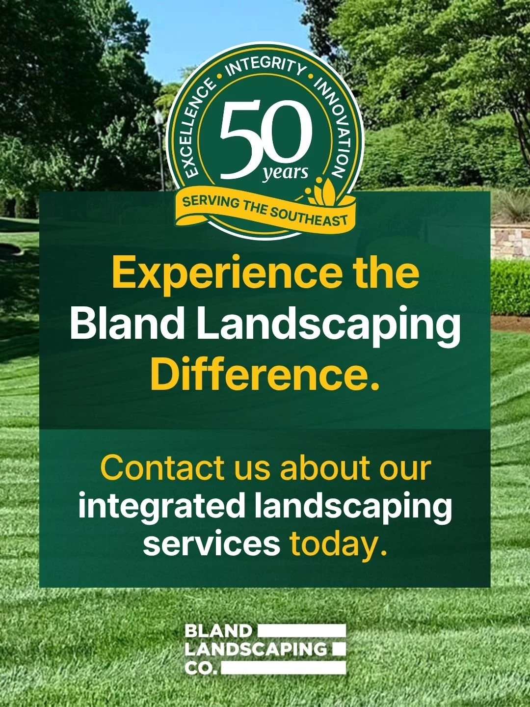
Our new, 50th anniversary seal design.
Part of that differentiation came down to simply updating the brand styles: BLC’s fonts and colors were modified back in 2021 as part of our brand extension project. That alone gave the seal a more up-to-date look. We went even further by adding a BLC-gold ribbon along the bottom with a call to the southeast, acknowledging their expanded presence and branch additions. We also nestled one of BLC’s legacy graphics, a simplified illustration of a tulip blossom, into the banner corner for balance and a throwback all in one.
With the new seal approved, we packaged up a brand guide and concurrently got to work on some screen-based projects that would help them get the word out.

Screen
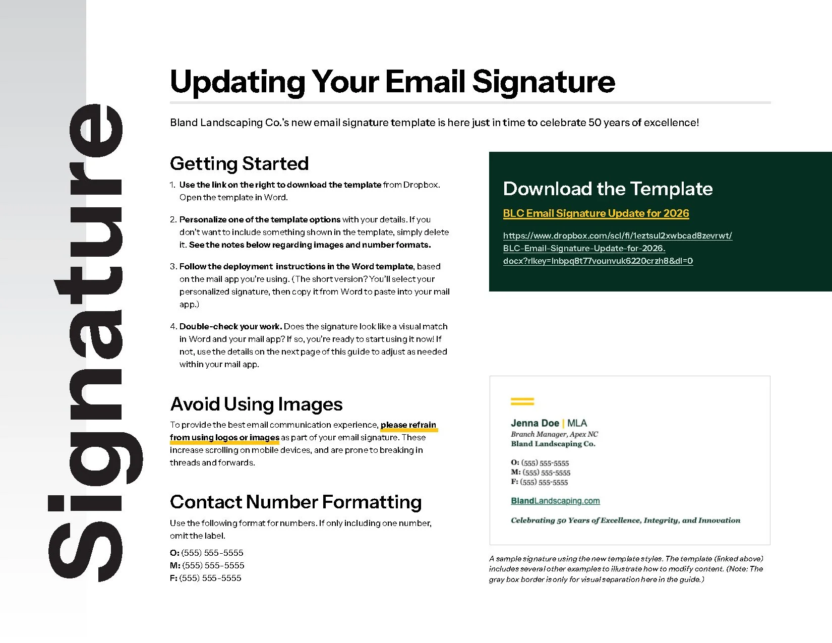
Knowing BLC would want to deploy the 50th branding quickly, we rolled right into a couple types of templates for screen: An email signature and social media templates.
Email Signature
Though it is always tempting, we recommend skipping logo files or other images in email signatures due to the many reasons we’ve listed in our resource post. BLC agreed, and we provided them with a stylish, branded, text-based signature that performs well across all common email apps.
So, how exactly do you season your signature with brand flavor without using images? The literal answer is using HTML styles, but it goes deeper than that. We start by considering what elements are in the logo, and what we might be able to visually reference or recreate with code only. For our own email signatures at HALO 22, as an example, we referenced the hexagon from our logo using Unicode U+2B21. Setting it at the top of our signatures makes for a more on-brand, unique, graphic division between email body and signature than a simple line or text:
The HALO 22 email signature.
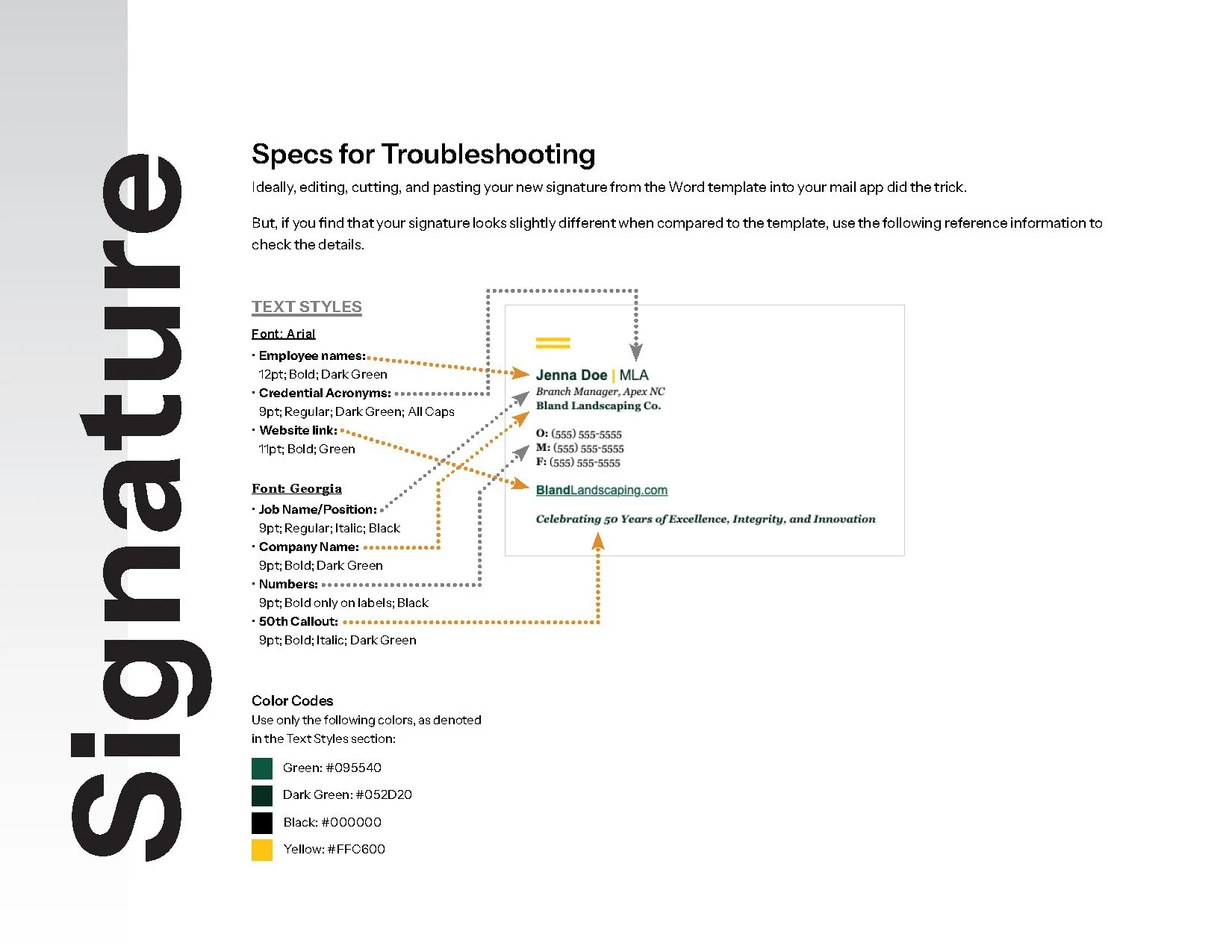
In BLC’s case, the primary logo features bold yellow stripes. These were recreated using Unicode characters, and styled in the exact same yellow as the logo. We reinforced it with a bold yellow vertical pipe to divide names from credentials.
From there, it’s all a matter of styling text.
For emails coming from campaign platforms like Mailchimp, you have a little more flexibility in what fonts you’re able to include. However, for everyday emails, you’re restricted to a set of eight total fonts. (Want to know which fonts are email safe? See the list in this Mailchimp article, in the section called “8 email-friendly fonts for use in email.”) So, we defined email-safe alternatives that matched the brand look as closely as possible. In BLC’s case, this meant leaning on Arial as a substitute for Inter, and Georgia as a substitute for Merriweather.
The BLC logo. We mimicked their iconic yellow bars in the new email signature.
By applying brand colors and hierarchical style and size treatments, we were able to create a reliable, branded signature. And to cap it off, we referenced BLC’s anniversary sans logo with a line at the bottom reading: Celebrating 50 Years of Excellence, Integrity, and Innovation.
But don’t forget deployment: With every email signature we design, we run thorough tests before handoff. Those tests allow us to provide customized instructions for how to set it up in different apps—and troubleshooting tips in case it doesn’t go as smoothly as expected. Having that info handy means you don’t have to write out instructional emails every time you share the template with a new colleague. It’s a simple step for us that saves precious time for our clients.
The BLC email signature.
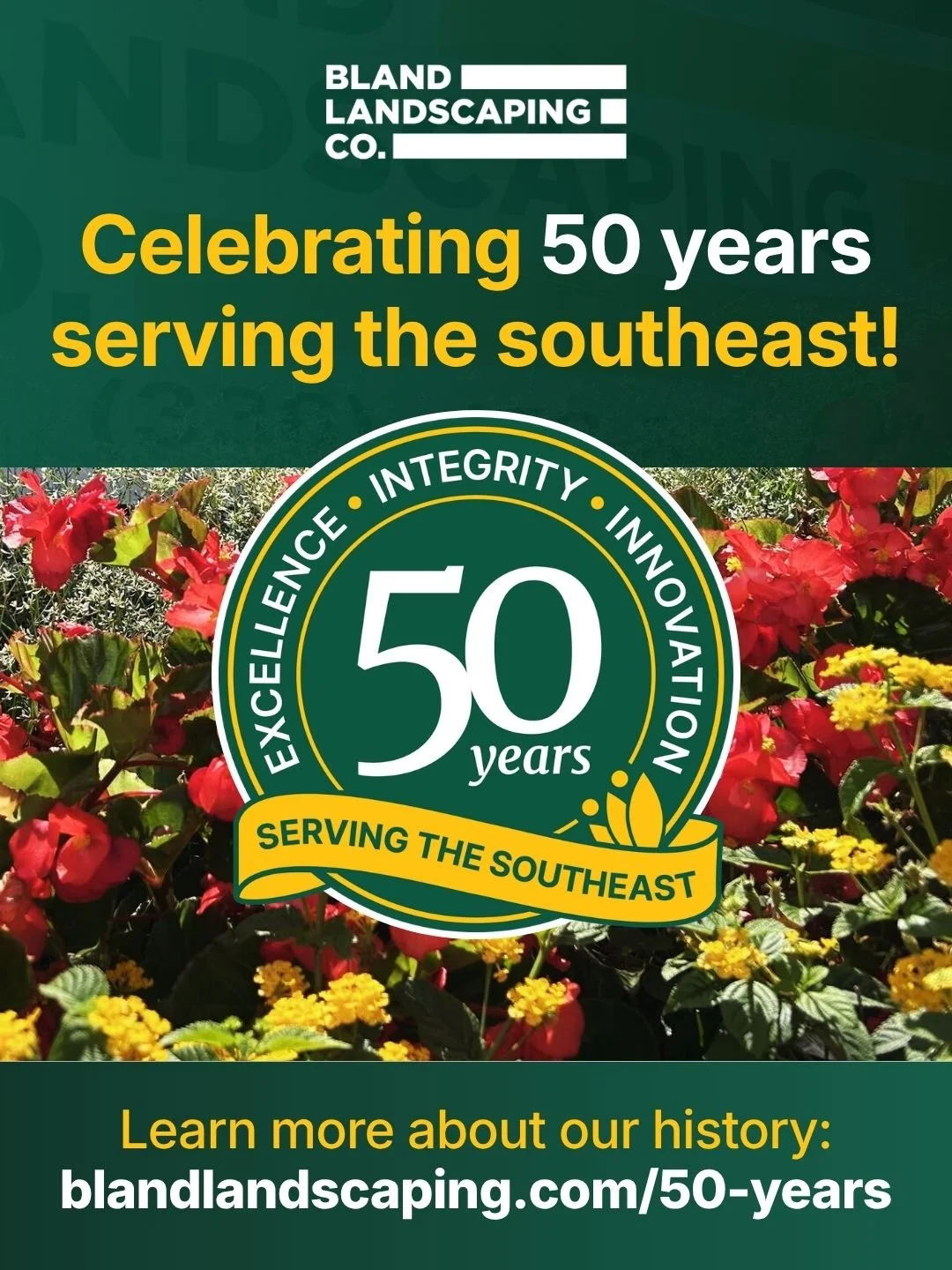
Social Media Templates
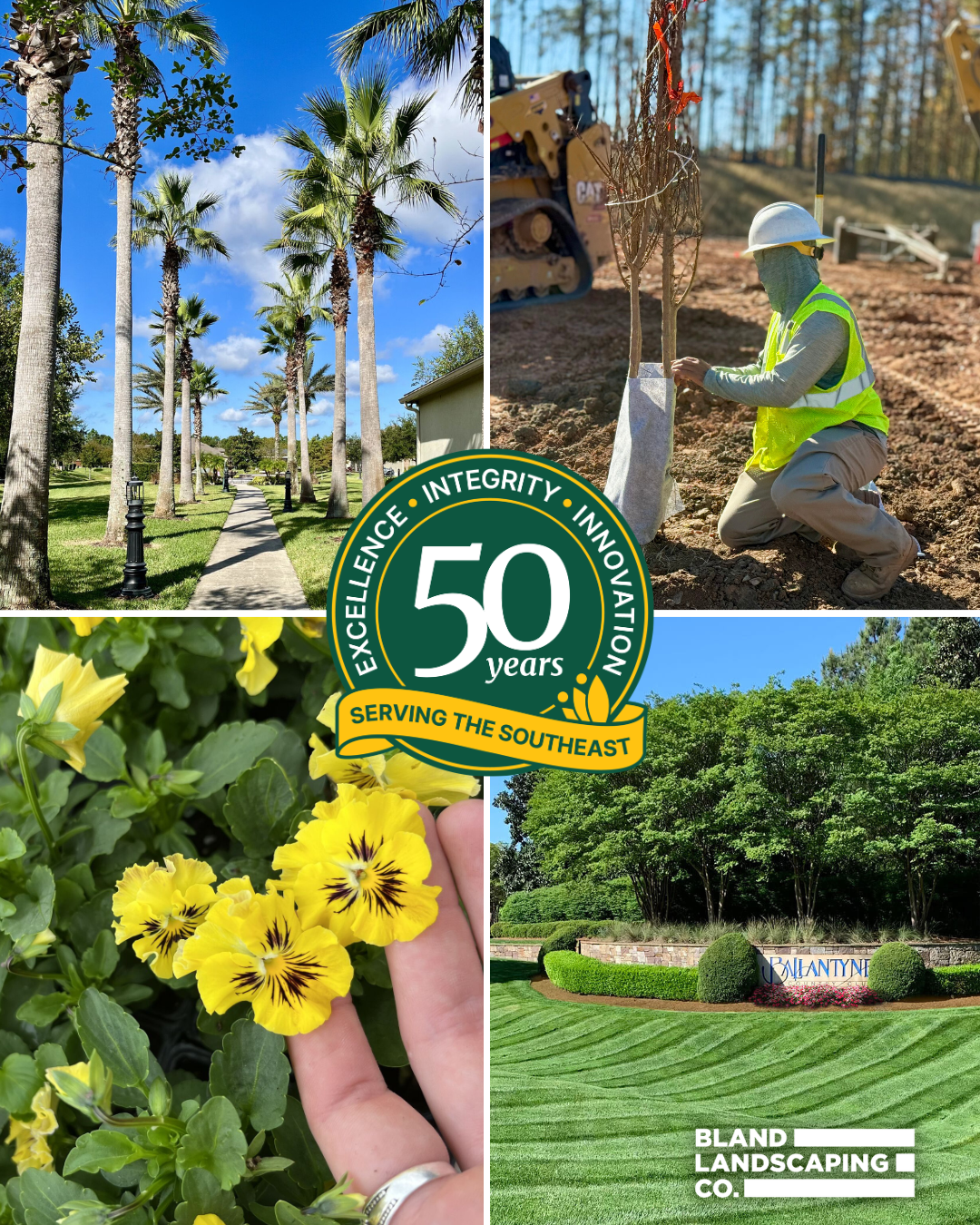
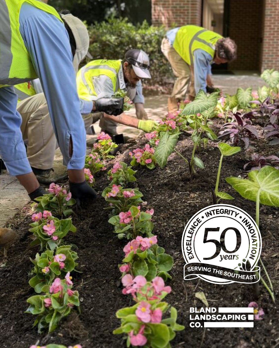
BLC has a large team, with more than one person posting to their social media accounts. Their team already had familiarity working together in Canva, a browser-based design tool that makes sharing and editing files easy for those without access to more robust apps, like Adobe Photoshop, etc. So, we crafted vertical and square social media templates in Canva using the new, 50th anniversary identity—and supplemented them with text options and vibrant photography, all in a variety of layouts.
You’ve probably noticed that we’re not the type to drop templates and leave you to figure it out alone. As a regular part of our Canva template builds, we include usage instructions and styling recommendations right on the first slide. It’s an easy way to make sure that no matter who uses the files, there’s solid guidance in place for staying on-brand while editing templates.
We provided six different templates in two layout orientations, giving them a great foundation for making anniversary-branded posts throughout the year.
Looking Forward
With the flexible kit in place, we’re looking forward to seeing how BLC continues to leverage their 50th anniversary identity across future marketing materials. We’ll be sure to share any relevant project updates as the year continues.
And, we can’t close without saying: Cheers to the team at BLC on an anniversary that deserves big celebrations!
Need help with materials for a big event? Let’s chat about all the ways the HALO 22 team can support your marketing goals.
Can’t get enough HALO 22? Sign up for Dispatches—our (fun, informative, and infrequent) newsletter.