
Examining Inclusive Design in Print
Written by Anne H. Berry, Meaghan Dee, and Rebecca Tegtmeyer
Designed by Jon Key
We’ve always practiced inclusive design, and it’s been on our minds even more lately with the change in compliance rules that led to our recent web accessibility audit service launch. But we know from decades of experience that inclusive design in print is just as important. Books like this one are especially exciting because they’re proof that other professional designers and major organizations see the value of inclusive design, and are willing to invest in print to share practices and tips.
Before we get into our book design review, let’s break down the two key parts of the book title so we’re all on the same page:
Inclusive design allows products to reach more people more effectively. Part of how we design for inclusiveness at HALO 22 is by considering accessibility standards and guidelines.
AIGA, formerly known as The American Institute of Graphic Arts, now goes by “the professional association for design.” AIGA’s Design Educators Community (DEC) works to prepare designers for the future, with forward-thinking, inclusive materials—like this one!
Now, on to the review.
Design Successes
This book comes with notable design wins that we have to acknowledge:
Choosing to publish this content in print. Print is a long-term investment. Publishing inclusive design values, practices, and experiences in print is a bold statement that shows how deeply AIGA and the design community value inclusivity in their work.
General aesthetic concept. Inclusive design doesn’t need to be generic! The book leans into a grassroots aesthetic with its zine-style design reminiscent of political movements. How is it like a zine? It’s playful and experimental, and explores the boundaries of traditional type settings and page layouts. This style is a good match for designers looking for books that stand out on the shelf.
Choosing to run it in full color. Color is something we must all consider when thinking about accessibility and other inclusive design principles. Because there are so many art and design samples throughout, full color allows us to critique the works we see and better understand the choices designers made on those pieces.
Inclusivity Pain Points
What we found surprising was that some of the structural design choices in this book didn’t quite live up to inclusive standards. We’ll focus on the missing qualities that support accessibility, since those are so relevant to our work. (To be clear, this isn’t a roast—it’s a critique, which is constructive criticism that keeps personal, subjective feelings out of the conversation and instead focuses on what might work better for the audience.)
Low Color Contrast
We love unusual color combinations, but the numbers in the chapter opening spreads are a perception challenge even for those with normal or corrected vision. Someone with low vision or color blindness might not even notice there’s a chapter number.
The number nearly disappears due to low contrast.
Testing color contrast is fast and easy, and we do it for all our screen and print work. In print, we have to take testing further with proofs. Why? Screen and print are two completely different color spaces. Screens can show color with more vibrance and contrast because of the color space and backlighting factors. Print proofs reveal whether your color codes can be as successful in print as they are on screen, or whether adjustments are necessary to improve contrast or visibility.
Small Text
Because type styles vary so much, and because “WCAG has no minimum font size requirement,” it can be hard to know what size to use on screen or in print. On screen, there is, at least, the option to increase text size or zoom in. But in print, you’re stuck with the exact formatting limitations.
The first and last paragraphs are a comfortable reading size—but the middle? Less comfortable.
If readers have a hard time perceiving what’s in your design, you shouldn’t be surprised when they skip it. Test printing is the fastest way to find out if your text size doesn’t serve readers well enough. A good rule of thumb: If you’re looking at text on a larger sheet, does it feel like you’re reading a pill bottle? If so, layout reflow is worth it so your audience doesn’t get frustrated and give up. (It’s either that, or attach mini magnifying glasses to every print. And the latter definitely won’t help your budget.)
Challenging Decorative Fonts
It’s tempting to use decorative styles when you’re intentionally bringing experimentation into a design. They’re great for decorative designs—it’s right there in the name. But when they hinder legibility, it’s an issue that should be addressed.
Character complexity and ambiguity (and many font variations) are not advised for reading materials presented on screen or in print. Reading, especially long-form, requires your brain to rely on patterns. When we introduce decorative type, we must be careful about our selections. This many decorative fonts may just slow the majority of readers down, which is unnecessarily frustrating—but it has the potential to completely interrupt the reading experience of someone with dyslexia, for example.
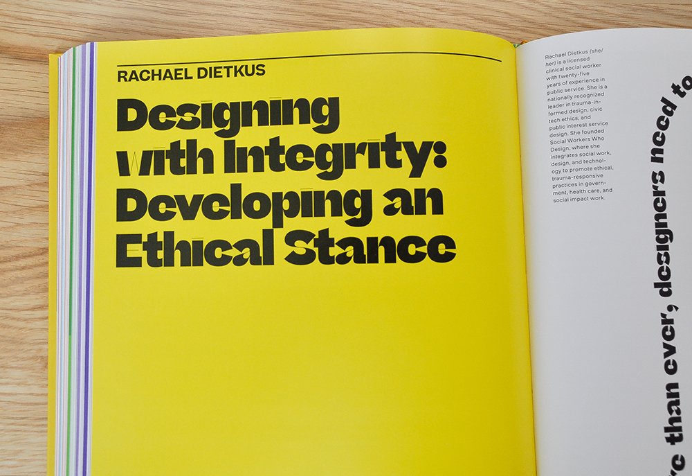
Some typefaces are best for decorative use, which means the copy length should be ~1-2 words and type size should be large. But when copy is set in a decorative font—even a fairly short headline—it can become a legibility challenge. In this example, the ‘w’ should have been a red flag.
For screen or print, we consider fonts specifically designed with accessibility in mind. While most sources cite fonts that everyone has by default with their OS, like Times New Roman or Arial, there are more creative options out there, like Atkinson Hyperlegible or Lexend—both free!
To make sure our font choices work in print, we:
Refer to reading distance charts to guide text size. Charts like these aren’t perfect—font styles vary widely and thus scalability also varies. But having a frame of reference is a helpful starting point.
Test print at scale. Reading distance charts don’t address the nuances of decorative type styles, so a proof is a great way to test our work before we commit. When you have as much experience in print as we do, it’s hard not to spot potential issues when you see the piece in real life, at actual size.
Those are just a few considerations for improving accessibility through design choices. When you work with us, you can be sure we’ll bring an eye for detail to the design’s unique elements of communication.
Details We Appreciated
Critiques are best when they end on a high note. Let’s take a quick look at some standout details.
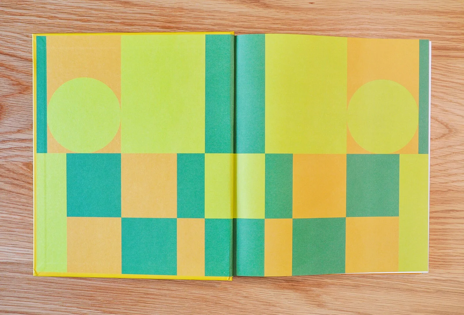
Liner Paper Selection
Whether it’s custom or stock, it certainly feels customized to the book design. Little details like these can make a book feel even more special—so, we loved this selection.
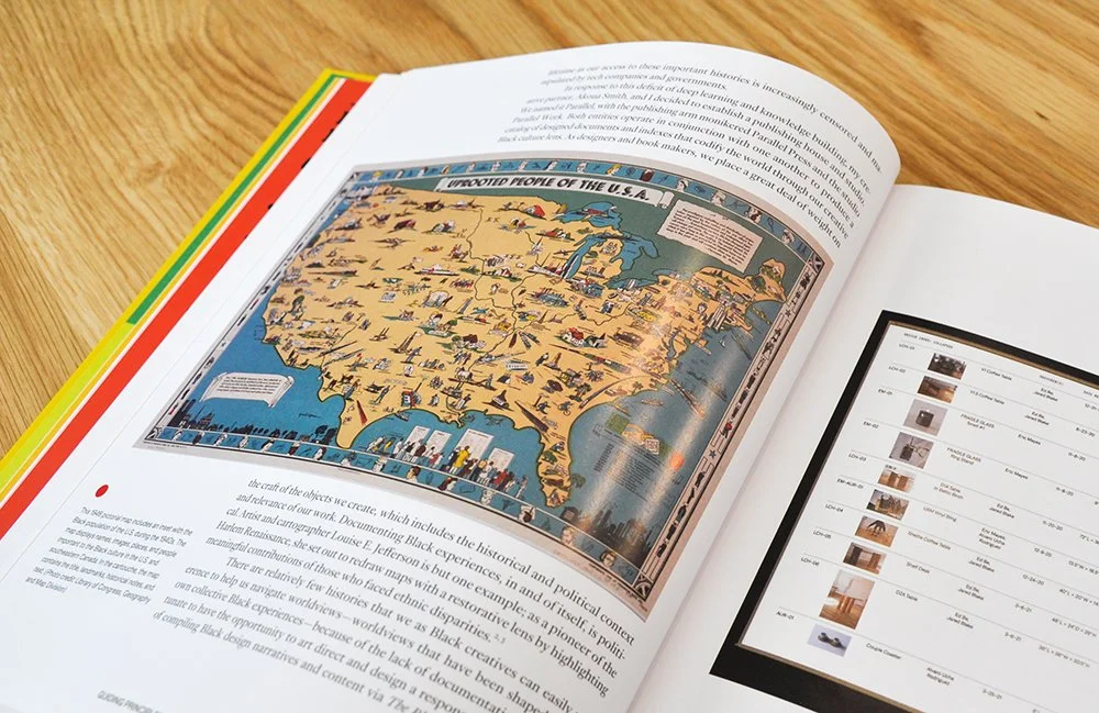
Creative Use of Sidebars
Using a flexible layout comes with benefits, like being able to use the white space of sidebars to house callouts or artwork. It’s a technique we often use since it can be a space-saver (every page counts in printing!) in addition to being a generally sophisticated style choice.
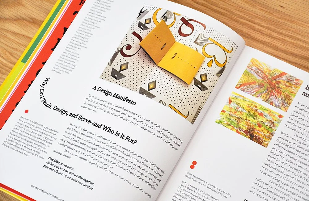
Breaking the Grid to Create Visual Interest
When you’ve got a good grid layout, you can selectively “break” it on purpose to keep layouts from feeling monotonous to readers. You know you’ve done it right when it feels like a nice surprise and not an interruption or distraction.
Wrapping Up
No one is perfect, and the best of intentions don’t always mean a design is as inclusive as it should be. The bottom line? Testing and print proofing are always necessary to help you avoid losing part of your audience due to lack of accessibility.
Whether you’re looking for inclusive design for screen or print, we can help. Give us a few details about your project to get started on more accessible marketing materials.