2025 State of Downtown Durham Report
Our team’s collaborations with Downtown Durham Inc’s (DDI) reports go back a long way—from the 2015 Welcome to Your Downtown piece to 2021’s State of Downtown Durham (SoDD) Report to new 2025 Quarterly Reports and more. For this year’s SoDD meeting, they tasked us with refreshing the template branding and creating a new print piece for the event. As always, we were up to the challenge.
Refreshing the Look
We knew we could get things moving swiftly. To our advantage, in 2021 we developed well defined type, swatch, and table styles along with structured layout options. For 2025, that meant rather than building and adjusting styles at the same time, a tedious but worthwhile process, we could move more quickly by editing the existing styles and layout.
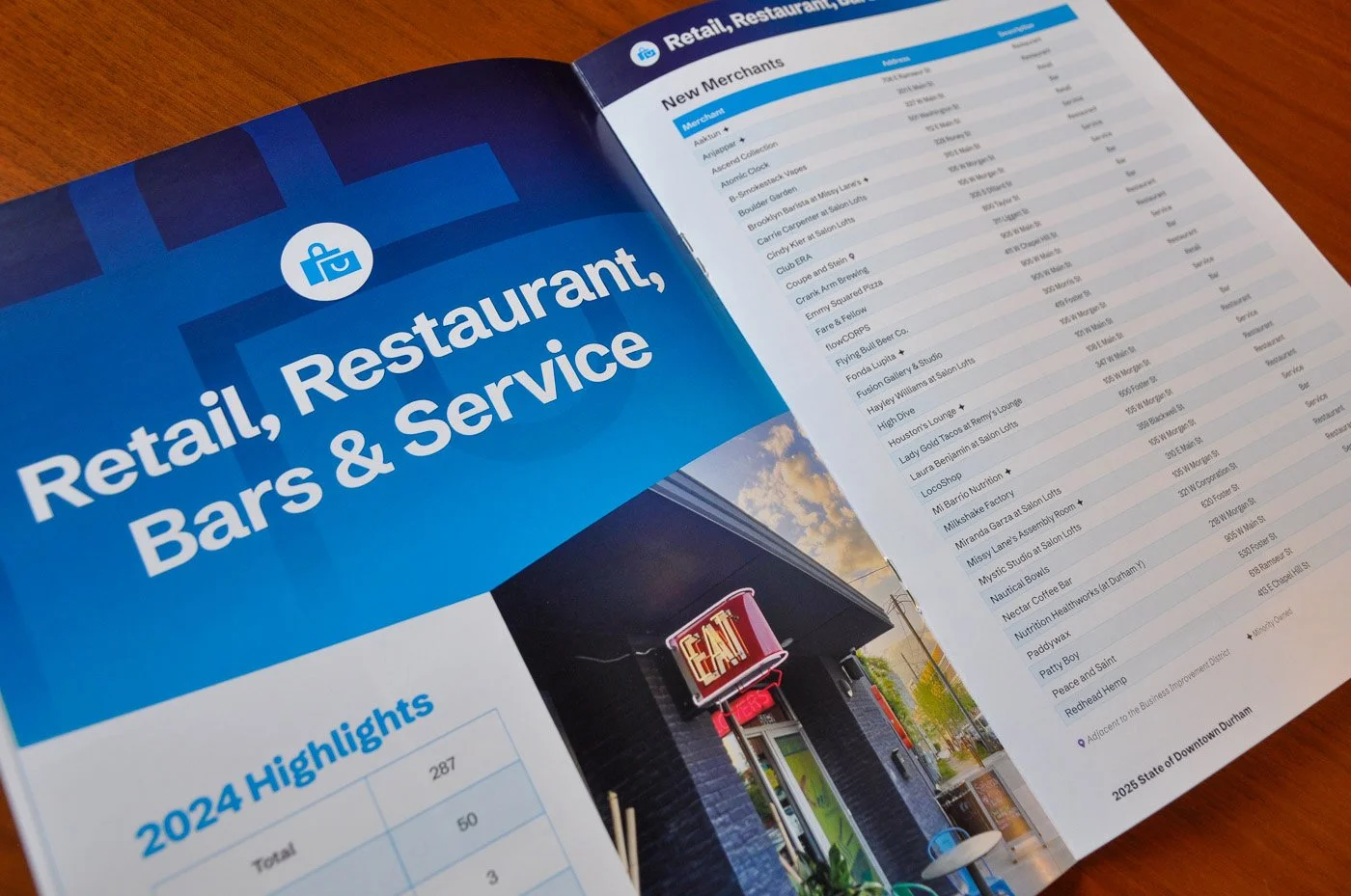
The 2025 report needed big layout changes to the section opener pages. By necessity, DDI operates with a limited photography budget. They also requested that the ‘Highlights’ information stand out more than in previous years. The new version relies on vibrant brand styles to bring interest to an intentionally less photography dependent format. Using a consistent gradient theme of dark navy to a brighter color also created a sense of continuity between sections.


Preparing for Print
One of the many benefits of having a long-standing relationship with our local print vendors is being able to commit to a tight turnaround time. We know the specifications required to produce quality prints—and the files we package go to press quicker as a result. Our industry knowledge combined with decades of print experience results in a professional, polished end product.
To Pantone or Not to Pantone?
Some colors are fussier than others when it comes to process printing in CMYK. One of those colors is bright purple. DDI’s new brand styles include a bright purple primary, and we knew that would come with print challenges.
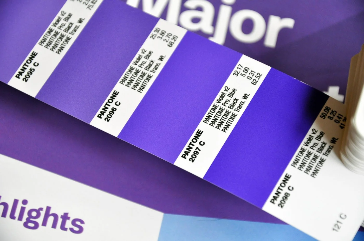
Pantone 2097 vs CMYK print output
When we create new brands, part of our process is considering if printing without Pantones will result in a more muted look. It’s not bad—it’s just different—a little less energetic. We work with the client to figure out if that’s right for them. For DDI, having that vibrancy available across so many channels was worth it.
Pantones provide the ultimate color reliability in print. The downside is increased cost. We love printing with Pantones because we want our designs to pop in print as much as they do on screen, but we’re aware that every piece may not merit the cost. For this we priced it both ways and with the limited run, process printing was the right answer here.
The Results
Even without the Pantone, the print report is plenty bright, colorful, and engaging. We’re happy with how it looks on screen, too—and so is DDI.


Have a report in need of refreshing? Whether it’s for print or online publication, we can help.