
One of our long-term clients recently opened his own consultancy and were thrilled when he asked us to develop the brand identity. A solid brand foundation makes for cohesive marketing materials right from the start. Of course we said yes and set to work on a launch kit.
Kicking Off with Curiosity
Jesse Rutledge had the name all sorted out: Public Trust Strategies (PTS). But it takes more than a name to get a direction for a brand’s visual identity. It’s easy for us to lead off kickoff conversations with curiosity. We are genuinely excited to figure out what an organization wants to accomplish, how they intend to differentiate from the rest of the field, the audiences they need to reach, and subjective stylistic preferences. Through these discussions, we make better-informed design decisions.
Jesse shared that all of PTS’ work “is designed around one core principle: enhancing public trust and confidence in our courts and in our system of government.” He has two decades of experience in the field of state courts—specifically, in looking at ways to understand and foster public trust in courts. Jesse’s experience and reputation position PTS as a dependable, experienced, knowledgeable, and trustworthy consultancy. Overall, he wanted the brand to come across as bold, visible, provocative, and assertive.
How does all of that translate visually into brand styles? We agreed that we should avoid colors traditionally associated with American politics, like red or blue, to prevent audience isolation. That note on color, plus the list of qualities to convey in the paragraph above, gave us plenty to work with as we moved forward into design.
Defining Visual Styles
The logo type, we aimed for bold and highly legible—which ultimately led us to Neue Haas Grotesk. If you’re into type history like we are, you’ll recognize it as the “original” Helvetica. Our timeline and budget didn’t allow us to pursue a mark or icon, but we knew we could still bring in character through creative typesetting. We staggered each word in the forward on its own line, hinting at the forward progression courts can make in public trust through PTS’s services.
For parity, we chose to use Neue Haas again as the collateral headline font. And for paragraphs, we selected Bitter. Slab serifs like Bitter nod to traditionalism but still appeal to modern audiences. Contrasting collateral fonts for headings and paragraphs bring a unique and tailored texture to all your materials.
As for color, we initially explored two directions: One that leaned on a forest green, and another with dark purple. In the end, that deep, sophisticated purple won for its relationship to all the qualities Jesse wanted PTS to convey. From there, we built a secondary palette that would support common needs in marketing materials, like the website. (We’ll share more on the website project soon!)
Marketing materials need to be engaging, and we knew that photography and iconography to fit PTS’ services would be a time-consuming challenge. So, the next best way to work in some engaging visual texture would be—literally—with custom-designed textures. PTS’s work is about getting the message to signal the right thing. Equating that to calibration, we found inspiration in vintage TV broadcast test cards. Our designs integrated elements from the test cards with a focus on compass-style elements to tie in another key theme: determining the right direction. We ended up with four unique vector art textures, built in light and dark mode iterations for maximum design flexibility.
A mockup of PTS business cards that will hit press soon.
Finalizing with a Signature
To wrap up the launch kit, we created a custom email signature Jesse could use right away in communications.
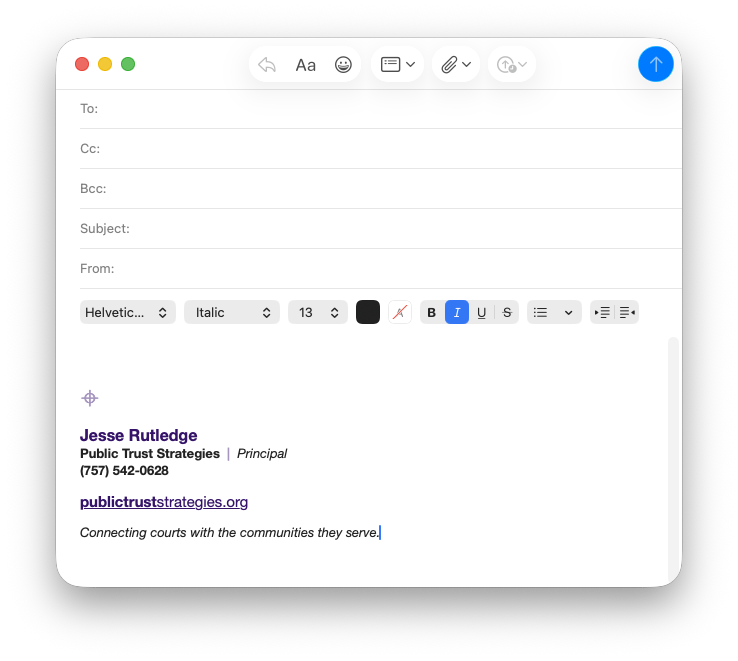
Signatures don’t need a logo image file to succeed in conveying recognizable brand styles.
This is where alternative collateral fonts are important, as most email clients still reliably support only a handful of fonts. From that short list, we used Helvetica to replace the more custom Neue Haas, and Georgia to replace Bitter.
And, rather than using an image file of the logo in the signature (a bad practice you can learn more about in our resource post), we found a Unicode character with an HTML entity that closely resembled elements in our custom texture designs.
The result? A uniquely-branded signature that’s as unbreakable as email signatures can be.
What’s Next?
As Public Trust Strategies grows, we look forward to extending the brand for more marketing projects, like social media.
No matter what your budget looks like—and no matter how new your organization—you can count on HALO 22 to provide creative solutions and a robust brand kit to make your branded materials stand out in a crowd. All it takes is a few details to kick things off.